[fusion_builder_container hundred_percent=”no” equal_height_columns=”no” menu_anchor=”” hide_on_mobile=”small-visibility,medium-visibility,large-visibility” class=”” id=”” background_color=”” background_image=”” background_position=”center center” background_repeat=”no-repeat” fade=”no” background_parallax=”none” parallax_speed=”0.3″ video_mp4=”” video_webm=”” video_ogv=”” video_url=”” video_aspect_ratio=”16:9″ video_loop=”yes” video_mute=”yes” overlay_color=”” video_preview_image=”” border_size=”” border_color=”” border_style=”solid” padding_top=”” padding_bottom=”” padding_left=”” padding_right=””][fusion_builder_row][fusion_builder_column type=”1_1″ layout=”1_1″ spacing=”yes” center_content=”no” link=”” target=”_self” min_height=”” hide_on_mobile=”small-visibility,medium-visibility,large-visibility” class=”blog11″ id=”” background_color=”” background_image=”” background_position=”left top” undefined=”” background_repeat=”no-repeat” hover_type=”none” border_size=”” border_color=”” border_style=”solid” border_position=”all” padding_top=”” padding_right=”” padding_bottom=”” padding_left=”” margin_top=”0px” margin_bottom=”0px” animation_type=”” animation_direction=”left” animation_speed=”0.3″ animation_offset=”” last=”no”][fusion_text columns=”” column_min_width=”” column_spacing=”” rule_style=”default” rule_size=”” rule_color=”” class=”” id=””]
[zoomsounds_player songname=”How to Design an E-commerce Checkout Flow” type=”detect” dzsap_meta_source_attachment_id=”9696″ source=”https://stablewp.com/wp-content/uploads/2020/09/bHow-to-Design-an-E-commerce-Checkout-Flow-23-Tactics-to-Boost-Sales-Podcastle.ai_.mp3″ config=”default” autoplay=”off” loop=”off” open_in_ultibox=”off” enable_likes=”off” enable_views=”off” play_in_footer_player=”default” enable_download_button=”off” download_custom_link_enable=”off”]
Checkout flow is the centerpiece of every e-commerce store. It’s a critical part of your online shopping experience!
Most retailers focus on shop design, attractive imagery, great UI and merchandising that they sometimes overlook the checkout process entirely (not to say these parts are less important).
The checkout flow takes users to the finish line, turning shoppers into paying customers.
Even a small bump in the checkout conversion rate can have a huge impact on your revenue.
But how to squeeze more people down to the very end of your checkout flow to complete the purchase?
Read on and learn 23 powerful conversion optimizations tactics that successful online retailers use to boost sales (and you can apply to yours too!)
Table of Contents
Why checkout matters
Online retail has huge business potential if you do it right.
Amazon recently reached an unbelievable milestone, becoming a trillion-dollar company. Yeah, you heard me right. That’s a one followed by twelve zeroes!
However, such incredible growth wouldn’t be possible without being able to close the deal.
Last year we helped a client increase their conversion rate. By optimizing their checkout page the number of people that proceeded to complete the purchase rose by 5.3%, leading to a gain of additional 75 monthly sales. With an average sale of $300, their revenue jumped by $25K/month.
That was over 28% growth and an extra $270K in sales in 2017!
So, improving your conversion rate by even a small percent can lead to immense gains.
But your checkout flow is where you also stand to lose the most.
The average online shopping cart abandonment rate is 69.89%.
This can be a terrible waste, especially if you consider how much it took to drive visitors to your store, turn them from browsers to shoppers, only to have them bail at the very last moment.
The top 3 reasons that cause abandoned carts are:
- Hidden costs at checkout (shipping, tax, other fees, etc.)
- Having to register before buying (forced registration)
- Lengthy/complicated checkout process
With so many customers lost at the very end of the buying process, it’s clear that optimizing your checkout should be high up in your priority list.
Now, let’s dive in. Follow these 23 tactics to increase your revenue today!
Pre-checkout stage
Your checkout optimization should start early, even before the cart page.
The pre-checkout stage is not directly a part of your checkout process, but there are a few elements that greatly influence your flow.
1. Encourage decision-making with product pages
To master online retail, it’s good to take a page out of the e-commerce king – Amazon’s playbook.
By looking at their product page, there are a few things Amazon does really well.
You’ll notice right away that all the important information is right above the fold, so users don’t have to scroll down to find the essential stuff.
On Amazon’s product page, you can see:
- Product ratings (70% of consumers consult reviews and rating before purchasing)
- Reviews and comments which you can access from this section
- The product description is here as well, with all the specs
- Multiple images, which can be zoomed in, as well as a video showcasing the product (Multiple images increase sales by 58%)
- Different colour options
- Pricing as well as how much money you save if you use this offer
- Plus a countdown timer to push for a quick purchase
Everything you need to make a decision is here or can be accessed from this page.
Down the page, you can even compare this to other related products. There’s a cross-selling offer with a few complimentary items that are usually bought together.
The shopper is already interested, so why not squeeze a bit more money and increase the value of the purchase.
There are so many things you can learn from big online retailers, so be sure to check out our post on 19 tactics to steal from big e-commerce sites.
2. Streamline your checkout process
When it comes to your checkout process, less is more!
Fewer steps mean fewer clicks and a shorter path to your end goal – purchase. Simplify the checkout flow as much as possible.
If you take a look at Made, their checkout consists of only three steps:
- Address
- Delivery, and
- Payment
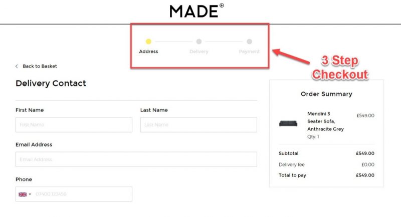
People expect checkouts to be simple and linear. Anything different will either annoy or confuse users and disrupt their flow, which can lead to high drop-offs and cart abandonment.
So, inspect how many steps it takes for your shoppers to complete the order.
You can see this in your Google Analytics (GA), Conversion reports under Goals > Goal Flow.
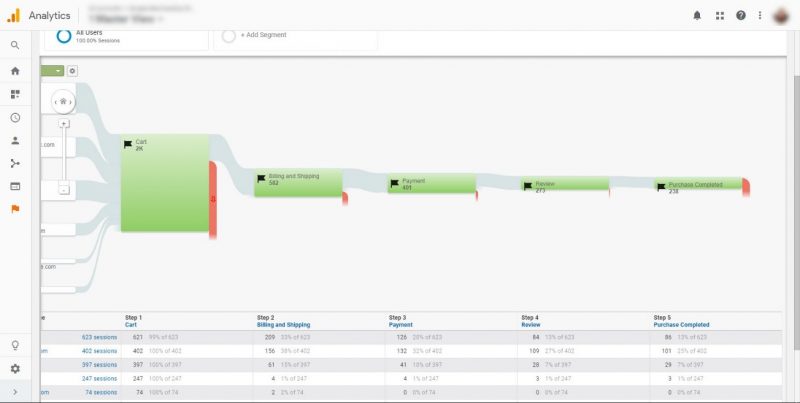
In GA you’ll see the entire checkout process with the number of shoppers that entered and went through each step.
The red strips indicate the drop-offs in your purchasing funnel. It’s critical to check where most people exit and understand what’s making them leave.
Also, remove any unnecessary steps, that don’t contribute to your conversions, especially if they have high abandonment rates.
Generally, a rule of thumb is to have 3-4 steps until the purchase is complete.
If you really want to go all the way, consider offering a 1-click checkout like Amazon.
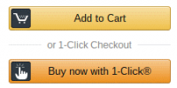
It can’t get any simpler and convenient than that.
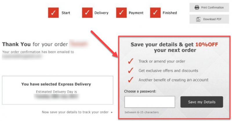
3. Visually show the checkout process
Give reassurance to your shoppers that the checkout process won’t take long to complete.
Today’s people relish convenience; they don’t want to engage in a long and complicated process. They want to get things done quickly.
To assure your checkout flow will only take a minute, display progress indicators in your checkout page. This helps shoppers understand where they are in the process and how long it takes to complete it.
JCrew does an excellent job, with its progress bar placed on top of the checkout page.
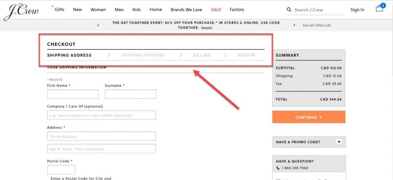
Having a progress indicator signals convenience to your shoppers and can significantly increase the number of people that go through with the purchase.
4. Remove distractions
Removing distractions from your checkout page is another tactic to boost sales. In the e-commerce world, this is also known as enclosing the checkout.
You know-how on each page of your site you want to make it easy for users to navigate to other pages, content, etc.? Well, on your checkout page you want to do the opposite!
Header, footer, navigation bar, search box, and other elements normally found on other pages, only serve as a distraction for shoppers.
Even well-known retailers like Nordstrom can’t resist the temptation of cluttering up their checkout with needless navigation elements.
These can cause users to click away to other sections of your e-store and ultimately forget about their cart or second guess their decision. And you don’t want that, do you!?
Stripdown your checkout page from any unnecessary distractions that don’t contribute to making a purchase.
Give users a distraction-free checkout experience. Walmart does a very good job at this with clean page design and a clear Call-to-action (CTA) on what to do next.
Everything on your checkout page should drive users one step closer to your ultimate goal – completing the order.
5. Infuse credibility with trust signals
Online security is a major concern for most users nowadays. Scam, phishing and other fraudulent activities made people reluctant to give out their sensitive information.
To counteract this, infuse your site with credibility by displaying trust seals throughout your checkout process.

Baymard Institute analyzed which trust marks have the highest perceived security for online shopping. Norton, Google, and BBB were the top 3 most trusted badges.
Place your trusted logos strategically in your checkout process, especially on pages that require sensitive information such as your billing/payment page.
You should also sprinkle other trust signals throughout your buyer’s journey wherever it makes sense. These could include:
- SSL certificate
- Logos of available payment options
- Social proof like ratings and reviews
- Customer policies such as returns, privacy, etc.
- Any other verifications and accreditations
Add to cart stage
The “add to cart” stage of your checkout flow is all about user convenience. You want to make it as simple and convenient as possible to move from this stage to the cart.
Furthermore, now’s the time to increase the value of those sales and make them more profitable. The following 3 tactics will boost your sales and revenue.
6. Add to cart convenience
Once a user is ready to buy, make adding to the cart as easy as possible.
Newegg has a great “add to cart” section design.
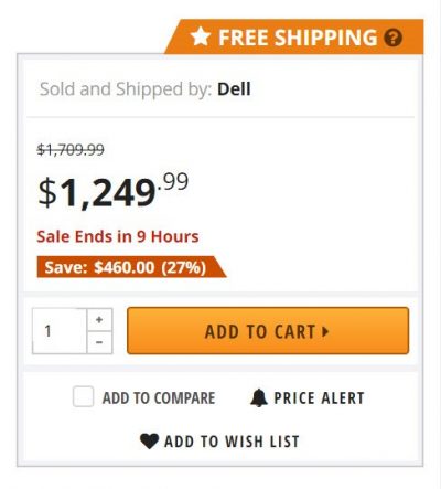
Add to cart section looks clean, yet provides all the important information for this stage. You see the final pricing as well as the amount you save if you take this offer.
It’s super convenient to select the number of items you want to add since you don’t have to type. Simply select the exact number from the drop-down, and you’re good to go.
The CTA stands out with bright contrasting colours, clearly signalling what the user should do next.
Free shipping is displayed on top to lure you in and reinforce the benefit of shopping here.
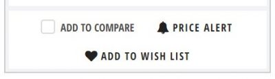
For those still on the fence, there are 3 more options:
- Add to compare (compare to other similar products)
- Price alert (get notified once the price drops)
- Add to wishlist (save for later)
The takeaway here is that the “Add to cart” section should encourage action. The main focus is on proceeding to cart, but if the user is still undecided, there are alternative actions that they can take.
7. Confirm cart add with visual cues
Once the item’s in the cart, what’s next?!
There are two main approaches to what should be the next step:
- Confirm the item is added to the cart and remain on the same page. This approach has good and bad sides. The good thing is users might consider adding more items to the cart before checking out. The disadvantage is that they might not know what to do next, so they may continue browsing and get sidetracked, leading to an abandoned cart.
- Take the user to the cart page. The biggest advantage of this method is that it takes the user one step closer to the final purchase. The drawback is that users might not consider buying anything else.
Which one you go for really depends on your industry and average cart value, make sure to do some A/B testing to find the best strategy for your e-commerce store.
If you go for the first option, make it obvious that the user added an item to their cart. You can do this with visual cues like pop-ups or animations. This is optimal because human eyes react to movement and they will shift their attention to the checkout.
JCrew does this well with a small pop-up box appearing in the top righthand corner as soon as you add an item to your shopping bag.
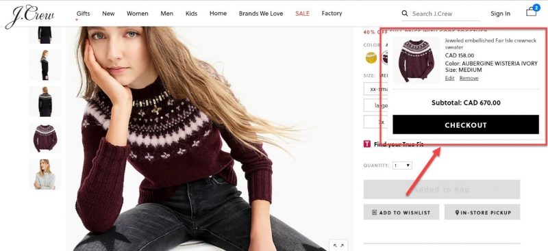
What I love about their pop-up box is it only has one CTA – checkout. This moves the shopper along the checkout flow and on to the next step.
Amazon, on the other hand, takes users right to the cart page.
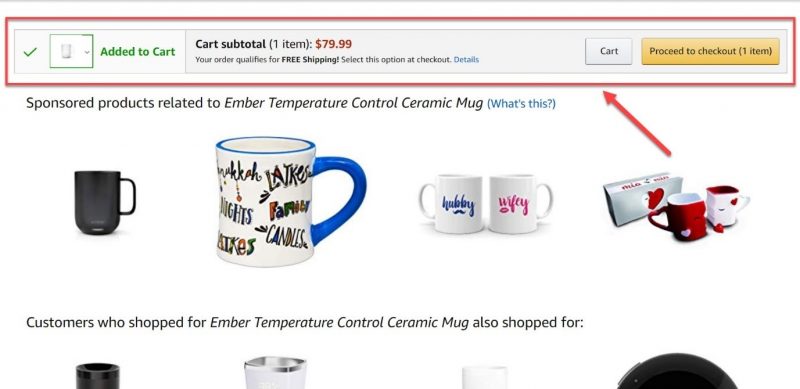
They want to take users closer to the checkout as fast as possible. This small nudge can help reduce abandoned carts.
But Amazon wouldn’t be the king of online retail if they didn’t have another trick up their sleeve. Amazon’s cart page is also full of cross-sells and upsells to allow shoppers to add a few more items before they finalize their purchase.
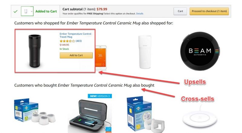
It’s full of relevant products shoppers might buy along with the item already in the cart. And it’s easy to add them just by hovering over the item and clicking the “add to cart” button.
Which leads to the next tactic to boost sales…
8. Upsell, cross-sell and down-sell for more profitable sales
Upselling and cross-selling are tactics to boost the average order size. They increase the value of each transaction and make for more profitable sales.
In the previous section, you’ve seen how Amazon adds upsell offers to their checkout page. But there are other ways to do this as well.
Home Depot tries to upsell you a 2-year protection plan for an additional $25 when you’re buying one of their power tools.
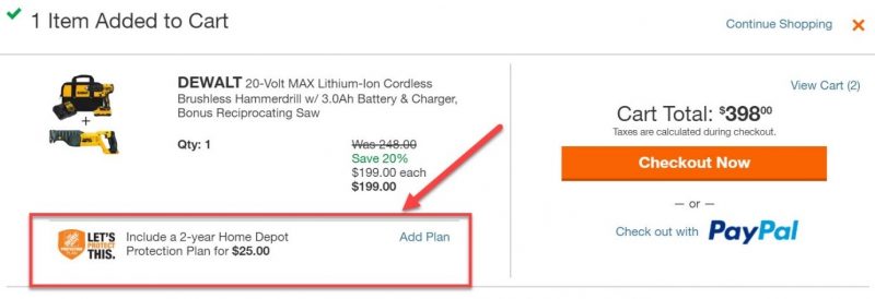
There are many upselling strategies, but the goal is always to increase the value of each order.
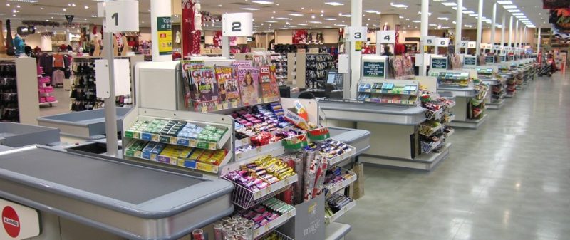
It’s the same thing you encounter in brick-and-mortar stores while waiting in line at the cash register. You’ll see conveniently placed items like candy, condoms, razors, etc., meant to boost the sale size.
Upsells really work because it’s easier to sell accessories and add-ons to someone who already intends to make a purchase then it is to someone just browsing.
Cart page
Clarity and control are the names of the game for your cart page. Allow shoppers to review their cart in the same way they would in a physical store.
9. Clearly display cart details
Your cart page should help users easily understand what’s in the cart and how much they have to pay for it.
Unexpected costs are the number one reason for abandoned carts. Make sure all the pricing and cost information is obvious and easy to understand.
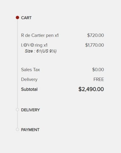
Cartier takes a minimalist approach with its cart design.
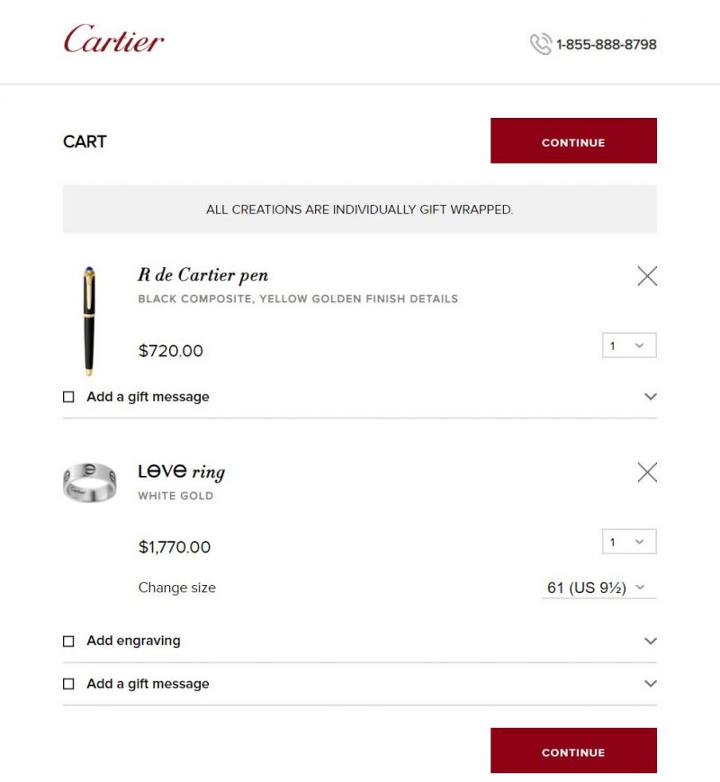
You see product images, quantity, size, pricing and a few add-ons like engraving and complimentary gift messages.
They also get the visual hierarchy right with clear CTAs shown one above and one below the cart. It’s easy to understand what the priority action for this page is – continue to the next step.
Next to the cart, you can see a progress indicator of their checkout flow (mentioned earlier), along with the total cost for this order.
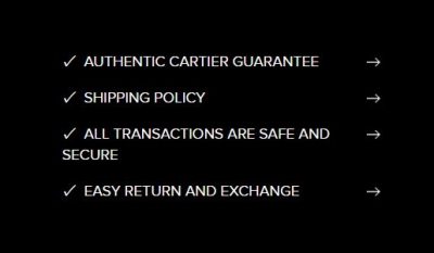
It’s also a good time to remind them about the good stuff like your free shipping, guarantee, return policy, etc. (more on that in a bit).
The intention is to clearly show all the contents and information useful for this stage, in order to push users onto the next stage of the checkout process.
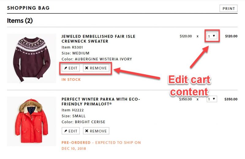
10. Give customers full control
Allow users to change their minds, and offer full control over their cart contents.
Give shoppers the option to easily:
- Edit (size, colour, etc.)
- Remove
- Change the quantity
They should be able to make changes from within their cart with just a few clicks.
Sometimes shoppers might mistakenly add the wrong option such as colour, size, quantity or even the wrong product. Other times they might simply change their minds.
If you don’t allow them to review the contents, in most cases, they’ll just abandon the cart. So it’s best to give shoppers the full control on your cart page.
11. Save cart content for later
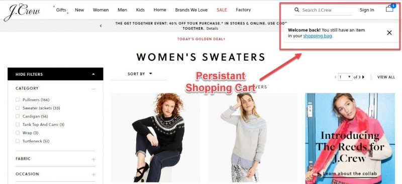
Not everyone will be ready to buy despite getting all the way to the cart page. Save their carts to allow them to continue where they left off.
Persistent shopping carts appear the next time users visit your e-commerce shop even if they don’t register for an account.
Most well know e-stores use this tactic nowadays, but J’Crew goes a step further showing a “welcome back” pop-up reminding shoppers that they still have their cart ‘waiting’.
You can also allow users to save their cart items for later.
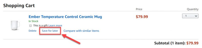
54% of shoppers say they would gladly purchase products left in shopping carts if those products are offered at a lower price.
If you give users the option to save cart for later, you can use cart abandonment emails and retargeting ads to bring people back with personalized offers and discounts.
Billing and shipping stage
Now it makes it or break it time. Shoppers have officially entered the checkout phase, and it’s time to reel them in with your payment and shipping options.
The critical areas of this stage are choice and security.
12. Offer up multiple shipping options
Different people have different needs and schedules, so It is ideal to have multiple shipping options available.
Some people don’t mind waiting if it’s going to save them a few bucks, while others don’t care about the cost, they just want the product at their doorstep as fast as possible.
Offer them at least two options: one free with slower shipping (taking 3 or more days) and one paid but faster (within two or fewer days to ship).
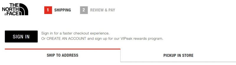
Additionally, if you do have a physical store, you can offer in-store pickup.
The North Face allows for two options, home delivery and in-store pickup.
If you opt-in for shipping to your address, you have more options depending on how long you want to wait. 3-day shipping is free, while more rapid options will set you back from %17.8 to $25. The choice is yours.
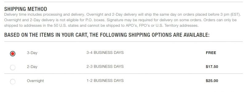
It really pays to appease the various schedules and needs of your customers by allowing a range of delivery options and methods.
Shipping can be used as a marketing strategy to improve the shopping experience and increase conversion rate.
13. Ask for credit card info last
The trick is to have users fill out the shipping info first, before getting to the payment forms.
The reasoning behind this is that once people start doing something they feel they have to finish it. It’s a psychological principle of commitment and consistency explained by well know Cialdini, master of persuasion.
If you want to increase conversions of your checkout flow, ask for billing information after the shipping form.
Dsquared2 does this right with their billing and shipping page.
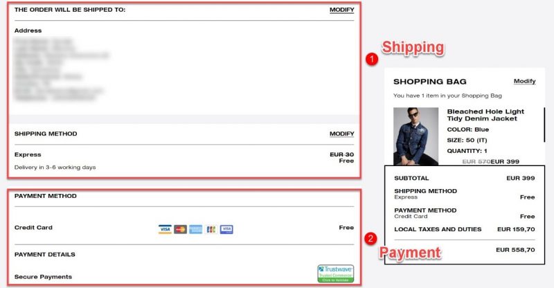
Users already typed in their bio (name, address, phone, etc.) so they don’t need to enter that information again, only the card details and they can proceed to order.
14. Provide an abundance of payment options
Customers have various preferences when it comes to payment options, so the more you offer, the better.
40% of consumers have more confidence in online shops with multiple payment options, and 59% will abandon a transaction if their preferred payment method is not in place.
Give your shoppers the convenience to select from a large variety of payment methods – credit and debit cards (Interac), and perhaps even PayPal.
PayPal is becoming super popular (60% of web transactions) because of its convenience. Users don’t have to dig through their wallets and look for their card numbers. They can simply log in with their PayPal account and quickly complete the purchase.
Asos is offering a solid selection of payment cards, plus a quick checkout with PayPal.
For more expensive items you can also offer financing. This can boost sales on high-ticket items.
You may even consider integrating with digital wallets like Apple Pay, Google Pay, Amazon Pay, etc.
Digital wallets are especially important for your mobile e-commerce experience. With predictions that mobile retail will hit over 50% of sales by 2021, this can have a huge impact on your overall business.
56% of shoppers expect to see a variety of payment options, so don’t let them down. You got them so far, don’t lose them just because you don’t offer their preferred payment method.
Check out our comprehensive e-commerce payment processing guide to learn how to choose the right solution for your shop.
15. Be careful with coupons/promo codes
It might sound counterintuitive, but don’t’ make coupon fields prominent on your payment page.
And there’s a very good reason for this.
Most shoppers won’t have a coupon code.
If you place a prominent coupon field that invites users to “Enter promo code here,” they will instantly think, “How come I don’t have a coupon?” and “Where can I get one?”
People love discounts so they’ll instantly go over to Google for coupon codes, which increases the chance of an abandoned cart. Many users will simply get distracted and may not return, while others may decide to hold off the purchase until they can find a coupon code.
Distractions are a real bane to your checkout process. If users leave your checkout flow, even for a moment to find promo codes, they’ll encounter even more distractions. They might find deals for other stores, check Facebook, etc., and get lost in the
Never take shoppers away from the purchasing progress, or you risk losing them entirely.
The best practice for coupon code fields is to actually use a text link that says something like, “Have a promo code?” Home Depot is a good example of how this should be done.
Their promo code field is tucked away under a link text, so it doesn’t stick out. The goal is that only those who actually have a coupon would look for this field and others won’t even notice it’s there.
16. Have easy to use payment information forms
This is a small touch that can go a long way. Make it easy to enter card information with a well-designed payment form that’s clear, easy to understand and has as few form fields as possible.
Your payment form should make it obvious what information shoppers need to input. Ask only for essential information such as:
- Card number
- Expiration date
- Security code
- Name on card
For added clarity, give users a hint of where they can find the security code on their card since not all cards have the same layout and number of symbols.
Don’t forget to make entering the information as easy as possible. Reduce friction with:
- Autoformatting
- Support copy/paste
- Make suggestions
- Disable autocorrect for certain fields like names, addresses, and emails…
Payment forms are easy to complicate and tough to design. Users won’t input their card info in forms that are poorly designed and confusing.
So, make sure to give them the most straightforward form design with as few fields as possible. Such attention to detail can give you a big boost in conversions and sales.
17. Make the payment form look secure
Security plays a critical role in e-commerce, and it’s especially important for your billing page.
We already discussed spreading signs of online security all over your e-store, but now let’s focus on users’ main concern – secure payment.
Pet Only encourages users with a sense of security on their payment page with Secure checkout and Norton security trust marks.
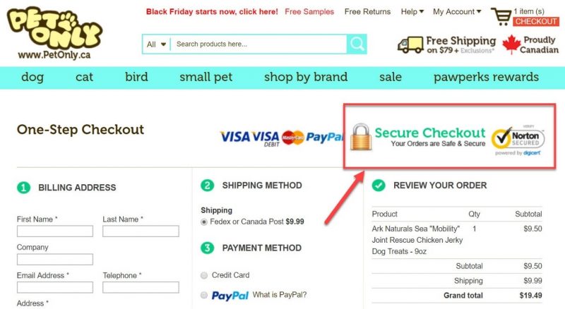
Credit card, PayPal and other trusted logos can also reinforce the trust in the security of your e-commerce checkout. Reduce customer fear, and it will surely lead to more finalized purchases.
18. Simplify checkout by storing card info in your system
This is another small trick that can boost sales. By storing their credit card info in your payment processing system,you’re making it easier for returning customers to make a purchase.
Storing customers’ card info is also known as “card vaulting”, and it’s a secure way to keep sensitive payment details on your payment gateway.
They won’t have to fill in all the forms once again, which can be tedious and may cause some users to abandon their cart.
Returning customers are more likely to buy something than new shoppers. It also costs much less to get them shopping again then acquiring new visitors.
For card vaulting, you need to be using a compatible payment gateway, such as:
- Stripe
- Braintree
- Authorize.net
- Adyen
- Moneris
- Bambora, etc.
This also requires PCI compliance. However, the increase in sales will definitely justify all the effort.
Summary and review page
It’s the final step! Get this one right, and you’ve effectively converted shoppers into paying customers.
19. Avoid forced registration
Forcing shoppers to register for an account can be detrimental to your checkout flow and your conversions!
If you remember from earlier, the second biggest reason for cart abandonments (claimed by 37%) is forced registration.
Registering for an account can be such a hassle. Users have to fill out a bunch of forms, create passwords, verify the account with email, so on and so on.
For many people, this can be a deal-breaker!
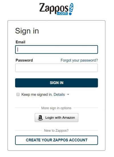
So, unless you don’t mind losing almost 40% of customers due to registration, you can force them to create an account at checkout like Zappos!
On the other hand, if you want to boost your conversions and sales, offer users a choice.
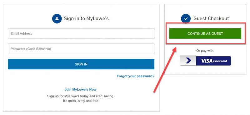
Lowes allows new customers to join for free or use “guest checkout”.
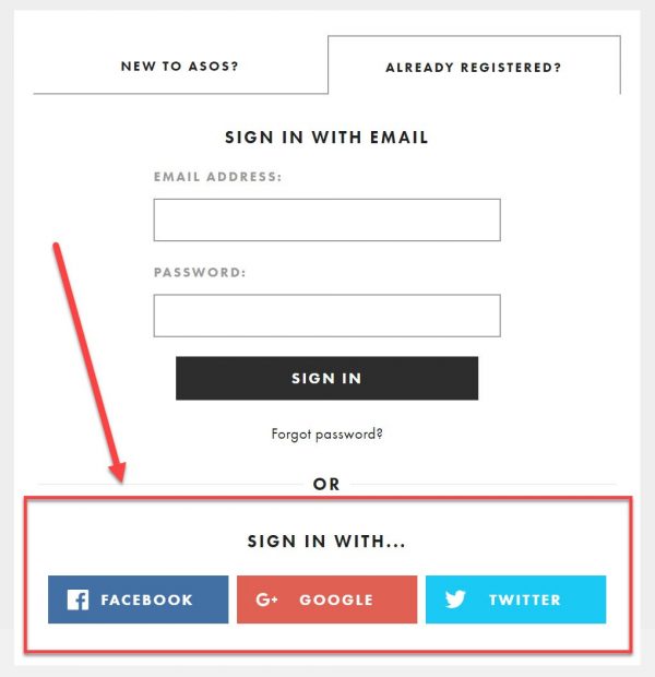
If you insist on having shoppers create an account on your e-store, offer them social login.
With social logins, users can forego the registration process completely and create an account using their existing profiles on Google, Facebook, Twitter, etc.
Once they fill in their shipping and billing information, you already have all the necessary details about your customers.
20. Bribe users to register
If social login is not your thing and you still want to have registered users, then consider offering an incentive to users who sign up for an account.
This can be a gift card, a special discount, store points or any other bribe that can motivate them to open an account.
A cunning way to get users to register is by offering them an incentive after they’ve placed the order. You already have all the necessary info about them, just offer them a cool discount on their next purchase.
This way you don’t interrupt their checkout flow, and you get them to sign up and finalize their purchase. A win-win if you ask me.
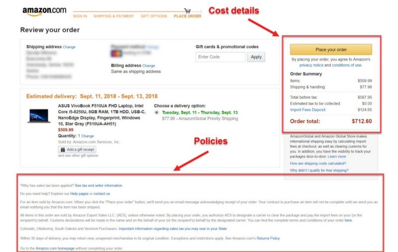
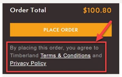
21. Boost shopper’s confidence with tax, returns and security policies
Allow your users to review all the purchase details as well as your policies on returns, exchanges, and privacy.
This is the final confidence booster that can solidify trust in even the wariest of customers.
Amazon does a good job of understanding user behaviour and displaying all the relevant information before the customer places the order.
Timberland also allows users to review the total amount, Terms and Conditions as well as their Privacy Policy, among other purchase details.
That’s it, now all that’s left is for your customer to push the final button and place the order.
There are two more Bonus tactics to boost sales with your checkout, which you should definitely consider.
BONUS
22. Capture emails early
No matter what you do, it’s unlikely that you’ll convert 100% of your visitors into customers. In fact, 99% of all online store visitors don’t buy anything during their first visit?!
But the good news is 75% of them have future intentions of returning to continue the buying process.
That’s why it’s important to remind your shoppers of their abandoned carts with email remarketing.
But this requires you to collect their emails early.
As soon as new users land on your e-commerce store, ask them for their email address. You can surprise them with a pop-up form like JCrew.
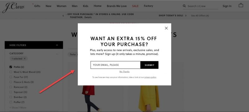
To make this strategy effective offer them an incentive in the form of a special discount if they provide you with their contact information.
23. Recover abandoned carts with retargeting ads
Retargeting ads are especially effective ad recovering interested users who haven’t converted on their previous visit to your online store.
Visitors are 70% more likely to convert if they see a retargeting ad.
Add tracking codes to your web stores like Facebook Pixel and Google Ads Conversion Tracking.
Once installed on your e-commerce store, they’ll keep track of all the visitors and their interactions with your site. So, you can target them with specific ads relevant to their latest visits even when they’re away from your site.
Retargeting hot leads with relevant ads can greatly boost your sales and skyrocket your revenue.
For a more in-depth guide, read our Retargeting 101 post and learn how to bring back lost shoppers and turn them into paying customers.
Wrap-up
Your checkout flow is probably the most important part of your e-commerce website. It’s directly responsible for driving sales, and it works towards your business bottom-line.
Streamline your checkout to provide a distraction and interruption-free experience. Shoppers get distracted easily, so make sure your checkout process is quick and simple.
Also, give the user a sense of security and control. Offer different options to bolster their convenience.
There’s no such thing as a perfect checkout flow for your business. Implement the recommended tactics above but make sure to A/B test everything to see what works for you and your customers.
Let us know down in the comments, what conversion optimization tactics are you using in your checkout.
[do_widget id=custom_html-25][/fusion_text][/fusion_builder_column][/fusion_builder_row][/fusion_builder_container]