[fusion_builder_container hundred_percent=”no” equal_height_columns=”no” menu_anchor=”” hide_on_mobile=”small-visibility,medium-visibility,large-visibility” class=”” id=”” background_color=”” background_image=”” background_position=”center center” background_repeat=”no-repeat” fade=”no” background_parallax=”none” parallax_speed=”0.3″ video_mp4=”” video_webm=”” video_ogv=”” video_url=”” video_aspect_ratio=”16:9″ video_loop=”yes” video_mute=”yes” overlay_color=”” video_preview_image=”” border_size=”” border_color=”” border_style=”solid” padding_top=”0px” padding_bottom=”” padding_left=”” padding_right=””][fusion_builder_row][fusion_builder_column type=”1_1″ layout=”1_1″ spacing=”yes” center_content=”no” link=”” target=”_self” min_height=”” hide_on_mobile=”small-visibility,medium-visibility,large-visibility” class=”” id=”” background_color=”” background_image=”” background_position=”left top” undefined=”” background_repeat=”no-repeat” hover_type=”none” border_size=”” border_color=”” border_style=”solid” border_position=”all” padding_top=”0px” padding_right=”” padding_bottom=”” padding_left=”” margin_top=”0px” margin_bottom=”0px” animation_type=”” animation_direction=”left” animation_speed=”0.3″ animation_offset=”” last=”no”][fusion_text columns=”” column_min_width=”” column_spacing=”” rule_style=”default” rule_size=”” rule_color=”” class=”” id=””]Looking to boost sales and take your e-commerce business to the next level?!
Best way to get started is to learn and implement tactics that are already proven to work!
Big online retailers like Amazon, Best Buy, and Zappos use certain techniques for their e-shops which help them convert like crazy (think billions of dollars!).
These 19 tactics will explode your e-commerce conversions and take you a few steps closer to greatness.
Learn how to boost your sales today!
Table of Contents
Pre-sale stage – Help shoppers decide faster
Imagine users browsing on your e-commerce store. Most of them are not confident enough to make the purchase decision right away.
Decision anxiety and other emotional distractions can wear down your potential customers, making them postpone shopping or leave entirely. Meaning, if you don’t address these issues, you stand to lose a lot of potential sales!
To counter this, consider the following techniques taken out of the big online retailers’ playbook.
1. Target shoppers’ FOMO with urgency/scarcity
Urgency and scarcity are two super effective persuasion tactics you can use to elicit more sales.
Fear of missing out (FOMO) is a powerful psychological phenomenon that triggers users to take action. People are compelled to do something otherwise they’ll miss out on some opportunity.
Just how effective it for e-commerce conversion optimization!?
According to a study by Strategy Online, 60% of millennials will make reactive purchasing decisions because of FOMO.
Scarcity indicates that the product is so popular that there’s hardly any of it left.
Amazon does an awesome job applying these tactics:
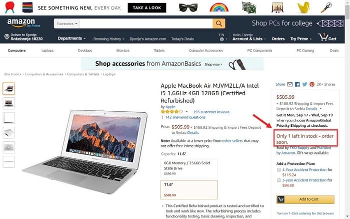
Amazon’s product page indicates this is such a popular product that most of the stock is already sold-out. For users this triggers their FOMO – if they don’t get it right now, somebody else will, and they’ll miss out.
Besides scarcity, the other tactic to boost sales is urgency.
Urgency targets people’s fear of missing out by revealing awesome deals that are about to expire if they don’t hurry up and buy.
Lowe’s is offering a great 10-15% discount which only lasts 4 more hours. Act now and save, or wait and pay the full price!

Yes, you can apply the same approaches on your WooCommerce site as well! To do this, simply install this plugin that enables you to include a countdown timer for your products.
2. Allow users to compare products in your shop
Product comparison makes it easier for your shoppers to make the purchasing decision since they can compare two or more products side by side.
This boosts users’ confidence and encourages them that the product they’re considering is the right one. Shoppers can determine which product is superior in terms of price, specs, etc., leading to faster conversions.
It also keeps users on your site, without having to switch to a different tab and website to check all the product details they’re comparing. People get easily distracted and if they leave your e-shop even for a moment, they may lose interest in the purchase.
Product comparison can be a very powerful tactic, especially if you are selling big-ticket items.
Amazon knows this all too well, that’s why they provide comparison options for hi-tech, expensive products.

For those items, you’ll see the comparison tool embedded on the bottom of the product page. It allows you to compare similar products or other items that you viewed recently (closely related to the item you’re checking out).
Yith offers an excellent comparison tool for your WooCommerce site which you can set up with a few easy clicks.
3. Drive sales with personalized user experience
People are bombarded by so much information these days, that it’s hard to pick out what’s useful in so much noise.
Make it easier for your visitors to find what they’re looking for by personalizing their user experience.
This works well as an e-commerce conversion optimization tactic because it reduces the amount of information they need to go through. Having less noise and distractions makes it easier to select the right product.
Customizing UX for each visitor will increase their engagement and give them a sense of importance. Shoppers will love it since the entire site seems tailored just for them.
Take it from Amazon, their entire home page is designed to meet each user’s specific needs and wants.

Scrolling down, you can also see elements like “inspired by your browsing history”…
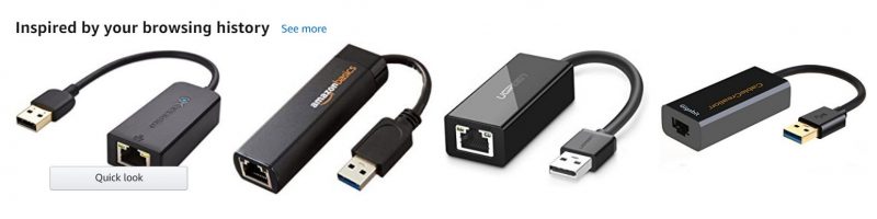
…and “recommended for you,” which makes it simple for you to find other products you might want to buy or give you more options if you still haven’t been able to make up your mind.

You don’t need to go all out like Amazon does, but it is nice to add a few personal touches to your customer’s experience.
Even small details like “inspired by your viewed products” and “recommended for you” can be enough to make your shoppers feel at home and inspire more purchases.
You can use plugins like “Yith recently viewed products” and “Yith customer history” to personalize your WooCommerce online store and boost sales.
4. Use clear CTAs that stand out
Calls-to-action (CTA) are the true drivers of conversion on your site. That’s why you need to make your CTAs:
- Clear
- Eye-catching
For your CTAs to be clear, you need to make sure they can be easily read and understood in 5 seconds or less.
Also, when labelling your CTA, be sure to address the users’ goals. A good formula would be to finish their sentence:
“I want to…”
So, label your CTA with something like “shop now” or “learn more” as well as more aggressive words like “buy now” and “add to cart.”
On your home page and category pages, it makes sense to use softer CTAs, since your visitors don’t know you well enough yet. Users are just getting warmed up for shopping, so you don’t want to come off as too pushy.
Be inviting, not aggressive at this stage.
Best Buy is using this tactic to boost sales: Instead of saying “buy now,” which would make users feel pressured, they use a call-to-action that’s inviting people to “shop now.” This is a much better option that encourages visitors to continue from just browsing to shopping.

Once you have your shoppers hooked on a product and when they’re viewing them individually on a product page, it’s time to be a bit more aggressive.
Follow the same logic here. If a shopper is looking at a pair of pants on J.Crew, they’re probably interested or maybe even want them. So, finish their sentence “I want to…add to bag.”

But you also need to make your CTAs noticeable. So, make them:
- Big
- Place them above the fold
- Use contrasting colours
- Surround them with white space
Canadian Tire presents a perfect example of what CTAs should look like. They’re using red CTAs, surrounded by enough white space to make them stand out, with an inviting label to “shop now.”

Take note: the colour red is oftentimes perfect for calls-to-action. It’s a colour of love and passion, but it also means courage, action, and determination. Which is why it works so well as a CTA colour.
5. Highlight deals of the day
This is a fairly simple strategy that shows different deals each day. Deals of the day are magnets for your visitors.
What makes them so special?!
Once people notice them, they’ll instantly become hooked. They’ll develop a habit of coming back to your site every day to see what the latest deal is.
The more frequently they visit your store, the higher the chance they will buy something from you.
Home Depot, uses this tactic. They’re listing a “special buy of the day” with up to 30% off.
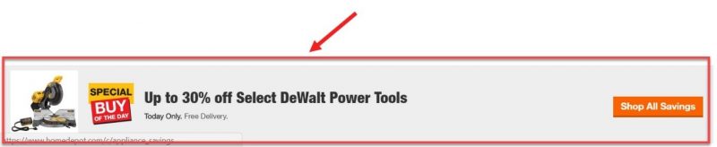
To make it even more appealing, they also offer free delivery.
And finally, they mention that the deal is on for only one day, making users act on an impulse (due to FOMO) and purchase without having too much time to consider.
Which ties in with the first tactic mentioned: urgency and scarcity.
6. Captivate users with stunning images
Even though having high-quality images on your site seems obvious, you’d be surprised at how many websites still get it wrong.
67% of online shoppers rated high-quality images as being “very important” to their purchase decision, even more so than “product specific information,” “long descriptions,” and “reviews & ratings.”
Custom, superb photos on your site will communicate value to your customers and make a strong and positive first impression.
Furthermore, images that give shoppers a sense of texture, size, scale, detail, context, and brand will increase their perceived ownership of the product, which is a huge driver of buying decisions.
Canadian Tire is using exceptional imagery to showcase its product categories.
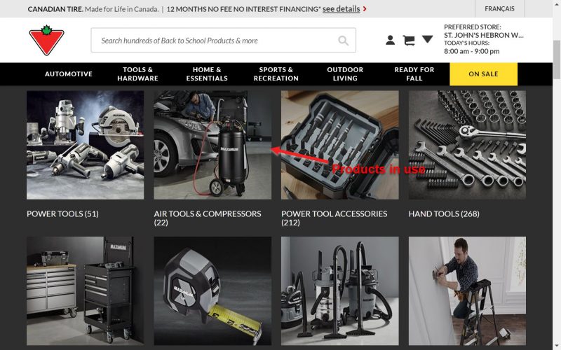
High-quality images help maximize the perceived value of their products.
Some images even feature products in action, which helps users’ perceived ownership, mentioned above. This makes even some ‘boring products’ seem fun to use!
But don’t limit yourself to only landing pages and category pages. Make sure your product page spells out high quality since shoppers are one step closer to a purchase.
Home Depot is engaging emotions by proposing what this mattress would look like in your bedroom.
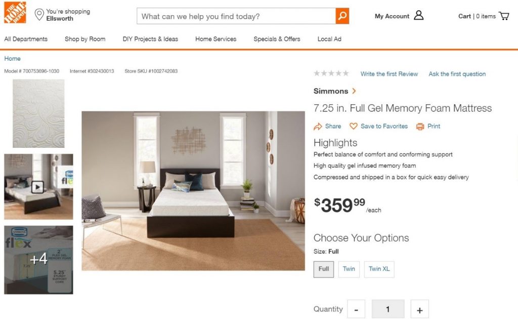
A palpable representation like this, makes you feel what it would be like to own a mattress like this. It’s as if it’s already in your bedroom, so you start to develop positive feelings towards it.
And soon enough, you’ll be ready to buy.
That’s the emotional roller-coaster your shoppers will live through once they see such images on your site.
7. Boost conversions with discounts and seasonal sales
Holiday and seasonal sales account for 30% of all annual sales for most retailers.
With this in mind, it makes perfect sense for you to use holidays and seasons to boost sales with special discounts.
Just about anything can be a cause for a special sale: back-to-school sales, Black Friday, Mother’s Day, Canada Day, Summer sales, Winter sales, etc.
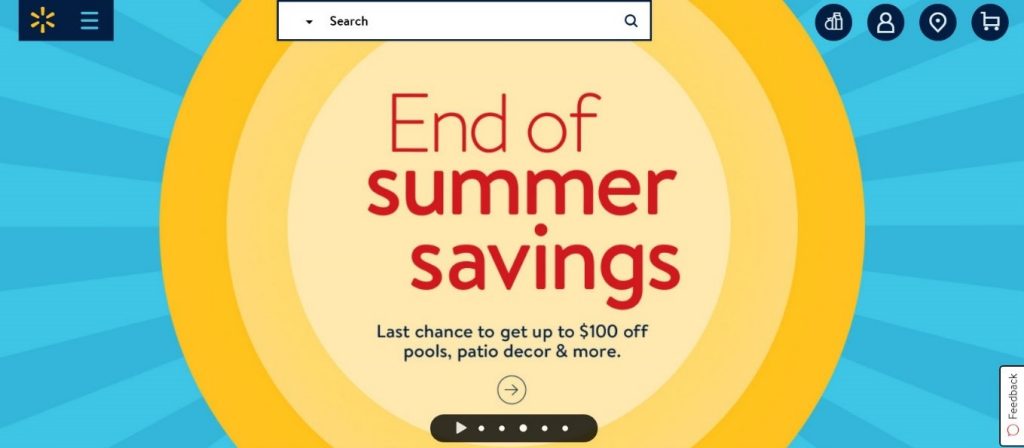
Walmart is offering a terrific “end of summer sale” with $100 off a variety of products.
Home Depot’s offering a 40% discount on appliances for Labor Day.

There are many ways to implement this tactic to boost sales. For example, WooCommerce protected categories plugin will allow you to hide only specific categories intended for seasonal sales.
8. Cross-sell with “frequently bought together” items
Accessories, add-ons, and related products are a great way to complement shopper’s journey.
Cross-selling is a great way to entice visitors to make impulse purchases, without thinking about if they actually need it or not.
For you, this spells out bigger and more profitable sales!
Let’s say you’re buying a garden feeder on Home Depot, you’ll be prompted to get a few extra items that might be useful alongside it.
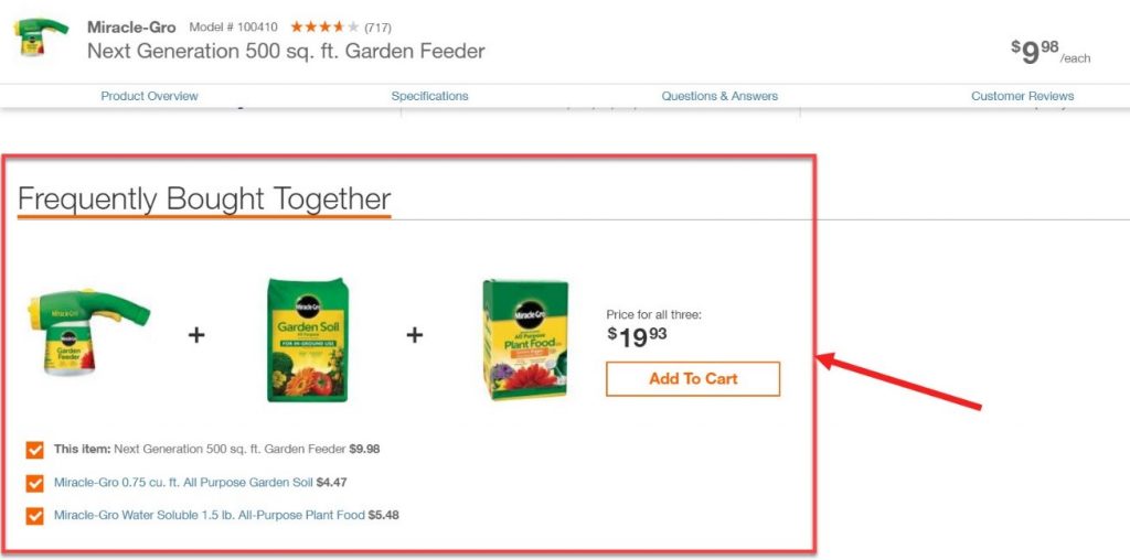
Cross-selling is low hanging fruit tactic that can easily increase the value of each transaction and dramatically boost your profitability.
WooCommerce users can add this feature with a simple “frequently bought together” plugin.
9. Provide free shipping when possible
According to a study by Walker Sands about the Future of Retail, 90% of people say that free shipping is the #1 incentive to shop more online.
Turns out, free shipping is a huge factor in online customer experience. When a potential sale depends on the shipping options you provide, you’d better give people what they want.
Zappos offers free shipping to all customers (and also free returns). They made sure all customers notice this by showing off “free shipping” banners throughout the site.
Now, I know shipping rates in Canada can be exorbitant (compared to the US), so offering ‘free shipping’ without any conditions can be tough, especially for smaller e-commerce sites.
Fortunately, there are some other free shipping options you may consider.
Like Best Buy, you can offer free shipping for orders above a certain amount. In their case, it is $35 or above.
Still not good enough? Then consider offering free shipping to a certain group of customers only.
Amazon only offers Free Shipping (with no minimum amount) to their paid/premium members – Amazon Prime. To join Amazon Prime, users have to pay for the membership upfront.
Amazon’s Prime membership is a huge profit driver and a great tactic to boost sales.
Other shipping options you can use are:
- Only offer ‘free shipping’ on certain occasions
- Free ship-to-store option (Walmart, Canadian Tire, Staples are all using this)
Optimize your checkout – lead them to the finish line
Congratulations, your visitors added items to their carts. Now it’s time to lead them to the end of the purchasing process.
This means optimizing your checkout procedure, and big e-commerce sites have a few tricks up their sleeves for this as well.
10. Streamline your checkout process
This plays a critical role in your e-commerce business success. So, pay very close attention when designing your checkout.
The average shopping cart abandonment rate is almost 70%. That’s huge!
Just think about all the customers, sales, and revenue you stand to lose if you don’t get things right.
Two out of three reasons for cart abandonments are related to checkout process issues.
That’s why it’s crucial to streamline your checkout procedure:
- Simplify the checkout process
- Have as few steps (pages) as possible
- Make the process linear, where each step brings you closer to the order completion
Use our checkout flow conversion optimization guide to turn every shopper into a paying customer.
Amazon even goes a step further by offering a one-click checkout option on their site.

To add a one-click checkout to your e-commerce site, install this Yith plugin.
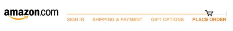
11. Increase conversions with a checkout progress indicator
Yet another small and simple detail but that can do wonders for your conversions.
Having a checkout progress indicator can help your shoppers visualize the process and see how many steps they have left until the order completion.
When they can see the finish line, it gives them more confidence that they’re on the right track and there are just a few more steps left.
Amazon again excels by showing a line that indicates checkout progress.
Wallmart uses a single page checkout, to reduce loading times and make it easier and faster to get to the end. The progress is demonstrated with step numbers, and once each step is complete the number is checked.

This method also helps you visualize and understand how simple and straightforward the process is. Shoppers want to avoid a hassle. Simplicity will encourage them to go through and finish the procedure.
You can optimize your checkout page with a simple to use WooCommerce plugin.
12. Remove distractions from your checkout page
Distractions can hinder your efforts to lead customers to the end of the checkout process.
What do I mean by distractions, you might ask?!
I mean everything on your checkout page that doesn’t directly contribute to taking the next step in the process.
Let’s take Lowe’s for instance. Even though they do so many things well, this is something that they desperately need to fix.
Just look at their checkout page: it’s packed with so many elements like the navigation bar, contact information section, deals banner, purchasing features, etc.

None of these are directly helping the user get to the next stage and one step closer to conversion.
Distractions are just diverting attention from what really matters to these other options. If the user clicks on any of them, they’ll be taken to another page with even more items, deals, etc., which can cause users to completely forget about their cart.
That’s a sure path to an abandoned cart.
Instead, your checkout page should look like this:

There’s nothing on Amazon’s checkout page except information relevant to this exact order, making it distraction-free and easy to complete.
A/B test your checkout pages to find the one that brings in the highest conversions.
13. Hide coupon code fields
Making your promo codes less prominent is a secret conversion optimization tactic to boost sales.
For some, it might not make sense – why not make it easier for visitors to use their coupon codes!?
Let me explain the reasoning behind this.
Most shoppers on your site won’t have a coupon code.
When they see a prominent field asking them to “Enter promo code here,” they will instantly think, “How come I don’t have a coupon?” and “Where can I get one?”
Shoppers will search Google for coupon codes which increases the risk of abandoned carts. Many users may not return or decide to hold off the purchase until they can find a coupon code.
Whenever shoppers leave the process, even for a moment to find promo codes, they’ll be exposed to even more distractions.
Never take them away from the purchasing progress, or you risk losing them entirely.

The best practice for coupon code fields is to actually use a text link that says something like, “Have a promo code?” Home Depot is a good example of how this should be done.

They hid their promo code filed under a barely noticeable link. Only users who actually have the code would see and click.
14. Don’t lose customers with forced registration
Remember that graph from before, showing the top reasons for cart abandonment? Well, the second biggest reason is forced registration.
This means requiring your shoppers to register an account in order to complete the purchase. For many people, this is a deal-breaker.
People generally don’t want to register, it’s a hassle. Registration means having to click on too many links, fill out forms, create passwords, verify their accounts, etc.
Sometimes, users may lose cart contents after registering, forcing them to go back and find the item.
Even some big players don’t get this right.
What you should be doing is offering people options. Give them the benefit of guest checkouts.

This will significantly reduce the number of abandonments and boost your completed checkouts.
After the order is made and money is paid, that’s the moment when you can ask for them to register. You already have their name, email, address, and other information, they only need to create an account and set their passwords.
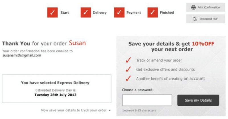
To make it worth their while, offer a special discount for users that register an account, like the example above.
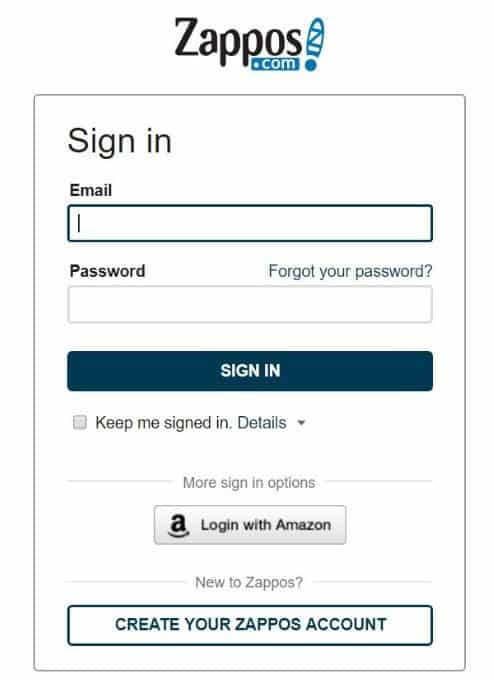
15. Still want them to sign up – offer social logins
A great way to combat account registration aversion is by using social logins. This is much more convenient since users can forego the entire registration process and simply log in with their existing accounts on Google, Facebook, etc.

You can add social login options to your WooCommerce shop with an easy-to-install social registration plugin by Yith.
Still not convinced that you need to avoid forced registrations?
Then perhaps read this article on how removing registration requirements led to a $300 million revenue hike.
Recover abandoned carts with remarketing
You did everything you could to drive up conversions, but inevitably some people will still leave items in their carts without completing the purchase. And by some, I actually mean most of them.
But all’s not lost yet.
Use remarketing as an e-commerce conversion optimization tactic to recover lost visitors.
Remarketing means contacting and engaging visitors that haven’t made a purchase yet. Basically, you’re marketing to the same people multiple times to entice them to convert.
Typical examples of remarketing are:
- Using emails to remind users about their abandoned carts
- Retargeting with Facebook and Google ads
16. Get leads with pop-up forms
Did you know that 99% of all online store visitors don’t buy anything during their first visit?!
But the good news is that according to the same source, 75% of them have future intentions of returning to continue the buying process.
A tried and true method for this is reminding people about their carts with email marketing (which we’ll talk about in a bit).
But you need to secure their email addresses, first. And the best way to get their leads is by using pop-ups on your e-commerce site.
Even though they seem annoying at times, all the big boys are using this strategy to get email sign-ups as a form of conversion.
Take Staples for example:
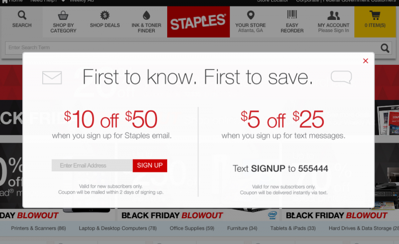
One of the first things you’ll see on their website is a pop-up form asking for your email address and offering a $10 to $50 discount if you sign up. They even go so far as to ask you to sign up for a text messaging option.
Same goes for Lowe’s.

Lowe’s is offering a $10 discount in exchange for a lead. That’s how valuable leads are!
Pop-ups are so effective because they are a part of a persuasion technique called “pattern interrupt.”
When browsing through your shop, users will quickly get used to the flow and will lull into the rhythm becoming desensitized to great deals that you offer. To get their full attention once again, interrupt the pattern with a sudden pop-up form.
For best results, your pop-up should try to solve a specific problem they’re having. If the products are too expensive, then a 10-25% discount, in exchange for lead information, is surely going to do the trick.
You can use this plugin to easily add pop-up forms to your WooCommerce site.
For something more sophisticated, you can use the Optin Monster plugin, but it’s a costlier solution.
17. Remind users of their abandoned carts via email
As mentioned in the previous section, a great way to recover abandoned carts is by using email marketing.
That’s one of the reasons you needed to capture leads from your visitors.
Once you have their email addresses, you can send them targeted emails reminding them that their cart is full and still waiting.
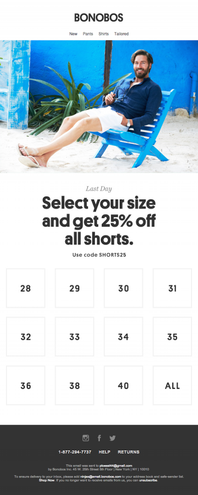
But you don’t have to limit your emails to just reminders, engage your current customers to shop again.
Like Bonobos, make it easy for your customers to find exactly what they want based on their interactions with your site content (you can do this with email autoresponders).
For a guide about best performing cart recovery emails, you can refer to this article by BackToCart.
If you don’t want to dive too deep into email remarketing, a simple solution you can use is another Yith plugin to recover abandoned carts. It offers you the ability to send coupons and customized emails to make those users come back and finish the checkout process.
But for a more complex recovery process, you can set up automation using email autoresponders like Active Campaign or Drip.
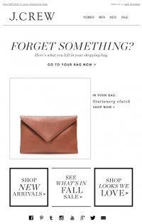
18. Retarget lost shoppers with Facebook and Google ads
Have you ever noticed that after you visit an online store and leave it, soon you see ads all over the internet promoting the exact products that you were browsing? This is retargeting.
And it’s such a clever and effective way of recovering lost sales. Essentially, you’ll see ads related to the products you were just looking at a moment ago.
And it’s effective because you’re still a hot lead – you’re still very much interested in these products, you just need a reminder to get you back into the buying process.
For example, I was browsing on JCrew for some clothes but hadn’t bought anything. When I visited my Instagram (a part of Facebook’s advertising platform) feed, I saw a sponsored post (ad) by JCrew to remind me to get those pants I was looking at in the previous example.

Similar to this, after browsing Zappos, I encountered retargeting ads on many websites I visited, promoting shoes I looked at on Zappos.
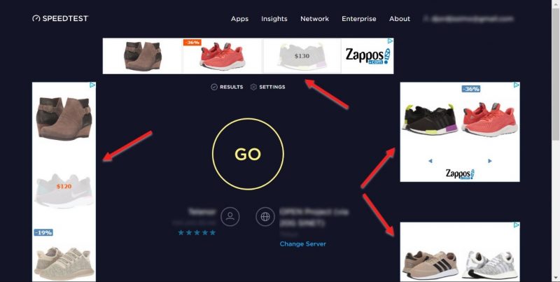
This amazing functionality is enabled by small tracking codes installed on your site (cookies), such as Facebook Pixel and Google Ads Conversion Tracking.
Once you have them installed on your e-commerce store, they’ll keep track of all the visitors and their interactions with your site. So, when they leave, you can target them with specific ads relevant to their latest visits.
Targeting hot leads with relevant ads is a great way to recover lost carts and boost conversions and sales for your e-shop.
You can learn everything about how to turn shoppers into paying customers with our retargeting ads guide.
Bonus: Upsell– make more money from each sale
Did you know that Amazon makes 35% of its revenue from cross-sells and up-sells?
Such a profitable tactic that you can’t stand to overlook.
Upselling is a marketing tactic that persuades shoppers to spend more money than they originally planned, thus making their sales more profitable.
For your e-commerce, this means persuading people to buy:
- More expensive items
- Upgrades
- Add-ons
It’s different from cross-selling, which is focused on getting people to buy other (complimentary) items along with the original product.
In McDonald’s world, a cross-sell would be when the clerk asks you, “do you want fries with that,” and an upsell would be “do you want to super-size that.”
But lines are blurry between the two, so don’t stress yourself too much over the terminology. Instead, let’s get into the meat of it. Let me show you what others do, and what you can use on your site.
Dollar Shave Club is a great example of a product upgrade type of upselling. The name of the company is a mind trick in itself, luring people into visiting their website to get shaving equipment for a single dollar.
Then they show you a page like this, that one-dollar razor compared with two pricier options that provide a lot more value than the standard dollar option (which actually costs more despite the catchy name).
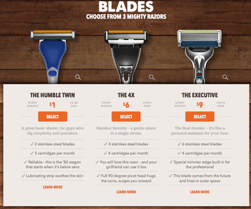
The whole purpose of their product page is to get you to buy the more expensive products instead of the entry-level package.
If you have ever shopped for electronics, then you’ve probably seen a product page like this.
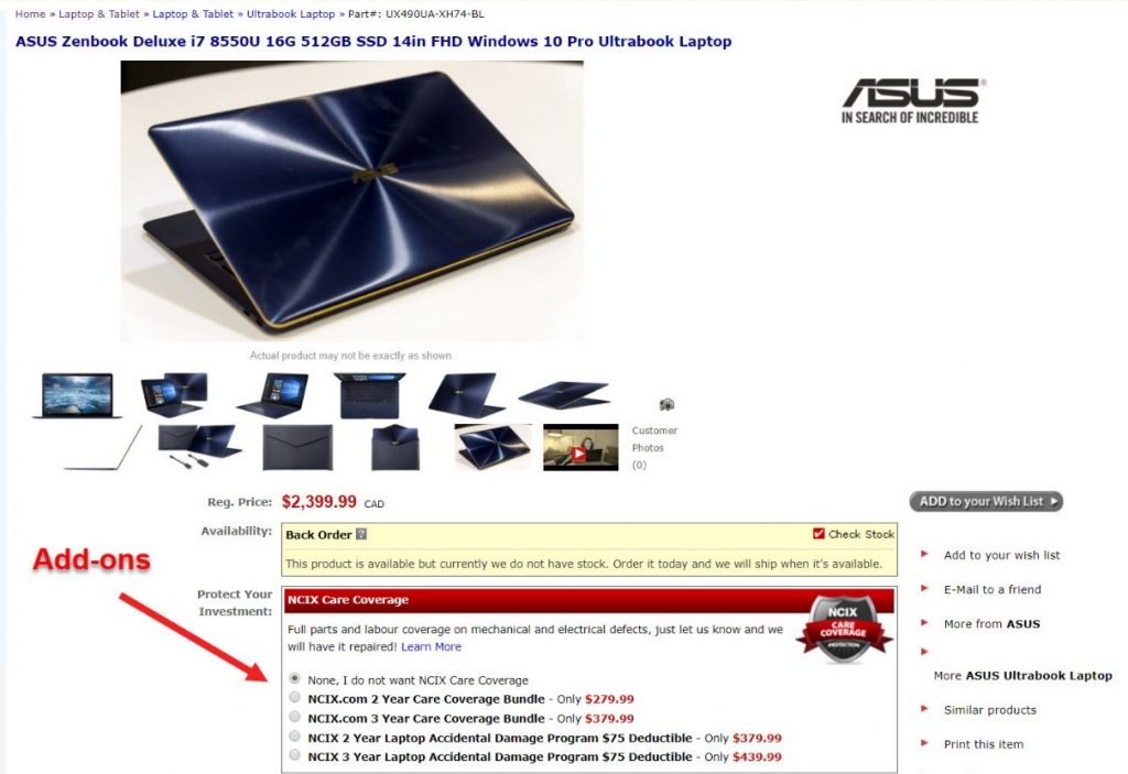
You’re getting a premium laptop, so it makes sense to protect your expensive investment.
E-commerce sites appeal to this by offering care coverage to give users peace of mind. At the same time, retailers make their sales bigger and more profitable.
During checkout at Nordstrom, you can choose to add a free gift message or upgrade to a gift box for $5 or a gift kit for $2.

There are so many forms of upsells you can add to enrich your offerings and bring more value to your customers. So, figure out what would best work for your site.
The main reason why I put up-selling in a section of its own is that it can be used in all of the different stages of your customer journey.
You can add upsells:
- On your homepage and category pages
- On your product page
- During checkout
- After checkout
- Even in abandoned cart emails
But it’s not always possible to use this tactic. It’s not suitable for all products. Make sure to do your research first and test your campaigns (A/B testing).
To add recommended products to your WooCommerce site, use this recommendation engine.
For checkout add-ons, you can use the following extension.
Conclusion
If you’re taking your e-commerce business seriously and want to see it thrive, then these mighty and proven tactics are what you should be utilizing.
Whole teams of marketing experts and tons of research are behind these strategies. And you can replicate them for free. How cool is that?!
And best of all, you don’t need to hire developers to ‘custom code’ these features for you. All you have to do is buy the plugins, install them on your site, and watch as your revenue soars!
Don’t forget to look at your products, your customers, and your Google Analytics to get a better sense of which of these tactics would work best for you.
And let us know in the comments which of these techniques are new to you, and which ones you are going to use for your e-shop.
[do_widget id=custom_html-25][/fusion_text][/fusion_builder_column][/fusion_builder_row][/fusion_builder_container]