[fusion_builder_container hundred_percent=”no” hundred_percent_height=”no” hundred_percent_height_scroll=”no” hundred_percent_height_center_content=”yes” equal_height_columns=”no” menu_anchor=”” hide_on_mobile=”small-visibility,medium-visibility,large-visibility” class=”post-link-tag” id=”” background_color=”” background_image=”” background_position=”center center” background_repeat=”no-repeat” fade=”no” background_parallax=”none” enable_mobile=”no” parallax_speed=”0.3″ video_mp4=”” video_webm=”” video_ogv=”” video_url=”” video_aspect_ratio=”16:9″ video_loop=”yes” video_mute=”yes” video_preview_image=”” border_size=”” border_color=”” border_style=”solid” margin_top=”” margin_bottom=”” padding_top=”” padding_right=”” padding_bottom=”” padding_left=””][fusion_builder_row][fusion_builder_column type=”1_1″ layout=”1_1″ spacing=”yes” center_content=”no” link=”” target=”_self” min_height=”” hide_on_mobile=”small-visibility,medium-visibility,large-visibility” class=”” id=”” background_color=”” background_image=”” background_position=”left top” undefined=”” background_repeat=”no-repeat” hover_type=”none” border_size=”0″ border_color=”” border_style=”solid” border_position=”all” padding_top=”” padding_right=”” padding_bottom=”” padding_left=”” margin_top=”” margin_bottom=”” animation_type=”” animation_direction=”left” animation_speed=”0.3″ animation_offset=”” last=”no”][fusion_text columns=”” column_min_width=”” column_spacing=”” rule_style=”default” rule_size=”” rule_color=”” class=”” id=””]Dedicated landing pages are a must-have if you want to maximize the leads and customers coming from your SEO and PPC campaigns.
Unfortunately, you can never know how the landing page is going to perform until it’s live and you start driving real, targeted traffic.
But you can always test and optimize your landing pages. ?
If you’re stuck with subpar performance, you must experiment to figure out which element to swap to drive more conversion.
And very often just switching your landing page headline, lead form or CTA can result in a 3X (or higher) increase in conversion rates.
Now, I know that brainstorming good landing page test ideas can be pretty overwhelming.
That’s why I compiled the most complete list with 51 landing page experiments to try, so you’ll never run out of testing ideas.
To help you stay organized, the list is broken into test subjects based on the 8 critical elements that make up a strong landing page structure.
- Unique selling proposition
- Landing page offer
- Imagery
- Call to action
- Lead capture form
- Landing page content
- Social proof
- Layout & design
Table of Contents
Test Subject #1: Unique selling proposition (USP)
Your unique selling prop is the heart of your landing page. Think of your USP as how you position your offering as different and better from all the rest.
Landing pages need to communicate your unique selling proposition in a clear and catchy way. So your visitors immediately understand what makes your product or service the best in the market.
When testing your landing page USP you’ll want to find the message that resonates with your target users and results in the highest conversion rates.
It’s important to get this right before progressing to other landing page optimizations.
Even though your USP should permeate throughout the entire landing page, there are 5 main parts to focus on when running tests.
1. Swap out your headlines
There are many approaches you can try when testing your landing page headlines.
Headlines are one of the most important parts to test.
The USP in the headline will dictate your entire landing page copy. It plays a huge role in persuading your audience to take action.
Headlines are typically one of the first things users notice (along with your hero image). It’s a decisive factor that determines if the users move on or go on and engage with your landing page.
Here are the main ideas for your headline testing:
- Headline length
- Positive vs negative sentiment
- Target different emotions (joy, hope, fear, surprise, etc.)
- Test including statistics and numbers in your headline
- Test asking a question vs making a statement
- First person vs second person vs third person (I, you, we)
- Experiment with testimonials in your headline
- Monetary vs percentage discount, etc.
For example, you can test which headline is more appealing to your specific audience:
- Save $200 on your first order
- Get 40% off when you order today
Both promote the same deal however each headline is framed in a different way.
Testing will determine which type is more attractive and gets you more conversions.
2. Try different subheadings
Subheadings live below your landing page headline. Their role is to support the main idea.
It’s sort of like a one-two punch; the headline grabs users’ attention and the subhead tells exactly what to expect from the offer.
Figma uses a very catchy headline, the sort of thing that sticks in someone’s head.
However, unfamiliar prospects may not get it right away.
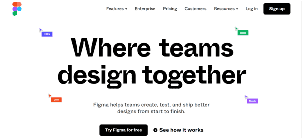
That’s why the subheading is there to clarify the offer.
Subheads mean that you can get as creative as you like with your headlines, knowing that the subheadings will make everything clear.
That’s why subheadings are a prime testing target.
Experiment with different versions of your subheadings to try and explain with more clarity, helping everyone understand the benefits and increasing your conversions.
3. Test various selling points
Different selling points will appeal to different prospects. You can frame your USP in many different ways to try and convert more of those prospects into leads and sales.
Test out various selling points to find the optimal, highest-converting landing page variant.
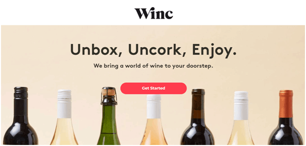
Here’s a test example from a meal delivery service:
- Fresh healthy meals delivered to your door
- Lose 10 pounds in 30 days
Both headlines promote the same product but focus on a different selling point.
The first one focuses on the convenience of getting fresh, healthy food delivered to your door, while the other one promises direct and specific weight loss results.
InVision ran a similar test with their landing pages.
The first variant focuses on the power of the tool in the headline with more specifics in the subhead…
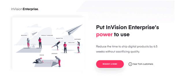
…while the second variant engages prospects with a specific promise of a 60% faster design launch, straight in the headline.
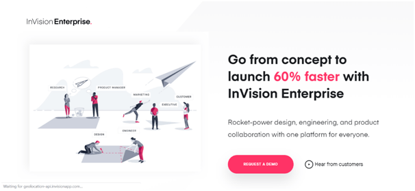
Split tests like this will help you determine the winning USP that maximizes conversions.
4. Play around with messaging
Another experiment to try is to test different ways of getting your message across.
Your landing page copy should clearly communicate the benefits of your offer.
But there are many ways you can deliver this message, so you need to test which one drives the highest conversion rates.
Remember that people always buy for emotional reasons, then justify their purchase with logic.
The key is to highlight the emotional response a customer will get by using your product or service.
As the saying goes – “sell the sizzle, not the steak.”
Putting a cause behind your offer is a great way to get your message across and appeal to things your prospects may care about.
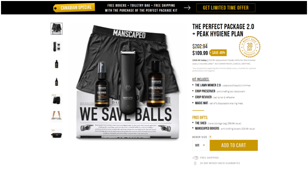
Manscaped, a company selling body trimmers for men, focus one of their landing page variants on their partnership with the Testicular Cancer Society.

Even though the landing page is still designed to make a sale, it does so by appealing to something men care about.
Brainstorm a few different variations of what potential customers care about and test your landing page messaging.
In this case, you’re most likely going to create two entirely different versions of your landing page and pit them against each other until you find a winner.
5. Try 100% message matching (keyword insertion)
Message matching is very useful for PPC campaigns, where the landing page copy 100% matches the promise made in the ad.
Test message matching between your ads and landing pages to see if it results in higher conversions and even lower advertising costs.
The idea is that the ad copy that resulted in a click already got the user primed and ready for what’s in store. When they see consistent messaging on your landing page, they’re more likely to convert.
Not only that, but this also makes the landing page more relevant in the eyes of Google and Facebook, so you’ll be awarded a lower cost per click.
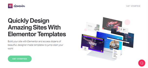
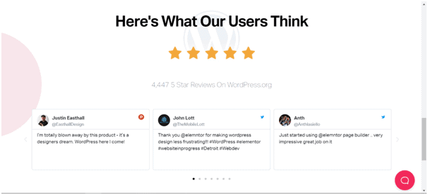
Elementor uses the exact same text in their Facebook ad…
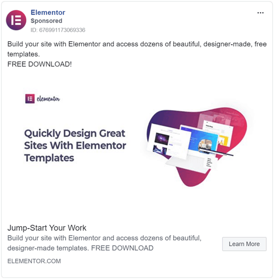
…as on their landing page headline.
Experiment with message matching on your landing page to see if it drives better performance.
Similar to dynamically inserting keywords, you can also test dynamically inserting images based on URL parameters. DynaPictures allows you to generate dynamic images from image templates by directly linking to them from your pages.
Test Subject #2: Landing page offer
Your landing page offer is what you use to generate leads and sales. It’s what you offer in exchange for users’ lead information or their hard-earned cash.
The success of your landing page rides on how irresistible your offer is, which is why you want to test different offers as well as how you frame them.
When it comes to testing your landing page offer, the following are the key approaches to take.
6. Experiment with different offers
The offer is what brings prospects to your landing page and compels them to become leads or customers.
But your offerings don’t have to be static; you can test and optimize the landing page offer itself.
When it comes to lead magnets, perhaps one topic will resonate better than another.
Also, you may test different formats and discover that perhaps checklists outperform e-books.
In the case of e-commerce, you might even try testing out different price points to see how much your audience is willing to spend.
When running ads on Google, Facebook or LinkedIn, remember to always align the landing page offer with the specific stage of the buyer’s journey.
If you’re offering a free consultation, but the temperature of your prospects is still a bit cold, meaning they’re still in the early stages of your funnel, you should consider giving away a free report before asking users to schedule a call.
An optimal combination of targeting and landing page offer will result in more leads and maximize your conversion rate.
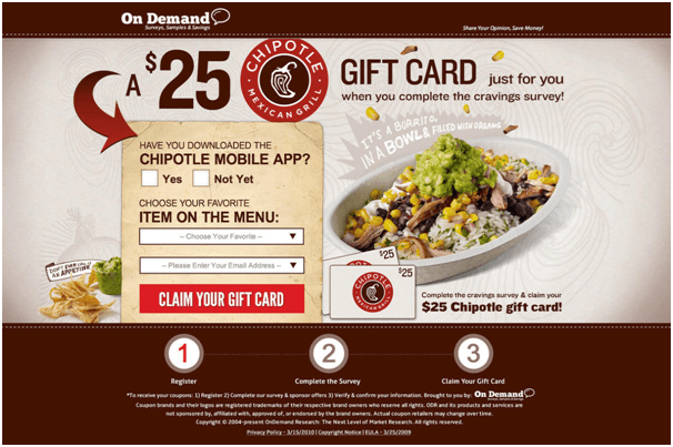
7. Try out different incentives
Very often you’ll need to back up your landing page offer with some incentives. These will make it irresistible and can significantly boost your conversion rate.
You can test out various incentives to figure out what drives the best performance. Some ideas include:
- Free shipping
- Fast shipping
- Free gift with a purchase
- No setup fees
- No long-term contract, cancel any time
- Money-back guarantee
- A discounted price
- Two for the price of one, etc.

In the case of free lead magnets, you can also test subtle cues that increase the perceived value of your offer.
For example, you can test including slashed prices to make your offer more attractive. Especially if you’re giving it up for free.

8. Test including upsells and cross-sells
Run experiments to see if your landing page can increase the revenue and profits with upsells and cross-sells.
Most of the conversion optimization specialists focus on testing only the main offer. However, landing pages provide plenty of opportunities to upsell and cross-sell to boost your AOV.
If you already have a persuasive landing page that drives conversions like a beast, try including some more expensive items or related products to increase profit from each conversion.
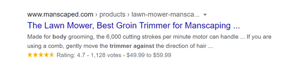
You can even test product bundles, like Manscaped and turn what could have been a $75 into a $110 sale.
Here are some awesome test ideas to consider:
- Try suggesting related products before the purchase
- Suggest addons
- Offer other products that complement the customer’s needs
- Try to upsell with more expensive items
- Offer product bundles
- Test upselling on the Thank You page
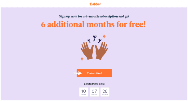
9. Test out various FOMO triggers
Tap into people’s fear of missing out (FOMO) and create a sense of urgency on your landing page.
Experiment including different FOMO triggers to see how people react.
Figure out which of these drive immediate action and make users convert on your landing page.
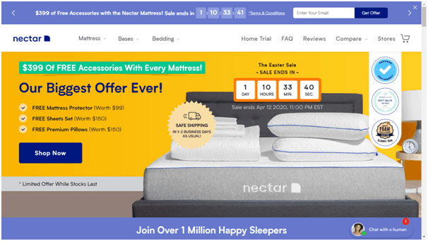
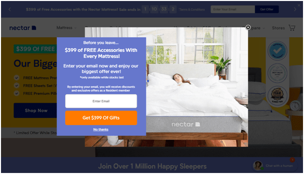
One of Nectar’s landing pages includes a very prominent countdown timer. And it appears twice, in the top bar and on the HERO section.
It drives home that sense of urgency making it seem like a once in a lifetime offer.
You can test various different FOMO triggers to create a sense of urgency and drive conversions:
- Countdown timers
- Limited-time offer tags
- While supplies last
- Only XX left, etc.
Test Subject #3: Imagery
Images, videos, graphics and icons can make a massive difference in your landing page conversions.
The imagery on your landing page works to grab attention and immerse the prospect on a deeper level. It’s supposed to provide context and clearly communicate your offer.
After all, an image can say a thousand words.
And keeping in mind today’s declining attention span, imagery can captivate users the way no word can.
What works will largely depend on your audience, industry and offer, among other things. That’s why testing different visuals is a key part of landing page conversion optimization.
So, when it comes to visuals on your landing page there are quite a few tests you can run. From changing the hero image, trying out different combinations of position and size, all the way to experimenting with various visual formats.
10. Hero image
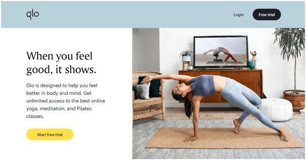
The hero image is the main photo or image that appears above the fold.
Ideally, it should show your product or service being used in a real-life context. The ultimate goal of your hero shot is to be relatable so potential buyers can see themselves either using the product or experiencing its results (benefits).
The hero image is supposed to embed itself in the prospects’ minds on a subconscious level and influence their desire for your offering.
But how do you know what hero shot will convert the best?
Testing different images for the hero section will help you pick the winner that results in the highest conversion rates.
The hero of your landing page can either be your prospect or your product.
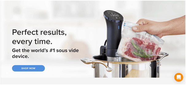
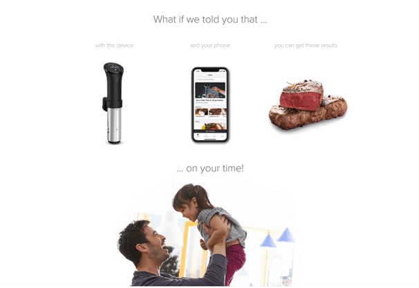
Anova Culinary features a closeup of their cooking device in action, helping potential customers get a feel of how it’s used.
On the other hand, for some industries, it can also be an illustration or a vector graphic.
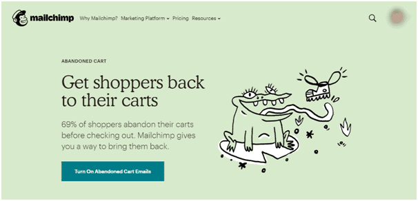
MailChimp’s landing page is a fine example of how to use a fun and engaging graphic to illustrate recovering abandoned carts with email remarketing.
There’s no rule set in stone as to what kind of hero image to use, that’s why testing and experimenting with different versions will help you pick out the top converter.
Some ideas for testing your hero image:
- People vs product
- Illustration vs photo
But also test variations of each one:
- Product closeup
- A smiling couple using the product
- A happy person
- Abstract vs specific, etc.
PRO TIP: One thing to keep in mind, though, always make sure your hero image matches the headline.
11. Split test image vs video
What if you forgo the image entirely in favour of a video?!
You can split-test if using a video in your hero section actually helps users get a better feel of your offer and makes them convert on a higher rate.
If the image says a thousand words, then a video can say 60,000 words…per second (60 frames/second x 1000 words lol).
Landing page videos are perfect for demonstrating the benefits of whatever product or service you’re marketing in a concise, entertaining and informative way.
Test including a video vs an image in your landing page hero section.
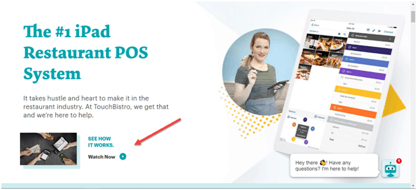
You can even experiment with using both a video and an image, like TouchBistro here.
Be sure to test out different versions of your video. For example, you can experiment with explainer video vs success story.
On the other hand, you can also play around with various video formats to include animations, real people or something else.
Finally, you can test what converts better, an embedded video player or an autoplay video in the background.
12. Try various image position
It might not seem like much but changing your hero image position can make an impact on your conversion rates as well.
Placing your image in the right position will create an optimal visual flow that guides users’ eyes in the right direction.
Experiment with different positions, for example, if the image is on the righthand side or maybe in the background.
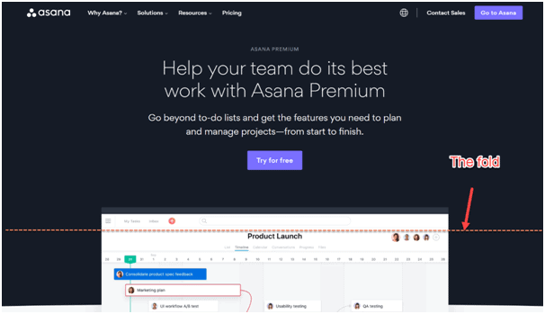
Another way to try is placing a hero image below the fold of your landing page, like Asana.
You can also test having an image vs not having an image at all.
13. Play around with image size
Various image sizes can also influence the visual hierarchy of your landing page.
A larger image may grab more attention, while a smaller one could put more emphasis on the headline and the offer.
Test various image sizes to find the winning combination that results in the highest conversion performance.
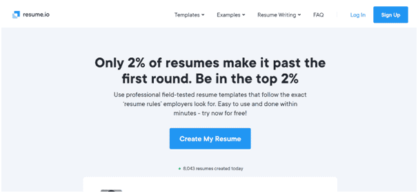
14. Test different icons
Icons on your landing page can help prospects grasp and visualize the benefits of your offer. They can also spruce up your design and provide a much better user experience.
Plus, they can help reduce long text and organize the landing page copy in an engaging way.
Resume.io uses icons do help emphasize the tool’s main features and makes the landing page easily scannable by users’ eyes.
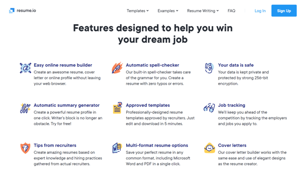
Experiment with including icons on your landing page to organize different callouts, benefits and features.
Also, test different versions of your icons to see which ones result in more leads and sales.
15. Try out different product pictures
Your hero section shouldn’t be the only part that deserves testing. Other sections also play a significant role in persuading users to opt-in for what your landing page offers.
If you’re promoting products, look around your landing page and find some areas where a product image would make sense.
Test out different versions of your product images:
- Products from different angles
- Closeups
- Different backgrounds
- Images depicting features and benefits
- Highlight different parts of your product
- Images that feature addons and accessories, etc.
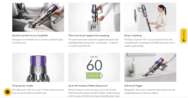
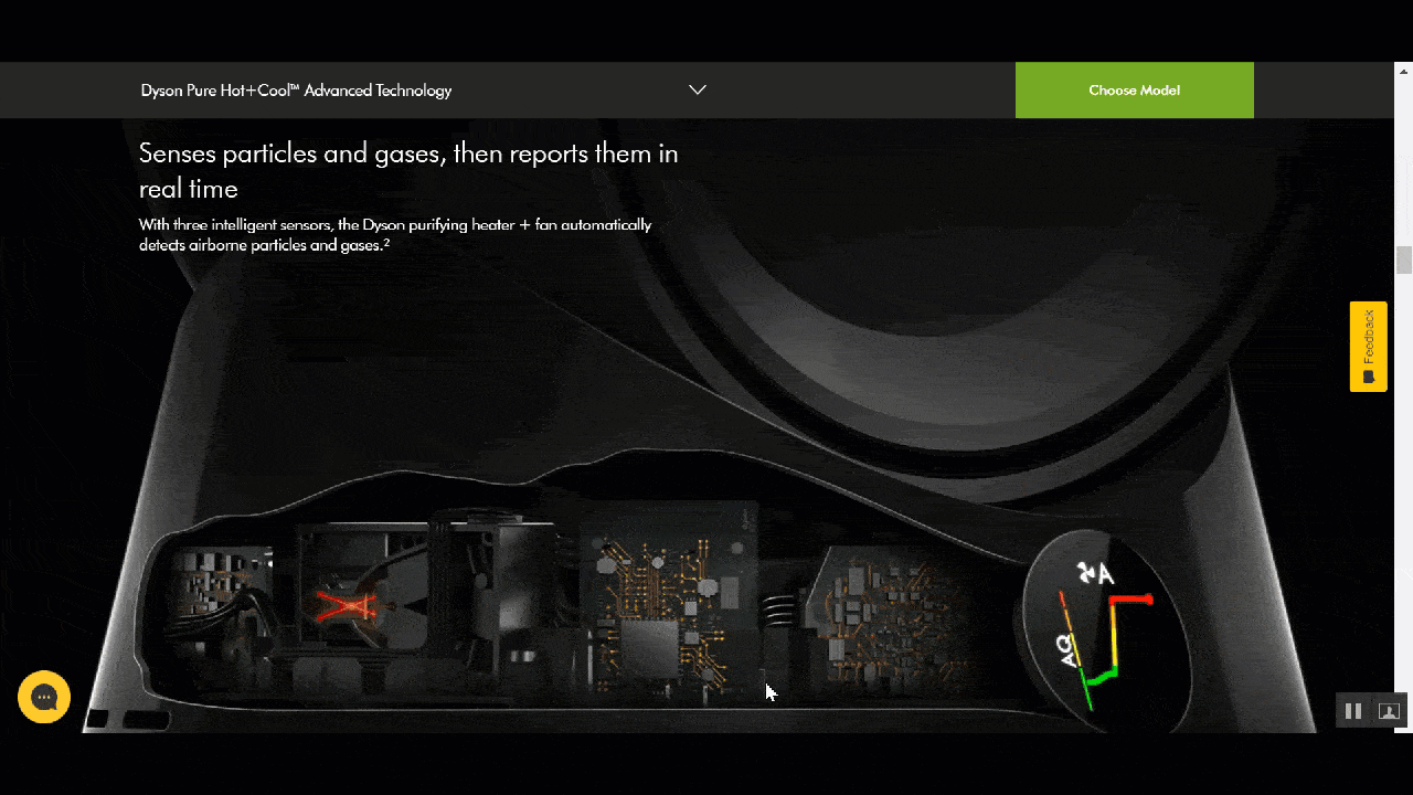
Dyson uses product imagery on the landing page to highlight the key features of the Cyclone vacuum cleaner.
16. Test adding products in action
Products in action create an emotional connection with your landing page visitors. They help prospects visualize what it’s like to be using your products.
Showing a product in use or connecting a product with a major benefit can prove to be a tipping point that leads to more landing page conversions.
This tactic makes it super simple to show off your value prop without using copy and long lines of text to explain it to your prospects.
And products in action can be used anywhere on your landing page, not just the hero section.
Try different versions of your products in action and find the best combination that resonates with your audience.
17. Test adding product demo animations or GIFs
Any content on the landing page that explains how the product/service works helps inform prospects and encourages them to convert.
Using animations or GIFs in your landing pages is a true example of “show, don’t tell” tactic which works much better at grabbing attention and proving your offer’s value.
You can test including animations that depict a common problem your product is solving.
In the case of Smart Nora, the landing page provides a cool animation of how snoring actually works, connecting it with how the product solves the snoring problem.

Or you can use GIFs and animations to highlight the core benefit of using your product.
Other tests to try are using animations to demonstrate the entire product, some use cases or even how a proprietary technology works.
Test various animations or GIFs on your landing pages to measure how they impact your conversion rate.
Test Subject #4: Call to action (CTA)
The ultimate goal of your landing page is to drive action, whether it’s to download an e-book, schedule a consultation, start a free trial or complete a purchase.
To compel prospects to take that desired action you need a strong CTA.
It needs to stand out, be clear, straightforward and attract clicks.
Since CTAs are what drives action directly, it’s also one of the most popular things to test on a landing page. In fact, 30% of all landing page tests involve a call to action.
And there are a ton of tests to ensure your landing page CTAs are attracting the most clicks and conversions.
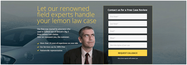
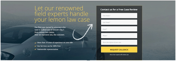
18. Switch up your CTA colour
Testing different colours for your landing page CTA is one of the oldest optimization tricks in the book.
A CTA button should ideally stand out, with a lot of contrast between it and the rest of the landing page.
For some time green, red and orange were considered to be optimal for CTA buttons, largely because they are easily noticeable against the typical white background.

However, you should also consider the psychological associations of colour. For instance, red can mean dominance and energy, but it can also mean danger.
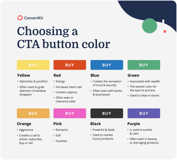
Depending on your landing page even white CTA buttons can actually make a lot of sense.
Try out various different colours and run A/B tests on your landing page to determine which one gets you the most clicks.
19. Try different versions of your CTA text
Having the right text in your call to action can make a big difference in your landing page clicks and conversions.
Experiment with different versions of your CTA text to find the winning combination.
You can test various different direct calls to action like:
- Learn more
- Schedule now
- Get free demo
- Download now
- Buy now
- Upgrade
- Register
- Start a free trial
- Get started, etc.
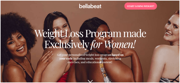
Another experiment to try is to be a bit more creative with your CTA text. For example, you can make benefit-oriented calls to action like:
- Start saving today
- I want to improve my career
- Sleep better tonight
- Start losing weight!
This last one is actually used by Bellabeat in one of their landing pages.
Be sure to match your call to action with the offer and the buyer’s journey stage.
20. Test CTA size
Colour and text are two of the main elements of your landing page CTA. But there’s also the size.
You can experiment with CTAs of different sizes and even shapes to figure out which one maximizes your button clicks and conversions.
On the extreme side, you can even try if having no real CTA button actually helps increase clicks. Split testing can determine if replacing buttons with links increases conversions.
21. Place CTA in a different position
Your CTA position can also influence the effectiveness of your landing page. Some placements can lead to thousands of clicks, while others not so much.
The rule of thumb to always keep in mind is that you should make your CTA button as convenient and easily accessible as possible.
Play around with various CTA button positions to determine which one leads to the highest click-throughs and conversions.
For example, you can test if a CTA button below the headline and subhead gets more clicks than the one placed on the opposite side of your text.
Should the CTA button be centred or placed on the side? Or should you only place a CTA button in the top right corner?!
You can run split-tests with each of these ideas to figure out what converts the best.
Another idea to test is having a sticky CTA button that follows the user as they scroll your landing page.
The convenience of a sticky (aka floating) call to action button can help avoid losing conversion just because a user was too lazy to scroll up and look for the button.
You can also experiment with having a CTA in multiple positions on your landing page. Which leads to the next test idea.
22. Test repeating CTAs throughout the page
Experiment with having multiple CTAs on your landing page, even if they are the same.
This can be extremely beneficial for medium or long-form landing pages. You want to make it as easy and convenient for the user to find the CTA button and convert.
Resume.io repeats the “Create My Resume” call to action multiple times. In the hero section…
…further down in the middle of the page…
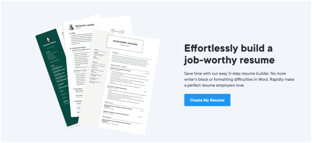
…and at the bottom of the landing page.

Test if repeating your CTA throughout the landing page actually helps get more conversions.
Also, test how many times it makes sense to repeat the CTA to drive people to take action.
23. Test adding a call option
Some users prefer making a call instead of filling out a landing page form or clicking through multiple buttons. In fact, Google’s study shows that 40% of mobile searchers use the click-to-call option.
Test if providing a call option on your landing page results in higher conversions.
You can even split-test variations of your call options; it can be a button or just a simple number.
Having a call option can tremendously increase conversions for local businesses or businesses that drive a majority of traffic through mobile devices.
Test out how the call option impacts your landing page conversions and which option performs best.
24. Experiment with having multiple CTAs
Sometimes you can go beyond just adding the call option. You can test-drive having multiple different CTAs on your landing page.
This may sound counterintuitive, as everyone preaches (including us) to only have one single call to action on each landing page.
While the arguments in favour of a single CTA are undeniable, in some cases having more than one option can significantly boost your landing page conversions.
Test out if including more than one call to action actually drives more conversions and if those conversions result in more sales.
Prezi, a PowerPoint competitor, provides plenty of CTA options.
Starting with the HERO section, there are already three CTAs:
- Get started
- See how it works
- See the science behind Prezi
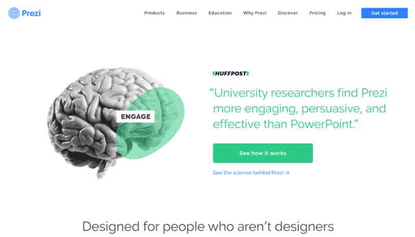
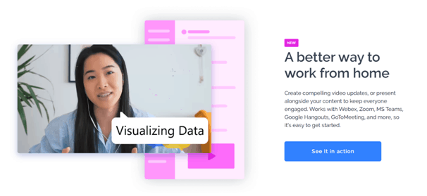
Deeper into the page, there’s another CTA inviting you to view the product in action…
…and finally, two more CTAs focusing on the science behind what makes the tool so awesome.
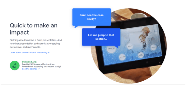
Figure out what options you want to provide, place those CTAs around your page and test if it actually drives better performance and more sales.
Test Subject #5: Lead capture form
Your lead generation form is another element that directly impacts your conversion rates.
The forms can make or break your landing page.
However, there’s no “one size fits all” when it comes to landing page forms. You need to test and find what works for you.
If not properly optimized for your specific business, audience and even your offer, not many people will convert.
There are so many different options for testing forms, and even small changes can result in a big lift in conversion rate.
Here are the best test ideas for your landing page forms.
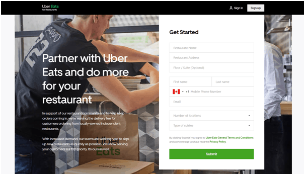
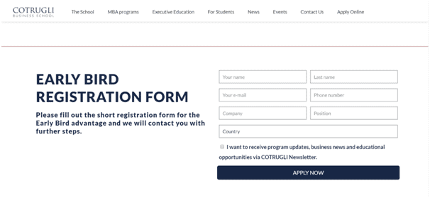
25. Test the number of form fields
The rule of thumb: only ask for necessary information in your landing page forms. When it comes to lead generation forms, less is more.
Asking too many questions can scare off the prospect and plummet your conversion rate. This kind of friction can seriously damage your ability to generate leads.
Depending on your business, you might need more than just a first name and an email.
So, whenever possible, you should test having fewer required fields. Trim down any unessential data to see if that helps increase conversions.
There’s just one caveat, the quality of leads can drop when the form is too easy to fill out.
If you need more data for qualifying leads or your CRM, try running a test with multiple variations of your form at different lengths.
Another way to mitigate this type of friction is by splitting your landing page form, which we’ll talk about next.
26. Single vs multi-step forms
When you want to maintain a high quality of leads while increasing your conversion rate at the same time, experiment with multi-step forms.
Multi-step forms work by splitting your long list of questions into two or more steps, making it much less intimidating and easier to fill out.
It’s similar to a scientifically proven persuasion method called the “Yes Ladder.”
You start by asking simple questions and work your way up to bigger asks, like the users’ contact information.
Once they already said YES to those initial questions, it’s much more likely they’ll go through and convert completely.
Much like our multi-step checkout flows for e-commerce, they too can tremendously increase conversion rate.
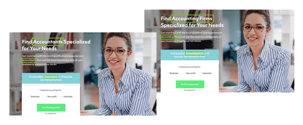
You can see a clear example of this on the GoodAccountants website.
The first step is used to qualify the potential lead by asking questions about why they need an accountant…

…and on the second step, the users are asked to fill out the contact details.

This makes the form much less threatening and helps gather more information on the lead.
You should also test how switching the steps impacts conversions. Perhaps ask for email first and then the rest.
Also, if your tests confirm that multi-step forms convert better, you should also experiment to see how many steps are optimal. Do two steps outperform three, or vice versa?!
Perform detailed experiments and keep a close eye on your metrics, as this type of testing can be critical to your landing page success.
27. Try various form positions
Besides the landing page form optimizations that include the number of fields and how they’re distributed, you can also experiment with various form placements.
A common test to perform is to split-test if the forms above the fold convert better than those below the fold.
Other ideas can include split-testing forms on the righthand side vs centred.
Also, try adding multiple forms, one above and one below the fold.
Optimize the lead form position to grab as many conversions as possible.
28. Play around with your form design
Lead capture form design should be fully optimized for conversions. That means it should be clear, inviting, simple to use and convenient.
When it comes to testing your landing page always start with the assumption that people are lazy. They want to do as little as possible to accomplish their goal. To collect more leads, you’ll want to provide as smooth of an experience as possible.
Experiment with various form design elements and layouts:
- Different design, colours and fonts
- Test different form copy
- Vertical vs horizontal layout
- Drop-downs vs radio buttons
- More whitespace vs less
- Generic form text vs benefit-oriented
- Hidden fields
- Form field arrangement
- Different form sizes
- Variations of field labels, etc.
Finally, you can test forms that open up in a popup as well as those that redirect to a new page.
Split test various different combinations of your form elements and layouts to find a perfect design that maximizes form submissions.
29. Test including exit-intent popups
What if someone doesn’t immediately convert on your landing page offer? Should you just let them go? Or perhaps give one last try with an exit-intent popup?!
Exit-intent popups can do wonders for your landing page conversion rate. Some studies show that as much as 10-15% of lost visitors can be ”recovered” by using exit-intent popups.
For situations when your landing page isn’t quite enough to make a user opt-in, exit popups provide one last chance to pitch and convert.
Be sure to test them out on your landing page and measure the impact.
The key idea is to provide a very valuable secondary offer in exchange for the user’s contact info. This can also be the same offer but framed in a different way.
For example, you might offer a percentage (%) discount on your landing page and if that doesn’t work, try the equally valued monetary ($$$) discount in your exit-intent popup.
Test various combinations of your exit-intent popups to see what drives the most conversions.
Test Subject #6: Landing page content
Landing page content works to support the main idea of your unique selling proposition and drive home the need for your offer.
Your landing page content can include various callouts, features, benefits, storytelling elements, etc.
The way to optimize is to figure out what to focus on and how to present your key information.
But which things to emphasize? What will resonate with your audience and bring the highest conversion rate?!
Well, the fact is you can never know exactly…until you test.
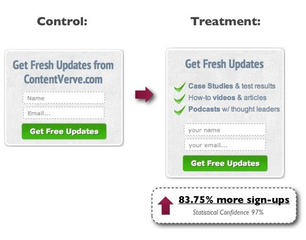
30. Try out different callouts
Callouts on a landing page can emphasize and bring attention to various key points that make your selling prop better than the rest.
It’s typically a set of purchasing benefits that support your USP and make it a compelling offer.
Which callouts you use, how you arrange them and where you place them are all terrific subjects for testing.
Biteable, a video creation tool, uses callouts on the bottom of the page to highlight what makes the product great: no creativity required, no learning curve and no worries.
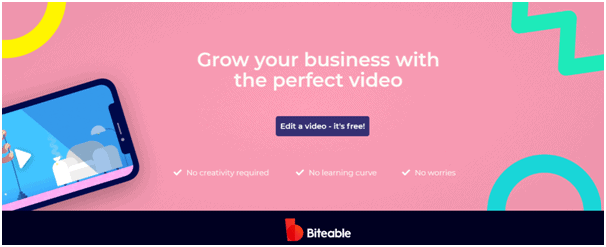
Basically, anyone can pick up Biteable and create a great business video without any knowledge of editing.
Pretty neat, huh?!
You can test out different variations of callouts to see which ones potentially maximize conversions on your landing page.
31. Find a perfect mix of features & benefits
Besides the headline, your landing page is going to need supporting copy to persuade people into opting for your offer. That’s where features and benefits play a key role.
A feature is a specific quality of your product or service, while a benefit describes a positive impact the feature delivers.
For example, a feature of a vacuum cleaner can be 2000W of power, cordless design or a telescopic extension wand. On the other hand, a benefit would be getting your home clean faster or keeping every nook and cranny perfectly clean no matter how far or high.
Test different combinations of features and benefits to find those that resonate the most with your target audience.
Also, experiment with different ways of presenting your features and benefits. Perhaps a mix of text and animations, like Asana.
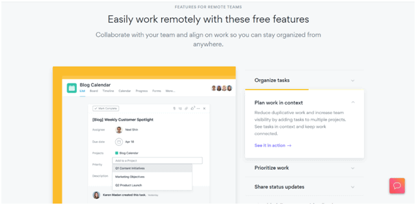
Images, icons and even animations provide more context and make it easy to see how the features tie into the benefits.
As far as testing ideas go, you can try:
- Different features
- Various benefits
- Using imagery vs just text
- Images vs icons vs animations
- Number of features and benefits
- Different positions on your landing page, etc.
32. Explore personalization
With personalization on your landing page, you go the extra mile to make your copy seem like it was written for each user specifically.
You can personalize your landing page copy for specific users based on the keywords they’re searching, location or even their name.
Of course, this doesn’t mean that you should write a different landing page for each person. Landing page builders like Unbounce, Instapage and Elementor provide dynamic keyword insertion which changes specific parts of your copy based on the search term, location, traffic source, etc.
Test and see if landing page personalization increases the chance of prospects converting.
Also, be sure to check which types of personalization make the biggest impact with another round of split testing.
33. Try integrating a chat option
Including a chat option on your landing page is another way of adding a personal touch and making your page more interactive and conversational.
Chat option unlocks a whole new world of possibilities to turn plane one-way landing pages into a highly engaging user experience.
Chatbots can answer various different questions from users. This helps guide them with an optimal information flow designed to drive conversions.
On the other hand, you can also experiment with live chat, where prospects can interact with a real person.
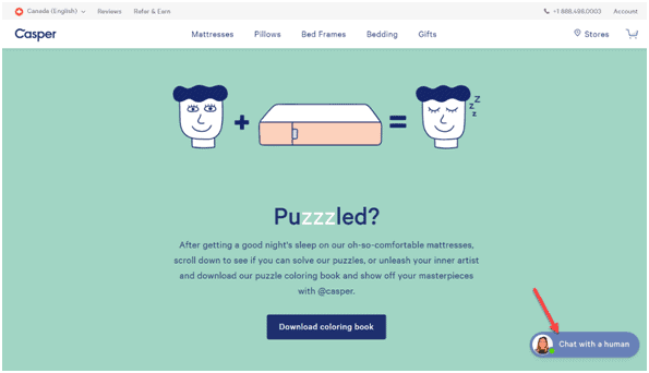
Chat option can reduce friction and give you a chance to clear up any objections, leading to potentially higher conversion rates.
Experiment with different chat options on your landing page:
- Chatbots vs live chat vs a combination of both
- Which questions to ask (chatbot)
- When to pass the conversation to a real person
- Tone of voice
- How you address each potential question
- How the bot prompts the user
- Design of the chat feature, etc.
Whatever you do, remember to always make the conversation human-like, even if it’s a programmed bot just answering questions.
34. Experiment with your tone of voice
Your tone and voice provide a glimpse into your brand’s personality, so use your copy to provoke the right emotions.
But which tone resonates the best? Humour? Seriousness? Empowering tone? Or something else…
Test different variations of your tone and language to see how that influences the way visitors react to your USP.
Make sure your landing page tone is engaging and sounds like a human. Find a voice that the prospects can relate to.
After all, you’ve probably never heard of someone boring a customer into buying.
MindValley uses empowering voice to help distressed people move on after a tough breakup.
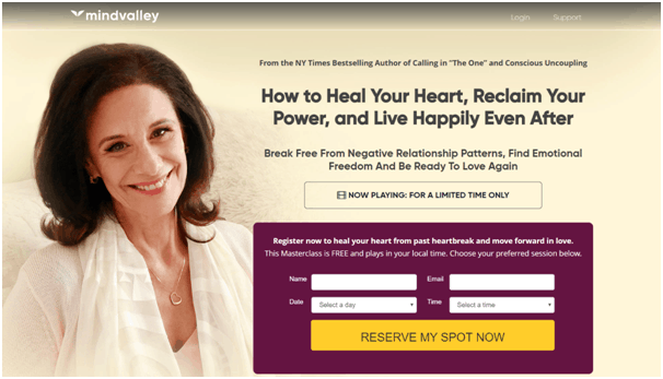
A tone like this sounds very personal and can truly resonate with someone going through a rough period.
With the right tone, users will relate to your brand and convert on your offer much easier.
Experiment with different variants to find the perfect tone for your landing page.
35. More text vs less (text vs images)
This is a very straightforward test to run; experiment with different ways of presenting your landing page copy.
You can run tests to figure out what converts best for your landing page:
- More vs less text
- Using text vs explaining with images
- Text vs videos, etc.
In some cases, a long textual copy can be what really hits the spot. On the other hand, people’s attention span is declining, and long text can quickly become boring.
Test what works best for your audience and if some text elements can be replaced with icons, graphics, screenshots or photos.
If you must use more text to get your message across, experiment with different formatting options. Include bullet points, headings, smaller paragraphs, checkmarks, etc., to make your landing page copy more readable.
36. Test adding storytelling elements
Storytelling is a strategy of engaging prospects on a deeper emotional level. It is supposed to help them identify with the story, recognize themselves and see the transformation your product/service helps achieve.
You can test to see how storytelling impacts your landing page visitors. Does your story trigger the right emotion?
You can test:
- Different stories
- Various story formatting
- Where on the landing page you position your story
- Which emotions you trigger, etc.
Experiment with storytelling on your landing page to see how it affects different emotions and if it leads to more conversions.
Test Subject #7: Social proof
One of the most persuasive tools in your landing page arsenal is social proof. It provides credibility and proves that your offer delivers on its promise.
Adding various social proof elements to your landing pages can help earn trust and increase the chances of prospects converting.
Of course, social proof needs to be believable and strategically placed on your landing page.
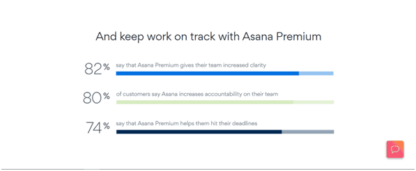
For instance, Asana includes survey statistics on the landing page to boast about the results it helps achieve.
So, you need to test and figure out how to optimize social proof to reach the highest conversion performance.
Test out the following tactics to infuse your landing page with trustworthiness and capture more leads and customers.
37. Test how rating stars impact your conversions
Product/service rating stars can also help build trust and entice users to convert on your landing pages.
If you already have a customer review system on your website, integrate that into your landing page.
Just make sure your score is 90% or above, or in terms of stars, 4.5 and higher.
You can even test if including comments from your internal review system drives more conversions.
An added benefit of an internal customer review system can be enhanced search results in Google. Having reviews and review schema markup on your pages can help with SEO.
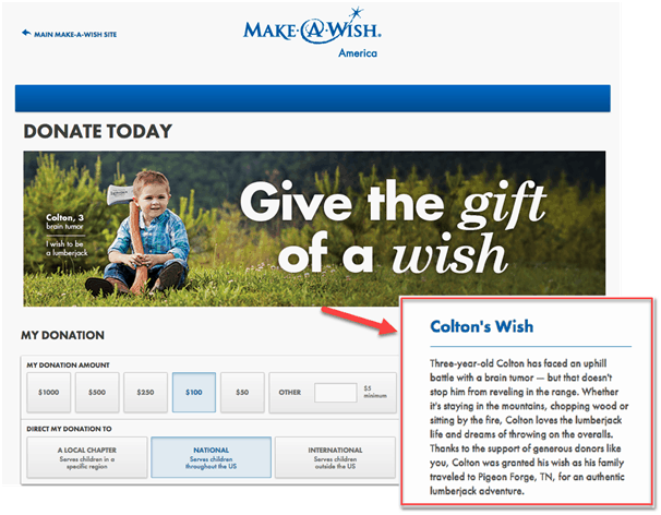
38. Explore various types of testimonials
One of the most effective types of social proof are testimonials. Look online for positive reviews or comments and include them on your landing page.
Make sure they sound like they came from a real person. Find testimonials that are specific and best describe the result of using your product or service.
Ideally, you should include a testimonial that emphasizes the value of your offer, preferably with measurable data.
Most effective testimonials are those the prospect can identify with. Test out different types and sources of testimonials to see which can increase conversions on your landing page.
Here are some testimonial ideas to test:
- Direct quotes from customers
- Case studies (or links to case studies)
- Video interviews or testimonials
- Celebrity endorsements
- Comments on social media, etc.
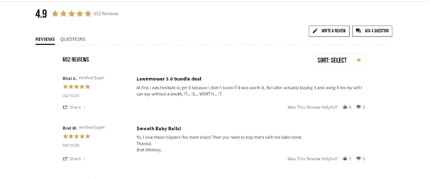
Here’s an example of including positive reviews from Twitter and ProductHunt on a landing page. It just makes all these testimonials feel genuine and honest.
Play around with different types and sources of testimonials to find the ones that resonate the most with your prospects.
Adding a photo and a name to your testimonial can make them feel even more genuine. Be sure to test how this impacts the trustworthiness and conversions.
Also, try out various positions for your landing page testimonials until you find a winning combination.
39. Experiment with reviews from other trusted sites
Another way of infusing your landing page with trust is by repurposing reviews and ratings from reliable sources such as Amazon, Yelp, Houzz, Trustpilot, Clutch, and others.
If you already collect reviews and manage your online reputation, why not brag about it on your landing page.
Test if adding reviews from trustworthy websites to your landing page helps bring in more leads and sales.
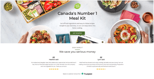
HelloFresh features reviews from Trustpilot to add that much more credibility to the landing page.
You can experiment including reviews from trusted sources as well as testing which review site delivers the best results in terms of conversions.
40. Test including a trusted logos section
Logos from other well-known brands that have used your product or service can act as a seal of approval. By including such logos on your landing page, you essentially tell your prospects; “see, all these brands love our product.”
With logos from trusted brands, you target a very subtle psychological moment where prospects start associating your business with these brands.
Experiment with including trusted logos on your landing page.
Consider your audience, who are you trying to reach with your landing page?! If you include logos of past customers, do you want to show big businesses, SMBs, end-users, or some mix of those?
You can also test different placements. For example, test which one works best, right below the fold vs logos at the bottom of the page.
Other things to test are with logos from different brands, the number of logos as well as how you design the entire section.
41. Include security and certification badges
If you’re asking for any sensitive information from your visitors, such as personal or payment info, adding security badges is another must-have.
So, test using different security badges to prove your landing page is safe.
This could be badges from VISA, MasterCard, PayPal, Norton Security, Google, etc.
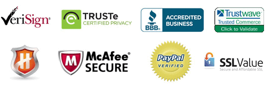
Certifications are another element to experiment with to add authority to your brand. These can be various licenses, certification from institutes or government agencies, partner programs, etc.
Mix and match different security and certification seals until you find a winning combination that results in more leads and sales.
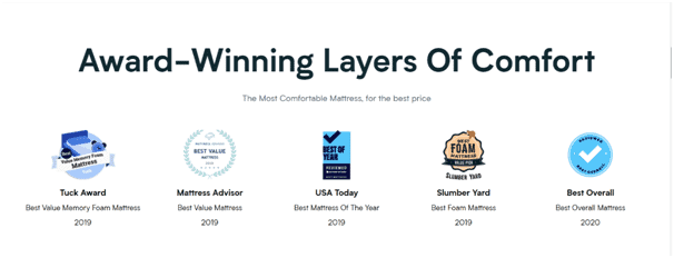
42. Test including awards and recognitions
Awards, accolades, recognitions and even brand mentions in news and popular blogs can add that much more flare and trust to your landing page.
Similar to other ideas from above, you can test which ones help boost your conversion rates.
43. Test real-time social proof tools
As you may have noticed, there are almost infinite ways you can add social proof to your landing page.
One more way to drive customers closer to conversion is to test streaks; it works by showing the total number of people who have recently taken action on your site.
The example below shows that 115 photographers recently visited the website.
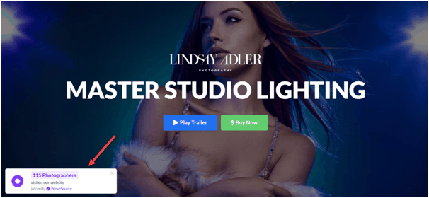
Tools like Proof show a live feed of real people who have recently taken action on your landing page.
The idea is that when prospects see a big number of real people opting in, they’ll also have more confidence increasing the likelihood of a conversion.
Test out this cool feature to see if it can increase your landing page conversion rate.
Test Subject #8: Layout & design
The design and layout of your landing page can steer the users’ eyes in the right direction to create a perfect flow of information.
An optimal layout will keep your landing page distraction-free, focusing the entire experience on the end-goal – conversion.
Play around with your web design and structure to find a perfect mix that delivers the best conversion results.
Besides the landing page structure, you can also test different colours and fonts, navigation, mobile usability and more.
44. Experiment with your landing page design and structure
Sometimes you may need to overhaul the design of your entire landing page. Perhaps you need to change the page structure, or you may want to create a completely new landing page from scratch.
Well, whenever you decide or plan to make changes to your landing page, make sure to test and see how that impacts your conversion rates.
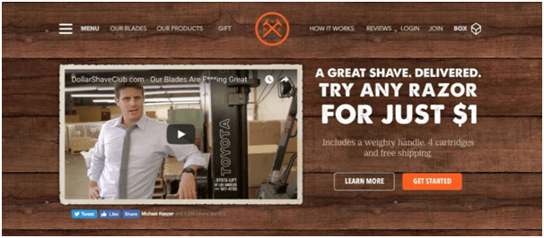
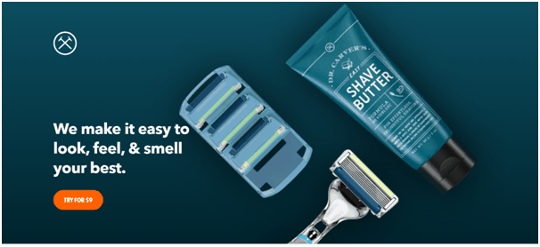
Dollar Shave Club revamped their entire branding which is reflected on their landing pages as well. It went from this, which was a bit cartoony but with a lot of personality…
…to this, which is more modern, minimalist and straightforward.
You can also test big structural changes to your landing pages to measure how that impacts the thing that matters the most – conversion rate.
45. Tweak your Hero section
Hero section plays a big role in your landing page performance. It has a strong influence on conversions since it’s the first thing that users see.
The hero section needs to make a strong impression which is why it warrants special attention from optimizers.
So far, we’ve covered testing various elements of your landing page above the fold section, aka the Hero section.
In this experiment idea, the goal is to split test two entirely different versions of your Hero section to find the one that converts the best.
This means, try out two versions of your landing page that have significantly different Hero sections.
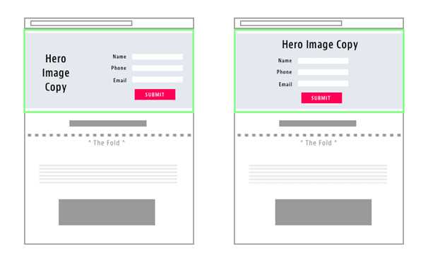
For example, you can test a Hero section where the image and copy are on one side, and the lead form is on the other vs a layout where the copy and the lead gen form are centred.
Other tests can include those where you omit one of the elements, like a lead form, the image and even the CTA button from the Hero section.
This kind of testing can help you determine the best Hero section layout that can be used as a template for creating other landing pages.
46. Long-form vs short landing pages
The landing page length is an everlasting conundrum that every landing page optimizer faces. There’s always that dilemma; should you use short or long-form landing pages.
The length of your landing page actually plays a massive role in your conversion.
Typically, you’d use a short landing page when your offer is familiar, easy to understand or when there are fewer barriers to conversion (i.e. low cost).
On the other hand, when you’re offering a more expensive or complex product/service you’ll need more sales arguments to persuade prospects to convert, so a long landing page is in order.
You should always start by following best practices for your industry and audience. However, there’s always the question of “what if…?” You simply won’t know until you test.
To settle this debate once and for all, at least for one of your landing pages, experiment with different page lengths or hide whole sections of content to learn how your copy impacts the conversion rate.
47. Play around with your colours and fonts
Even the smallest and seemingly insignificant design elements can make an impact on your landing page conversions. Don’t forget to test such things as colours and fonts.
Colours, for example, can influence users on a psychological level and can help determine how they make up their minds.
There are two main ways that colours relate to designing a successful landing page:
- Contrasting colour combinations
- Psychological colour associations
Experiment with different colours, including background, main colours and accents.
Fonts, on the other hand, can significantly boost readability as well as trigger certain emotions that can lead to a higher or lower conversion rate.
Fonts can also be used to create a sense of visual hierarchy on the landing page.
Mix and match different header and body fonts to find an optimal combination that maximizes performance.
48. Test adding visual cues
Visual cues can help guide your landing page visitors in the right direction, suggesting where to look and what to do.
Experiment with adding different visual cues on your landing page to encourage users to take action and convert.
When it comes to visual cues, the options are virtually limitless. You can test using arrows, lines, borders, pointing fingers, scroll wheels, exclamation points, checkmarks, and so on.
Visual cues can also be very subtle, like in this landing page experiment.
Or it can be more direct, like an arrow pointing towards the landing page form.
Experiment with different types of visual cues and compare your conversion metrics with heatmap analysis to get a clear picture of how they impact your landing page KPIs.
49. Optimize navigation
The main purpose of a landing page is for users to complete an action. However, navigation menus and bars can be a distraction that can prevent users from converting.
That’s why many conversion optimization specialists (including us) avoid adding the navigation menu at the top of the page.
If you want to fully control user behaviour on your landing pages, experiment with removing the top navigation bar.
However, this may not be optimal for everyone.
Be sure to keep an eye on how removing the navigation on your landing pages performs and if it results in a higher conversion rate.
Another way you can still provide navigation but make it less distracting is to place it in the footer.
This is sometimes called an “upside-down landing page” where the navigation menu is placed on the bottom of the page.
You can also set up event tracking in Google Analytics to record every time someone clicks on an item in your navigation menu. If people click away too often and don’t end up converting, that’s a sign that you should consider removing the navigation or placing it in the footer.
Create a few different navigation options and test them against each other to see which lead to the highest conversion rates.
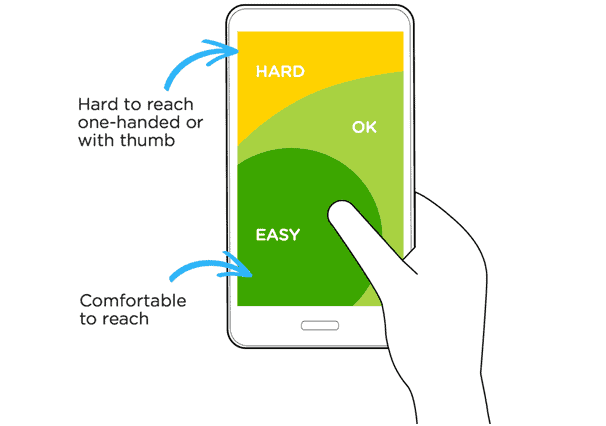
50. Test mobile design and usability
Various studies confirm that people use mobile devices more and more to access the internet. In fact, 52.6% of all traffic comes from mobile.
What this means that you have to consider the mobile usability of landing pages to ensure that such a huge segment of your traffic gets a proper user experience.
As mentioned throughout this guide, convenience eliminates friction and can lead to much higher conversion rates.
Test if your landing page is optimized for mobile users that primarily use one thumb to scroll and interact with your landing page.
Test out various different layouts of your landing page to ensure optimal mobile usability.
Compare your conversion performance across devices to see which layout helps increase conversions coming from mobile devices.
51. Test using a dedicated landing page for mobile
When mobile-responsiveness just isn’t enough it may be time to consider using a special, dedicated landing page for mobile traffic.
Test if having a separate landing page for mobile users can give you a significant boost in conversion rates.
Try using a stripped-down version of your landing page, experiment with big text and try reducing scrolling by cutting down your landing page length.
Another crucial thing to test is your landing page offer for mobile users.
People use mobile devices in short bursts. This means they’re probably too impatient to fill out forms or click on multiple buttons and wait for pages to load. They’re looking for immediate gratification.
That’s why CTAs that deliver instant results, like a call button, can bring much higher conversion rates.
Also, consider that a lot of people use mobile devices to find local deals or businesses. So, test having a dedicated mobile landing page for different locations.
These pages can focus on getting directions, scheduling an appointment or making a call.

If you must use lead generation forms, experiment with asking for just the email.
Conclusion
Testing and optimization are what digital marketing is all about. You should always run experiments to grab even more conversion, more leads and sales.
Even if you’re getting pretty good conversion rates, you should still run tests to drive even higher performance.
Hopefully this monster of a list helps gives you enough ideas for years to come.
And remember – always be testing!
If you need professional help, give us a shout. Find out how we can help you create a perfect landing page optimized for maximum conversions. ?[/fusion_text][fusion_text columns=”” column_min_width=”” column_spacing=”” rule_style=”default” rule_size=”” rule_color=”” class=”” id=””][do_widget id=custom_html-25][/fusion_text][/fusion_builder_column][/fusion_builder_row][/fusion_builder_container]