Increased conversion rates are the holy grail of most organizations in the B2B sector. Companies that rely on digital marketing to generate more business need landing pages that are laser-focused on one thing—capturing lead information to fill the sales pipeline.
The ultimate goal of your landing page is to persuade prospects and decision-makers to take action and convert. To achieve that, you must optimize your landing pages for conversions.
The smallest changes can make the biggest difference, which is perhaps part of what makes conversion rate optimization so exciting.
To help you generate more leads and customers, below are twelve powerful ways to maximize your B2B landing page conversion rates.
Table of Contents
1. Have a dedicated landing page for each campaign
A specific landing page for each campaign is an absolute must. A dedicated landing page will help generate more conversions because it’s entirely designed around your offer, it’s a 1:1 match to your ads, and fully focused on driving action.
Unfortunately, to cut costs and save on time, many advertisers just drive traffic to the homepage.
If you’re promoting a single product/service from your gamut and driving prospects to your homepage instead of a specific product/service page, you essentially put the onus of figuring out what to do next on your prospects.
It not only creates a confusing and complicated user experience, but it can also hurt your business goals. If prospects coming from your paid ad campaigns can’t find what they’re looking for, they don’t convert. And it ends up being a complete waste of your advertising budget.
If you’re using paid traffic sources to promote your B2B solutions, like LinkedIn Ads, Google Ads or Facebook Ads, having a dedicated landing page for your campaigns ensures a good ROAS (return on ad spend).
Depending on your product, you may even want to create separate landing pages that fully focus on a single feature.
For example, if you are promoting a software suite’s CRM feature, that specific aspect of the product should have its own page with all the information about the CRM.
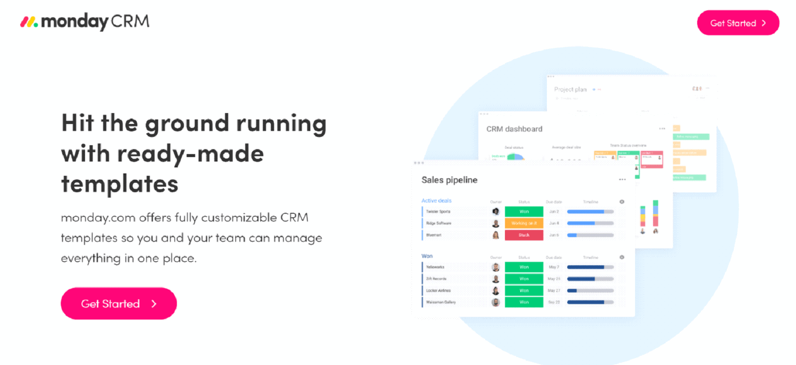

Sending traffic to a general landing page where prospects have to put effort into finding the exact feature they’re looking for, might turn them away. That, unfortunately, results in missed opportunities to capture a conversion.
2. Have clear and prominent messaging
Make sure the messaging on your landing page is clear and ensure the main idea can be easily understood from the first glance. Put your landing page’s primary intent front and center.
Every visitor to your landing page should clearly understand what the page is about.
Pair a bold headline with a hero image to create an impactful combination that speaks to the potential customer. Keep the overall design simple and easy to comprehend.
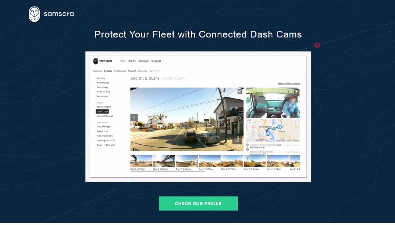

The copy on your landing page needs to be direct, clear, and to the point. Use persuasive words to create a sense of FOMO (fear of missing out) and apply some buying pressure to encourage the user to continue down your B2B funnel (without being pushy).
This may be harder than it sounds. The text on your landing page is arguably more important (or at least as important) as the design and layout, so it’s a good idea to consider working with copywriting services that know what they are doing.
Use the “five-second test” to measure if your landing page copy and design are optimized for clarity.
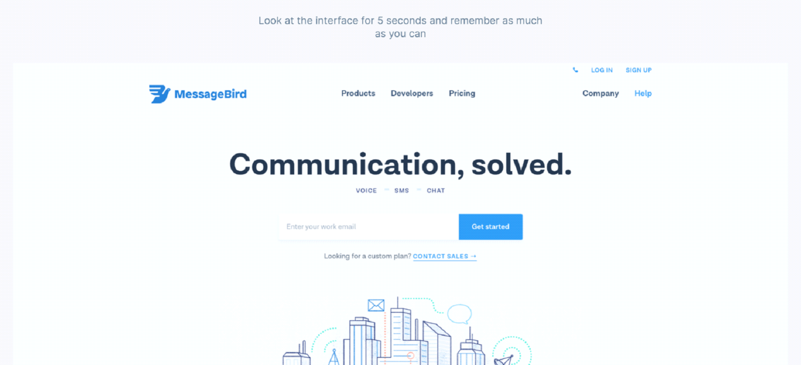

Five-second tests are a user testing method that can help measure what information users take away and what impression they get within the first five seconds of viewing a page.
3. Emphasize your unique value prop
Unique value proposition (UVP), is how you position your brand and differentiate it from other companies in your industry. Use it strategically on your landing page to set your brand apart from competitors.
This can be done in a variety of ways, but the goal is always to emphasize the benefits that are unique or exclusive to your brand or product/service.
When positioning your business, avoid naming your competitor with direct comparisons. However, using (factual) observations that point out the differences is an effective tactic.
“We are 60% faster than our competitors.” is an example of a direct comparison which may be too much on the nose.
However, saying “Go from concept to launch 60% faster” would be a good way to use your value proposition and state a benefit of using your solution that would make it stand out from others.
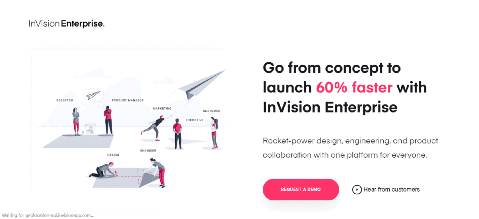

Your UVP should also dictate the overall tone and design of your landing page.
For a company that provides a product geared towards efficiency and streamlining processes, a landing page cluttered with too many links or unrelated information does not give the impression that your company knows how to streamline.
Always be sure to remain consistent across your entire site when it comes to colour schemes, fonts, and a general style of layout.
Use your landing page to make a clear promise about the value you deliver. Just make sure that it’s something your potential B2B customers care about.
4. Have a strong call to action (CTA)
Your B2B landing page needs to have a strong call to action (CTA) that clearly directs prospects to conversion. The ultimate goal of your landing page is to drive action, whether it’s to download an e-book, schedule a consultation, start a free trial, or complete a purchase.
You need a strong CTA to compel landing page visitors to take that desired action and convert.
A strong CTA is one that stands out, is clear, straightforward, and prominent.
Be sure to place your CTA above the fold as well as in other strategic locations around your landing page, use a contrasting colour and confident text.
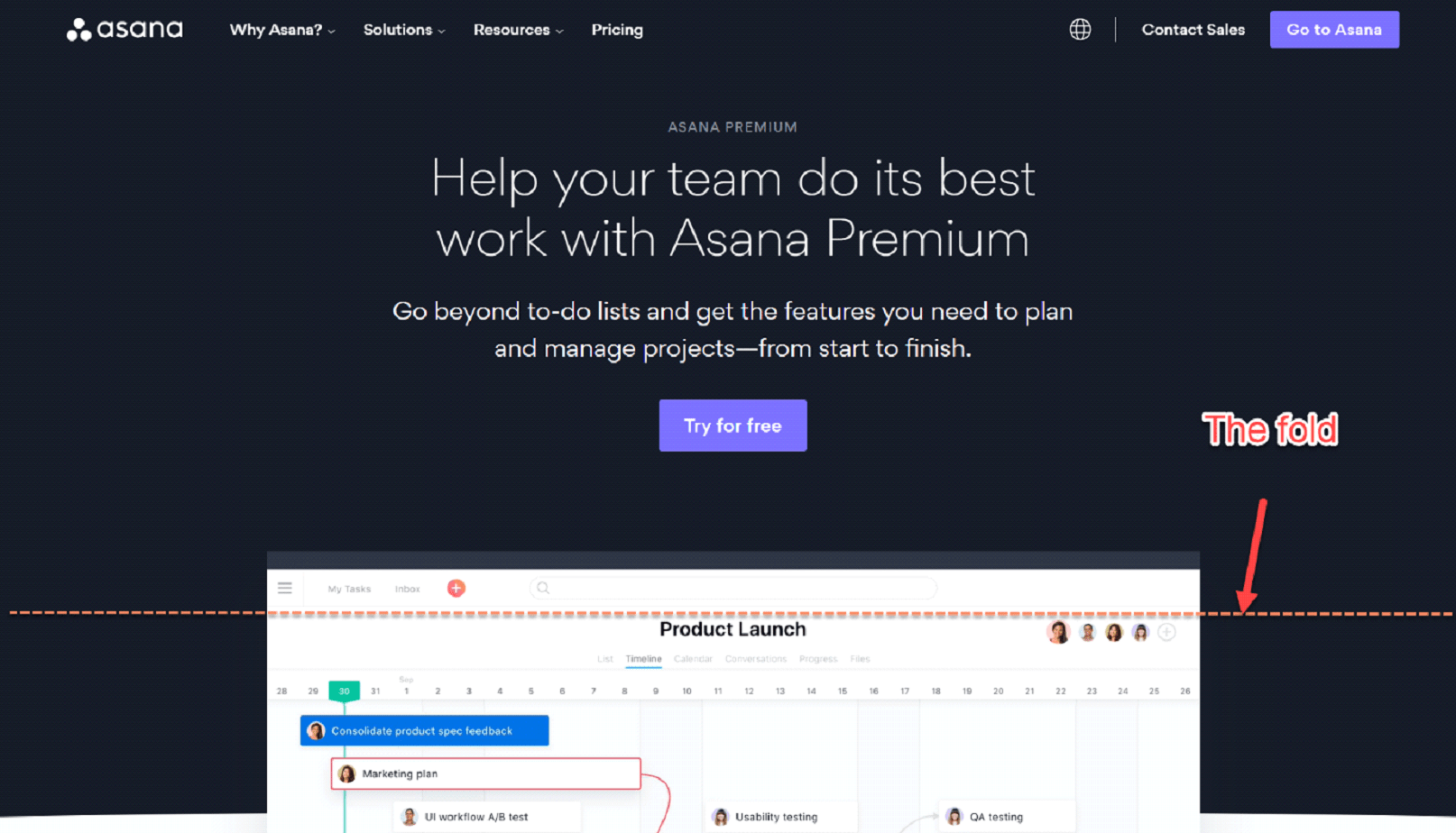

Since CTAs can come in various colours, shapes and sizes, and feature different text, it’s also one of the most popular things to test on a landing page.
Be sure to test out different variations of your landing page CTA to ensure you’re getting the maximum number of conversions.
3X Your Business in 90 Days
Get an unfair advantage with our powerful 3-step funnel strategy and learn how to increase leads and sales by 300% fast.

5. Optimize your lead capture forms for conversions
If the goal of your landing page is to generate leads online, then lead capture forms are another important part that directly impacts your conversion rates. B2B lead forms need to be simplified to make conversions easy while also maintaining the quality of leads coming in, especially if you’re using PPC.
The balance between lead form simplicity and the ability to filter out low-quality leads can be tricky.
On one side, you should try and have fewer form fields. Only ask for necessary information in your landing page forms. Too many questions and form fields can scare off the prospect and plummet your conversion rate.
On the other hand, lead forms are supposed to pre-qualify prospects to weed out low-quality leads and only capture those that you can genuinely turn into customers (MQLs and SQLs).
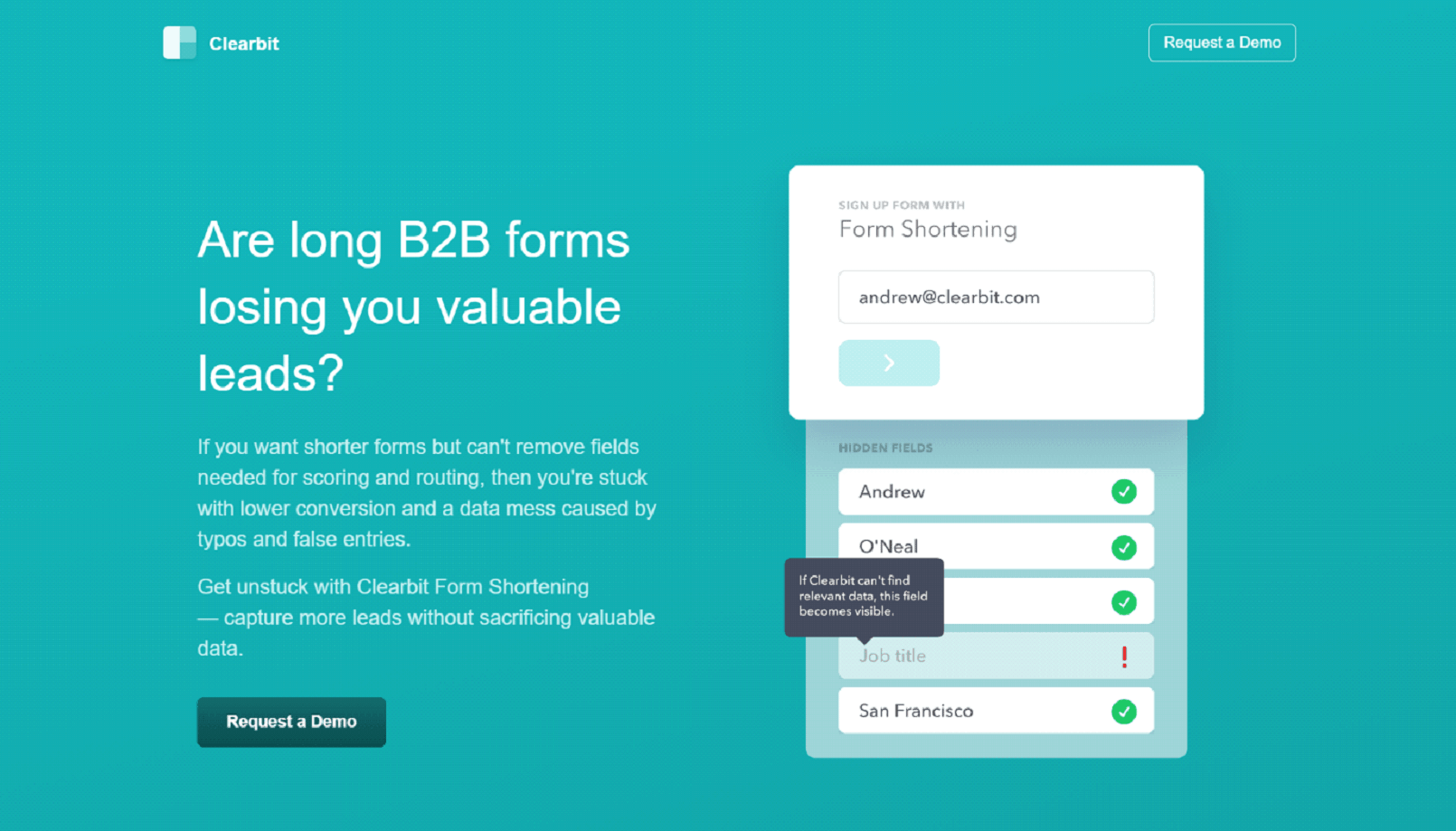

Multi-step (quiz) forms are an optimal solution for maintaining a high quality of leads while at the same time increasing your conversion rate.
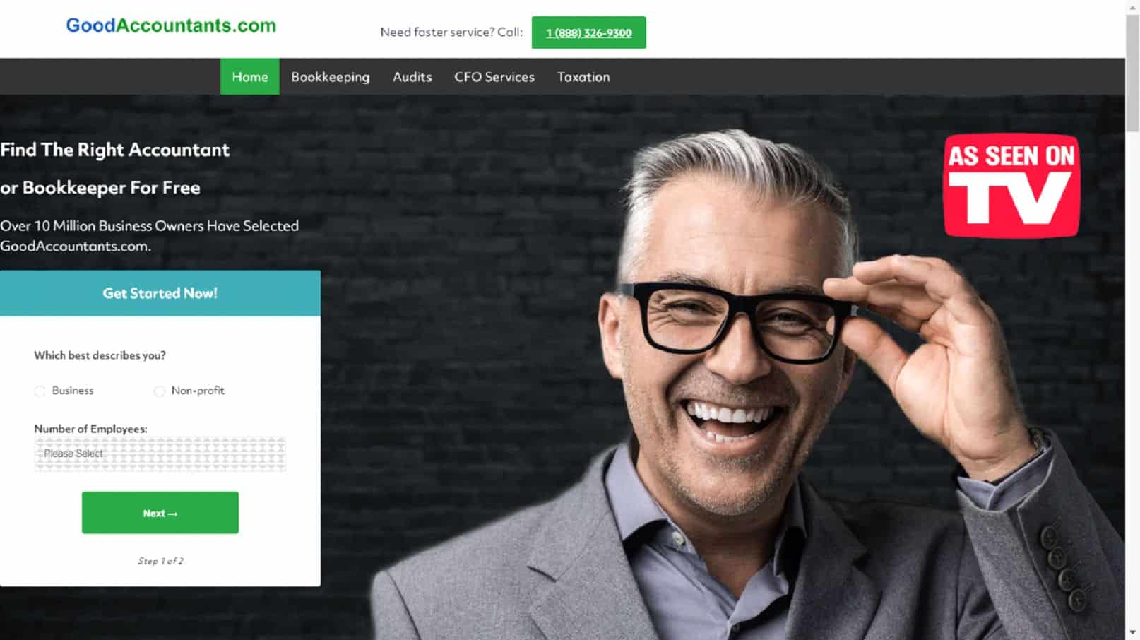
Multi-step forms work by splitting your long list of pre-qualifying questions into two or more steps. This makes it much less intimidating and easier for prospects to convert.
It’s similar to a scientifically proven persuasion method called the “Yes Ladder.”
Start with simple questions…

…and move your way up to ask for prospects’ lead information.
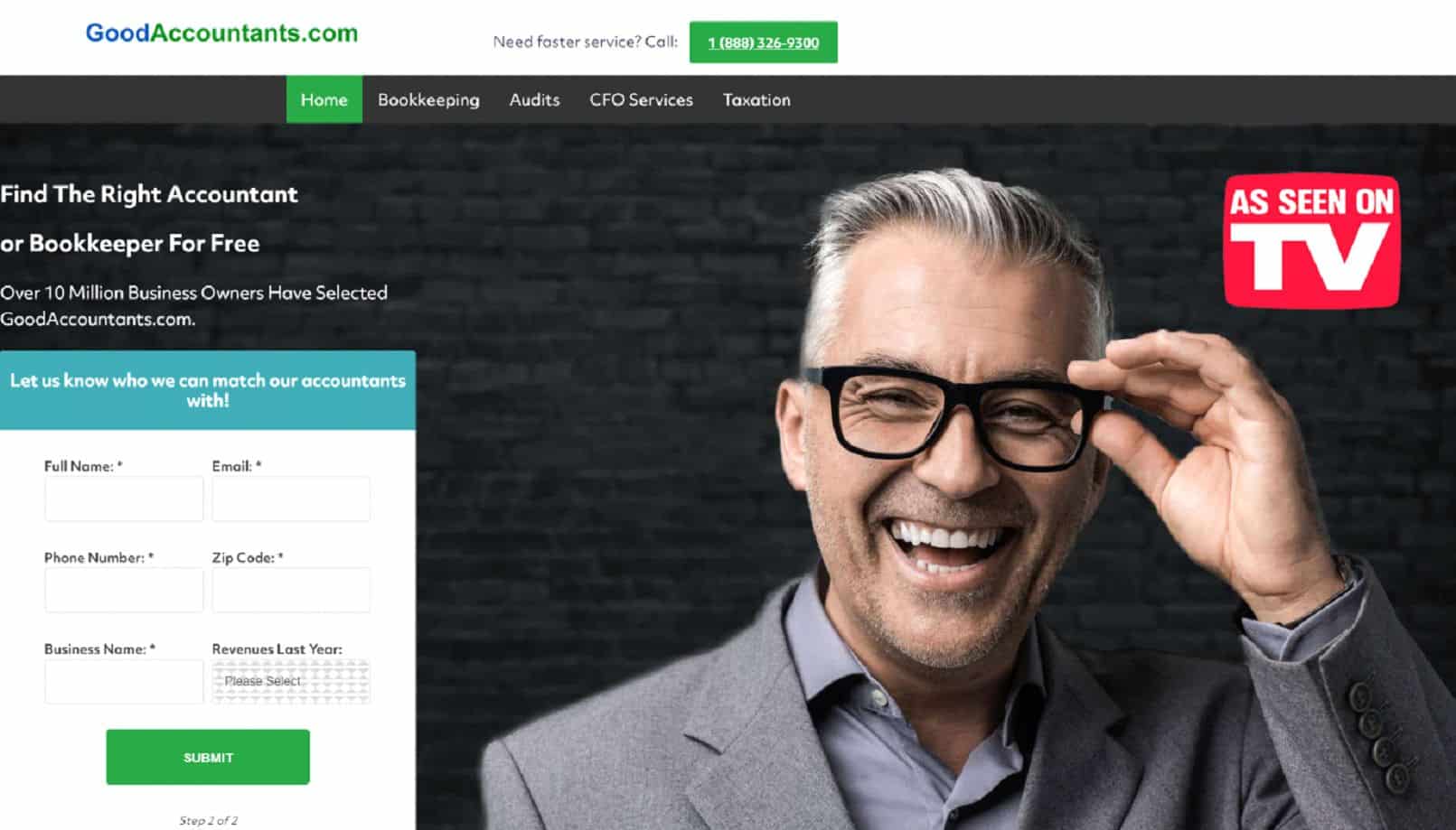

This makes your lead forms much less threatening and helps gather more information on the lead, leading to a higher landing page conversion rate.
6. Remove distractions from your landing page
Your site’s homepage is the most common place to put your header navigation bar in a prominent position where it will be the most beneficial in guiding visitors around. Where you don’t want it is on your landing pages.
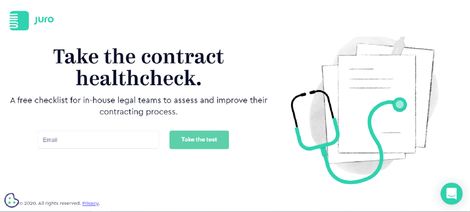
Simply put, if you want visitors to do only one thing, then give them only one option – and remove everything else, like this example from Juro.

If, for some reason, you must use the navigation on your landing pages, try adding a simple, unobtrusive menu button in one of the top corners. It’s enough to give visitors an option to browse your site without encouraging it too much.
7. Highlight the main benefits of your B2B solution
Your landing page needs supporting copy to persuade people into opting for your offer. B2B customers don’t make purchasing decisions for themselves, but to somehow enhance their business or get a competitive edge.
This is an area of overlap with B2C marketing. People who are purchasing something want that product to provide value, they want to get a certain benefit.
If you were to describe a payroll suite as having a “custom reporting feature available,” it may not be clear why it would be an important feature.
Instead, “This payroll suite comes with a custom reporting feature which means no longer needing to rely on IT to make on-the-fly changes, cutting down on lost time and resources spent,” is a statement that has suddenly fixed multiple problems and presented whole new possibilities.
Include key benefits on your landing page that resonate with your B2B customers.
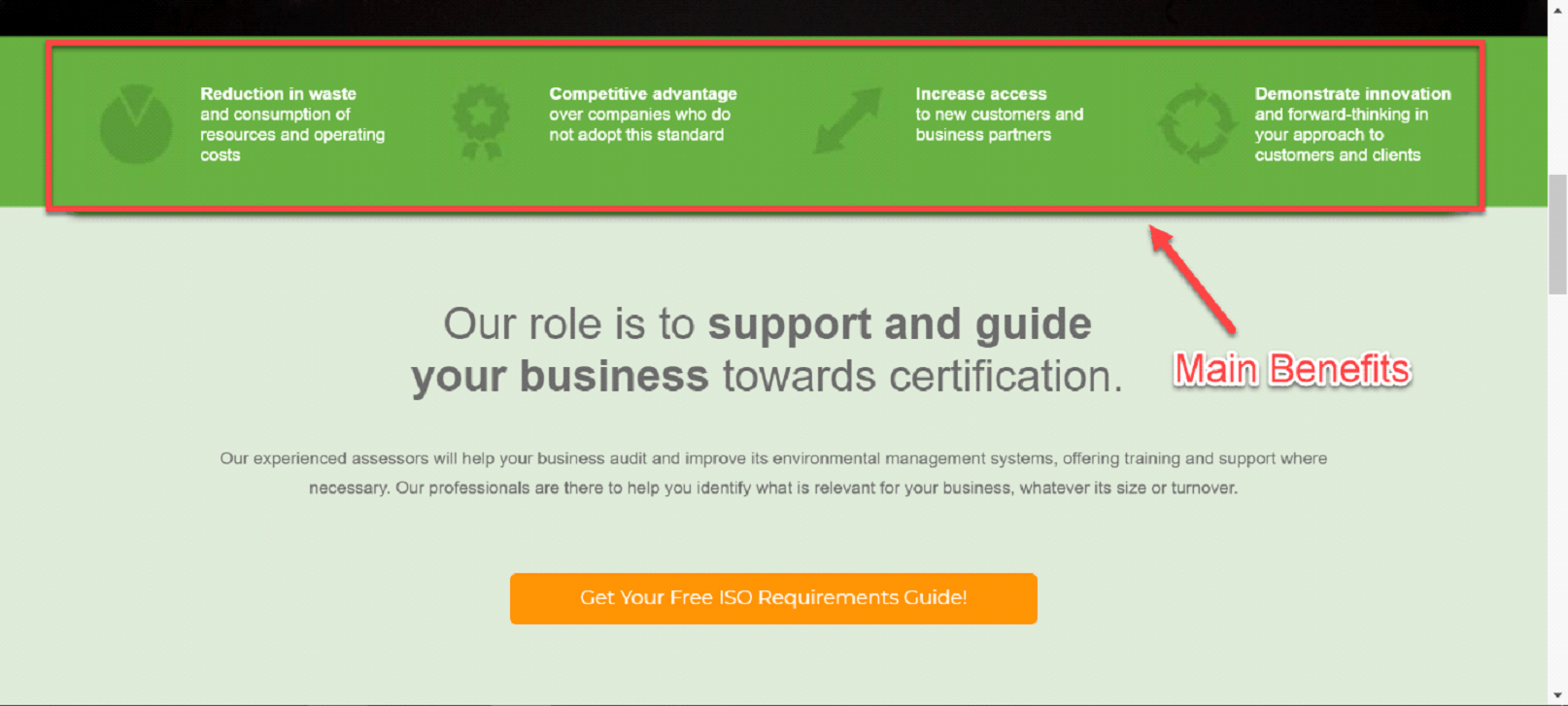

A major benefit can prove to be a tipping point that leads to more landing page conversions. By clearly communicating the benefits of your offer, you’ll be able to increase the landing page conversion rate.
Experiment with different selling points to find the ones that resonate the most with your potential customers.
8. Demonstrate quantifiable results as proof of ROI
Use your landing page to demonstrate the results of using your products/services. What businesses are mainly focused on is saving time and money. Show tangible results potential customers can expect as proof of ROI.
Suppose you have quantifiable data about how much prospects will save in expenses and gain in efficiency. In that case, include a few prominent statistics somewhere on your landing page where they can be quickly absorbed.
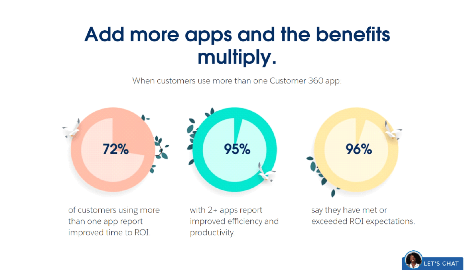

A business that knows 96% of its customers have met or exceeded their ROI expectations should include that as part of their landing page copy.
This is actionable, provable information that gives a definite answer to how your products will benefit them.
Another company offering SaaS products that can show other customers have streamlined from using four programs to just their software service should be able to provide some statistics on savings in licensing fees or a reduction in time spent by employees trying to collate reports from different systems.
The emphasis should be solely on what your product provides, not to point out how inefficient a competitor is. “Other companies will cost you 40% more in fees” does not read as well as “We have saved our customers 40% in fees.”
9. Validate your offer with reviews, testimonials and awards
Establishing that your business is reliable and dependable with a trusted background can make or break a conversion. This is especially true in B2B markets where decision-makers are very careful about which solution they choose.
By showing testimonials, reviews, or awards on your landing page, you can effectively validate your offer and add credibility to your business.
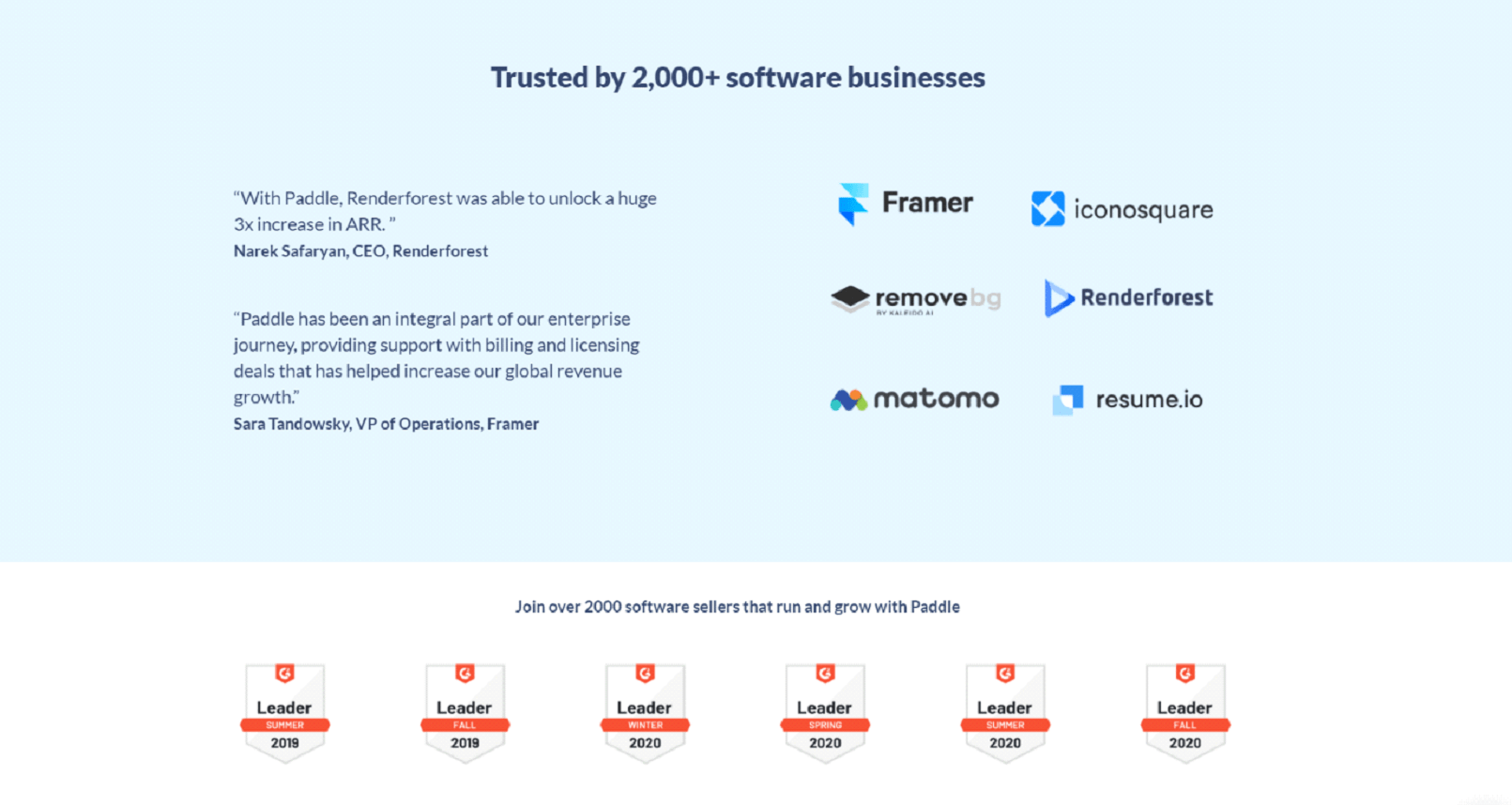

New companies may struggle in this area until they have established user comments and feedback.
Social media can be an ally here as creating a brand account in multiple areas can bring in past users to share their experiences. But with transparency comes the responsibility to live up to the promises your company has made.
With some social proof on your landing page, you can show that your business is trustworthy, with a good online reputation.
10. List out your main features
A simple bullet-point style list on your landing page with a few of your main features can provide a quick overview of what your product/service offers. While the landing page focus should be on what the product provides as a benefit to the buyer, an easy way to access a list of the product features is also important.
Some products and services can be understood immediately; others may need a little more explanation. Features along with benefits make it clear as to what your product/service offers to reinforce the unique value proposition on your landing page.
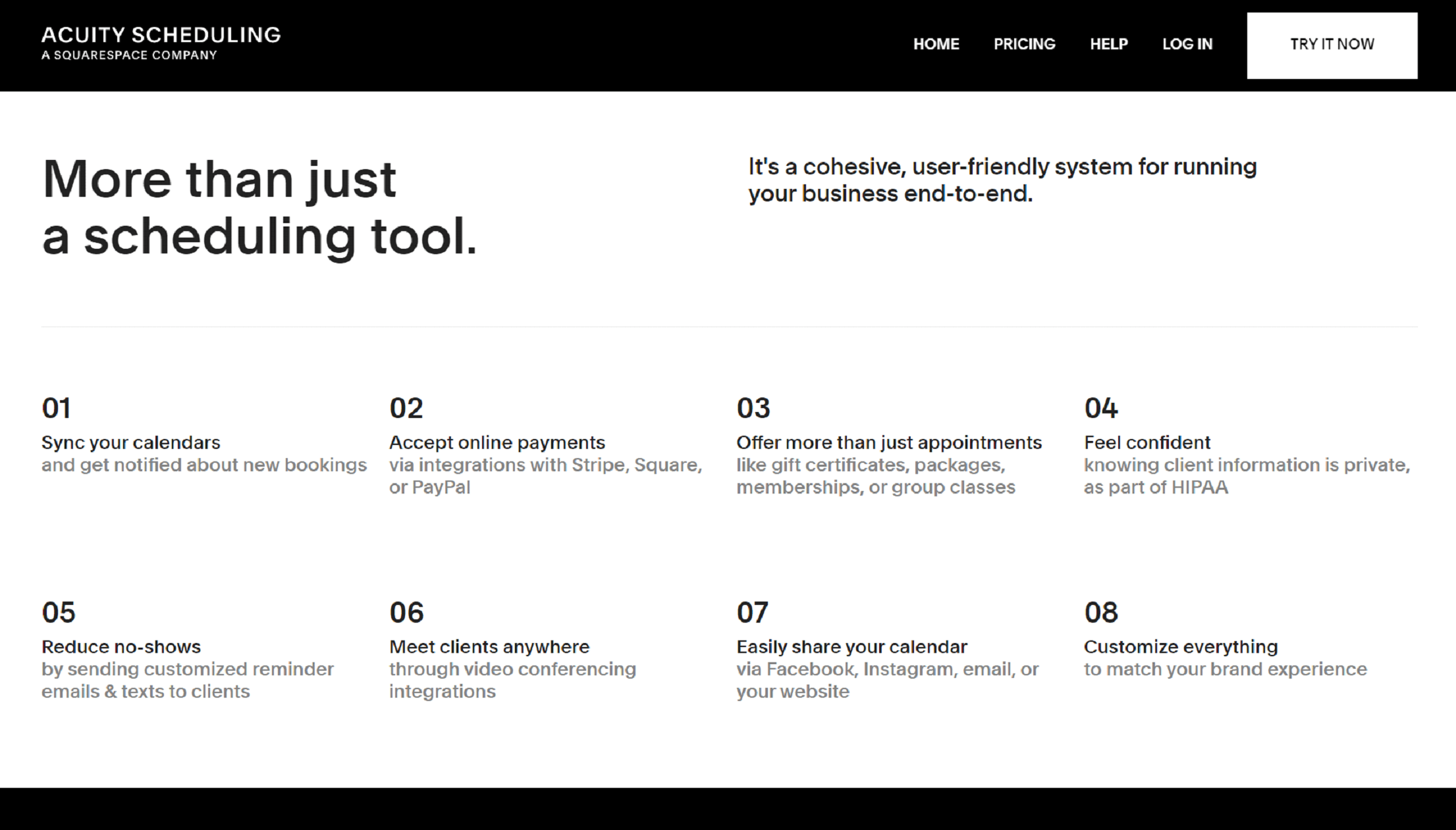

Features can also be good when prospects are comparing your solution to others.
By clearly listing the features on your landing page, B2B customers will have enough information to make a faster decision and convert.
11. Declutter your landing page background
Keep your B2B landing pages clean and focused, with lots of white space to help main conversion drivers stand out. Be sure to remove anything that doesn’t contribute to encouraging action on your landing page.
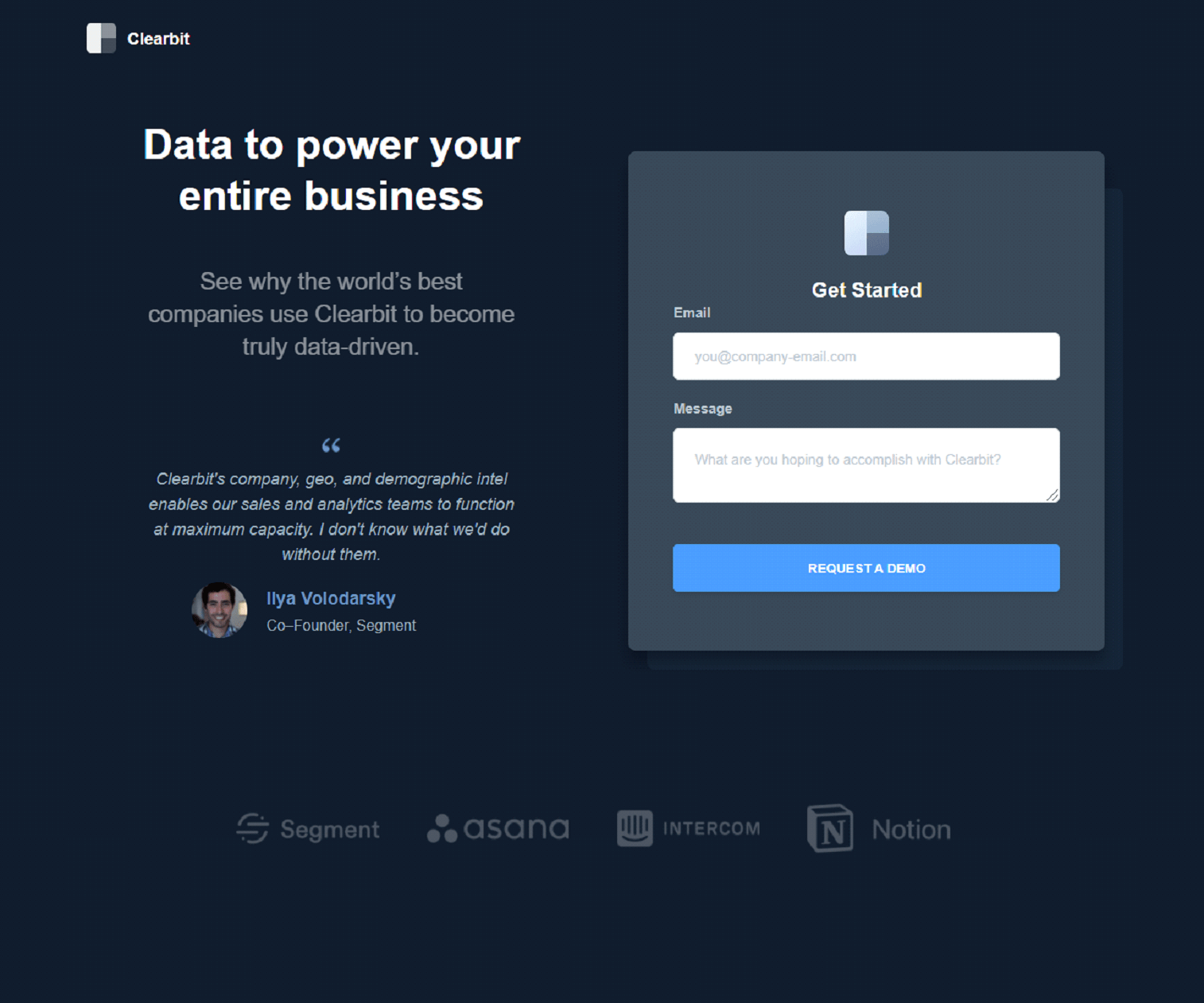

Fullscreen images, or in some cases videos, are popular for business products and services to use as the background of their landing pages, and they certainly make an impact. Unfortunately, they can also cause a slowdown in loading times, which can cause people to lose interest.
This is particularly important if you are trying to sell your services as a time-saving feature their business must-have.
If you are selling long-term service contracts, a background image of two people shaking hands is enough to send your message across.
Avoid background images or videos behind sections of your landing page that feature lots of data or text that needs to be easily read.
Whenever possible, try to use custom background images and graphics. Avoid stock photos as they can often be overused by others. And with the rising popularity of landing page builders that use templates, you can easily end up with a similar-looking page as others in your industry.
12. Incorporate different types of multimedia
Different types of multimedia on your landing page can help convey your unique value prop, demonstrate your solution, and help increase conversions.
Images and full-page backgrounds are good for an overall effect that you want to convey. Using an auto-play video is not recommended as the background, however, adding a video that can be clicked on can be quite effective at driving conversions.
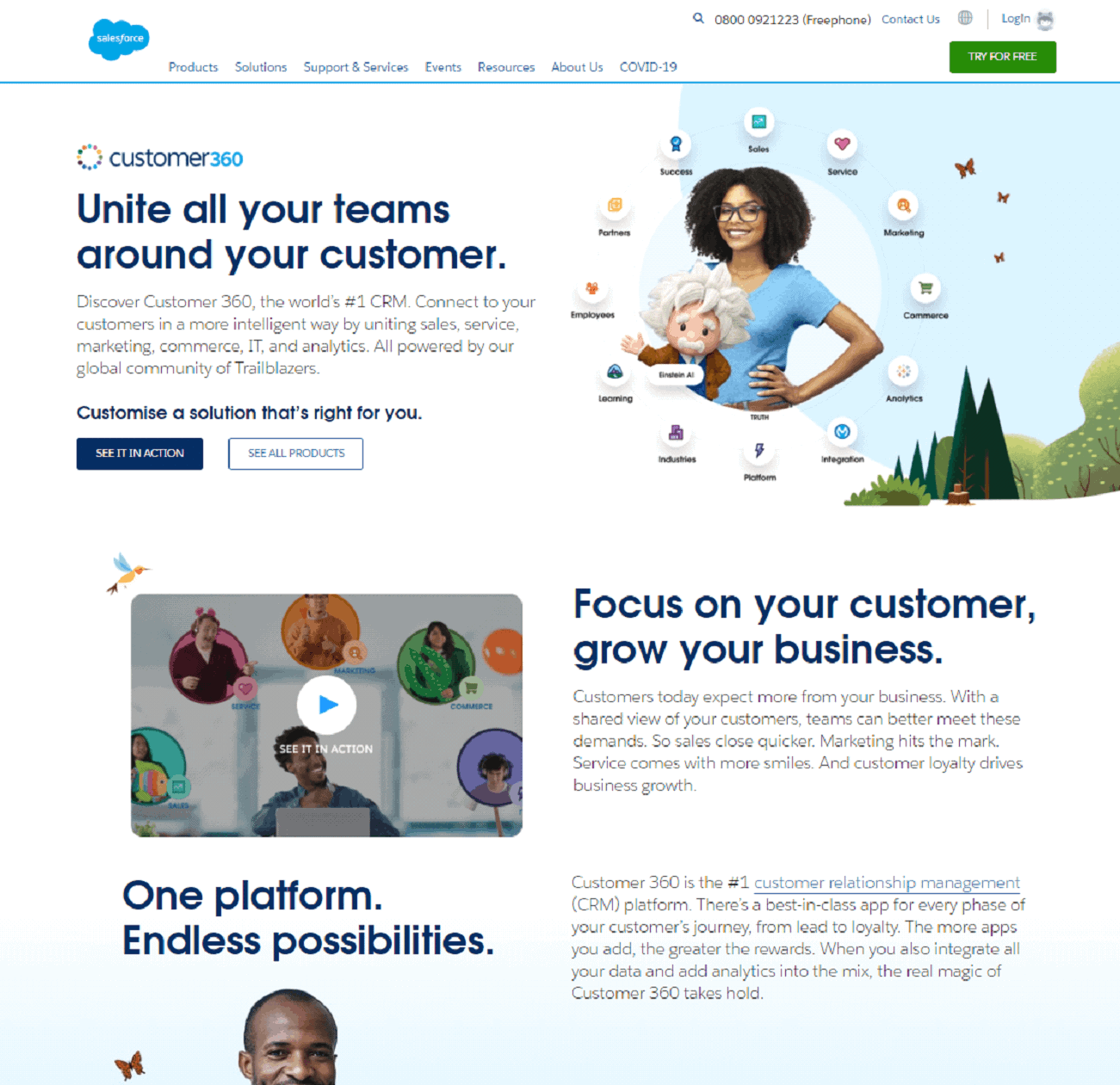

These videos should only be a few minutes long (or shorter) and made to give a more in-depth look at the product or service without taking up space with a lot of text or data.
Having a 2-minute video that shows the main features of a product with a helpful narrator listing the benefits is efficient, simple, and effective.
If you have multiple modules or features to go over, then using several short videos is better than one long one. This makes it easier for the viewer to go back and find the particular feature they want more information on.
To keep the main landing page uncluttered, try to put your videos below the fold on the landing page.
Conclusion
To generate more conversions on your B2B landing page, be sure that it’s fully optimized for driving the desired action.
Creating your landing pages should result in a simple, uncluttered, easy to understand pages with only specific, relevant information with a minimal amount of links and images all arranged in the most efficient but user-friendly way.
Start by making a checklist of the main priorities and then move into refining them. It may take some trial and error but never hesitate to try out different wordings or layouts to find the best performing options.
If you need help designing, creating or optimizing your B2B landing pages, reach out to our expert marketing and web development team. Get in touch to learn how we can help elevate your business online.
And if you have any questions or comments, drop us a line below. ????

