[fusion_builder_container hundred_percent=”no” hundred_percent_height=”no” hundred_percent_height_scroll=”no” hundred_percent_height_center_content=”yes” equal_height_columns=”no” menu_anchor=”” hide_on_mobile=”small-visibility,medium-visibility,large-visibility” class=”post-link-tag ” id=”ol-data” background_color=”” background_image=”” background_position=”center center” background_repeat=”no-repeat” fade=”no” background_parallax=”none” enable_mobile=”no” parallax_speed=”0.3″ video_mp4=”” video_webm=”” video_ogv=”” video_url=”” video_aspect_ratio=”16:9″ video_loop=”yes” video_mute=”yes” video_preview_image=”” border_size=”” border_color=”” border_style=”solid” margin_top=”” margin_bottom=”” padding_top=”” padding_right=”” padding_bottom=”” padding_left=””][fusion_builder_row][fusion_builder_column type=”1_1″ layout=”1_1″ spacing=”yes” center_content=”no” link=”” target=”_self” min_height=”” hide_on_mobile=”small-visibility,medium-visibility,large-visibility” class=”” id=”” background_color=”” background_image=”” background_position=”left top” undefined=”” background_repeat=”no-repeat” hover_type=”none” border_size=”0″ border_color=”” border_style=”solid” border_position=”all” padding_top=”” padding_right=”” padding_bottom=”” padding_left=”” margin_top=”” margin_bottom=”” animation_type=”” animation_direction=”left” animation_speed=”0.3″ animation_offset=”” last=”no”][fusion_text columns=”” column_min_width=”” column_spacing=”” rule_style=”default” rule_size=”” rule_color=”” class=”” id=””]Calls to action are a crucial component of your landing page because they compel visitors to perform the desired action – sign up to be a lead or buy your product/service.
One important thing to know about them, though, is that they’re tricky to get right.
CTAs have the power to make your marketing campaigns more effective. But if your CTAs are flimsy or dull, all your marketing efforts will go to waste.
Don’t be silly to think that any CTA will do the job.
While the term ‘’call to action’’ has a broad set of applications, good CTAs are a whole new ballgame.
The goal of this post is to dissect everything CTA-related. We’ll sprinkle in some basics about the importance of CTAs and top it off with 10 easy yet effective ways to bring your landing page CTAs to the next level.
Let’s go.
Table of Contents
What are CTAs and why are they so important?
In the simplest of terms, a call to action is a clickable link that users see on a page. It’s the link that your prospects must click to advance to the next step in the conversion process – becoming customers.
There are many different types and uses of CTA, such as:
- Lead generation form buttons
- Buy now buttons
- Social share button
- The ‘’Read More’’ button
- Landing page buttons
In this article, we will solely focus on landing page CTAs.
While it’s easy to understand what a CTA is and how to spot it, it is very difficult to get it right. Let’s see some examples.
Examples of landing page CTAs
Our first landing page CTA example comes from Spokeo. This is a people search and phone number lookup service.
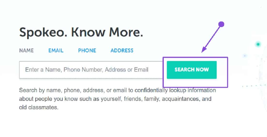
Its main large-volume ranking keyword is ‘’people search.’’ It brings in the largest amount of traffic and has a monthly search volume of 386k, according to our keyword analysis.
So, it’s crucial to match the intent for this difficult keyword or you’ll miss out on the valuable opportunity to bring in some serious sales.
And what’s the accelerant for landing page conversions? An effective CTA.
The service from our example above does just that. It matches the intent completely.
Do you notice the details, though?
The CTA is easily spotted – it hurts your eyes because it’s that obvious (if you still can’t see it, it’s this massive Search Now button. And, this CTA is totally appropriate for this service and search query.
The company even went an extra mile to accommodate their prospective customers’ needs. They’ve added an instant search option right in the center of the landing page, which takes you to their checkout page once the search is complete.
Since customers are looking for a people search service, and we know that no one likes wasting time scrolling through pages to find what they’re looking for, placing a convenient instant tool will slowly entice your customer into making a purchase.
Here is another good example from Honey:
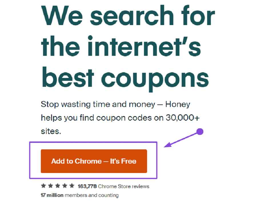
What we like about this landing page CTA is that it has a bit of everything:
- An effective value proposition – ‘’Helps you find codes on 30,000 + sites’’
- A button with power words – ‘’Add’’ and ‘’Free’’- a great combination of terms that inspires immediate action
- Social proof – ‘’163,778 Chrome Store reviews,’’ ‘’17 million members,’’ and the phrase ‘’and counting,’’ which indicates that their support base is continually increasing.
The combination of these three elements leaves us with an enticing offer which we simply can’t refuse. It’s no wonder that this company is among the most widely-used coupon-based services.
I’ll admit it – this CTA was so effective that I personally installed this widget on my browser seconds after taking the screenshot above.
And therein lies the importance of adding quality CTAs to your landing page – creating a now-or-never environment for your customers to increase landing page conversions.
10 ways to improve the landing page conversion rate quickly and efficiently
If you’re ready to optimize your CTAs, generate even more leads and skyrocket your conversions – the guide below will show you how.
This isn’t an easy way out, though.
We will share proven tips and tricks which will give you an overview of what to do and expect. But you have to do your part by figuring out which of these tips will work best for your business. Be creative and innovative.
And – test, test, test.
Don’t be afraid to test different types of CTAs on your page to learn what your customer base loves and is attracted to.
Now that we got that out of the way, let’s get into the nitty-gritty.
1. Attract users with clear and concise action-driven CTAs
Clarity and conciseness should be your number one priority when thinking of landing page CTA ideas.
As a business owner, you know well that customers’ impatience is growing rapidly. You don’t want to lose conversions over unclear and convoluted CTAs that take too much to interpret.
That means that time is of the essence – use up every second that a visitor spends on your website.
No one will bother reading motivational quotes or generic service descriptions – forget about those. Most customers don’t even scroll down to the bottom of the landing page before they exit the website.
The more text you add, the more information the customer has to consider before finalizing their decision. So, using something visible, short, and effective will entice your customers into clicking the link and performing the desired action.
Here are four clever ways to make your CTAs clear and concise:
- Use words and phrases that are simple, effective and short:
- Sign up
- Install
- Download
- Try
- Use action-oriented words:
- Shop now
- Get free quote
- Search now
- Learn today
- Get instant access
- Don’t use over 60 characters per CTA
- Run a 5-second check – if your CTA takes more than 5 seconds to read – SHORTEN IT NOW!
But words are… well, words.
Let’s see some real-life examples that will make you rethink your landing page CTA strategy.
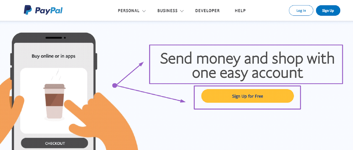
As you can see, PayPal does a great job of using clear and concise CTAs on their landing page.
The text-based CTA has only eight words, while the button CTA only has four. And that’s more than enough to convey the main message and attract new users. You can use one account for online shopping, to send or receive funds, and the signup is free. It’s as clear as day.
No other CTAs are blocking the view, the colours are contrasting enough to make the button stand out, and it’s effective.
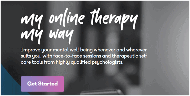
BetterHelp is another website that uses very short and effective landing page CTAs. As you can see in the image below, they don’t waste your time. They immediately classify the three different services they offer and have a respective CTA button for each.
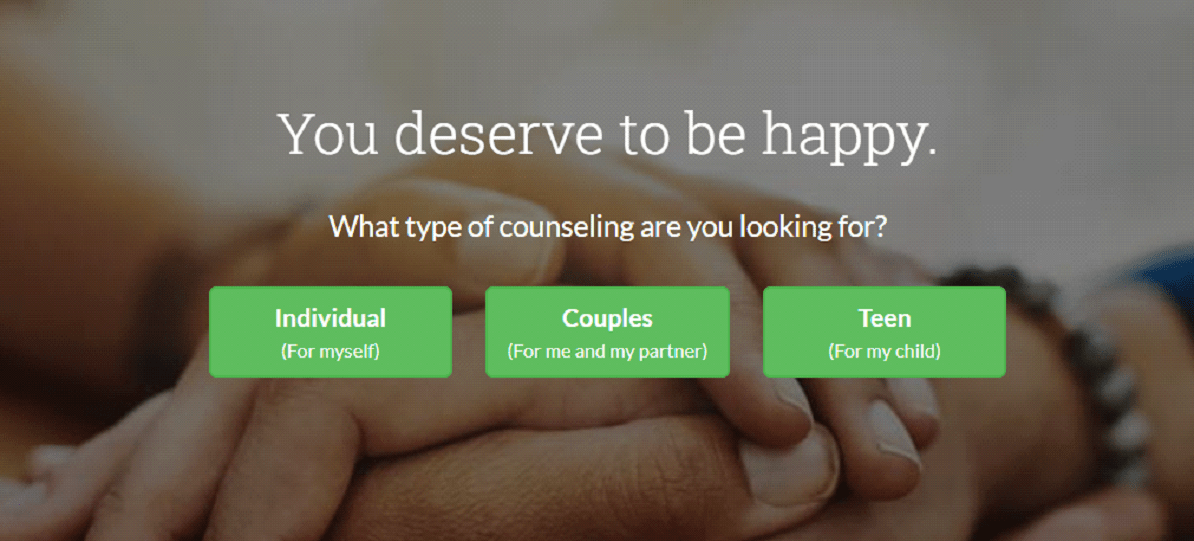
They use only one main word per button-based CTA and offer a brief explanation below for anyone who’s not familiar with the terms. The buttons take you to a short survey, which then connects you to suitable counsellors.
They even spiced it up with an emotional appeal that says ‘’You deserve to be happy,’’ which further inspires the visitors to seek help from their service.
And that takes me to my next tip – including elements that will evoke an emotional response in your customers.
2. Write emotional CTA copy that appeals to your target audience
An emotionally charged CTA message can be an extremely powerful conversion tool if done correctly. There’s nothing more effective for driving conversions than the good-old ‘’I feel you and I’m here to solve your problem.’’
Traditional ‘’robotic’’ CTAs only tap into the logical side of your customer. Even though they are acceptable, they’re certainly not innovative. But that’s not even the point.
The point is that there’s a whole other side you’re missing – their emotional side.
And customers are often influenced by their subconscious thoughts and feelings. Even research supports this claim.
A 2016 study by Nielsen has shown that ads with an above-average emotional response from consumers cause a 23% increase in sales. People love emotional stuff, be it happiness, sympathy, sadness, or anger. And, you can use this knowledge to drive your landing page conversion rate.
These are the five main emotionally driven CTA types:
a) Anger
It may seem weird or even impossible that anger-driven CTAs would be effective. However, if you’re not using overly aggressive language, you might be surprised at how eye-catching it is. Here is a cool example below:
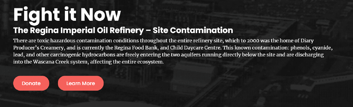
As you can see, they use a form of anger to inspire people to donate or learn more about their campaign. Even though they use strong, angry language, the copy still evokes strong emotions that urge you to do something about this issue.
I don’t know about you, but all of a sudden, I felt the urge to donate and learn more about the issue – which was the creators’ original intent. Bravo!
b) Fear
Believe it or not, you can cleverly use fear in your CTAs to inspire customers to perform the desired action. Remember to be tactful, though. You don’t want to scare them away.
Here are some examples of how brands used fear in their landing page CTAs.
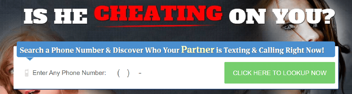
While this isn’t a very reliable website in terms of service quality and legitimacy, it is a great example of how fear-based CTAs can look. If you were suspicious of your significant other, you would’ve undoubtedly clicked on this button. Some other examples of using fear can include:
- Are your sales dropping?
- Are you noticing more gray hairs?
- Are you experiencing hair loss?
- Are you rapidly losing customers?
- Are you doing your SEO wrong?
- Don’t miss out!
c) Love
Using CTA messages that inspire positive emotions can help skyrocket your landing page conversions. As you can see in the example below, OkCupid does a great job at that. Since this is a dating website, we expect the landing page CTA to be love-related.
But OkCupid did a bit more which is definitely worth the applause.

First, let’s talk about the amount of text – here’s a great example of how longer copies can be compelling if done correctly. This CTA also shows that they know their customers well.
We’ve all been through the online dating wringer – and there’s nothing embarrassing about that.
Unfortunately, after a series of unsuccessful online dating attempts, many people feel quite discouraged because it seems as though everyone is there for a one-night stand.
Well, OkCupid does a great job of convincing you otherwise straight on their homepage.
They try to tap into new users’ emotions, encouraging them using heartfelt words like ‘’get noticed for who you are,’’ or ‘’you deserve better.’’
Remember the BetterHelp example we talked about in the intro? That’s another great instance of an emotionally driven call to action.
d) Inclusion
Inclusion works just as well as social proof – the whole point of evoking this emotion is to make your customers feel like they’re a part of a bigger cause or community. There are a couple of different ways to do this:
- Use the user’s location to personalize your landing page CTA
- Include relevant, compelling stats – ”join a community of over 1,000 members,’’ ‘’become a part of a larger cause,’’ ‘’join your peers,’’ ‘’XYZ users have joined today.’’
Here is a cool example of using the visitor’s IP address to personalize your landing page CTA and make your customer feel included.
When you go to Neil Patel’s website, you’re prompted with a CTA that says ‘’I’m determined to make a business in XYZ successful. My question is, will it be yours?
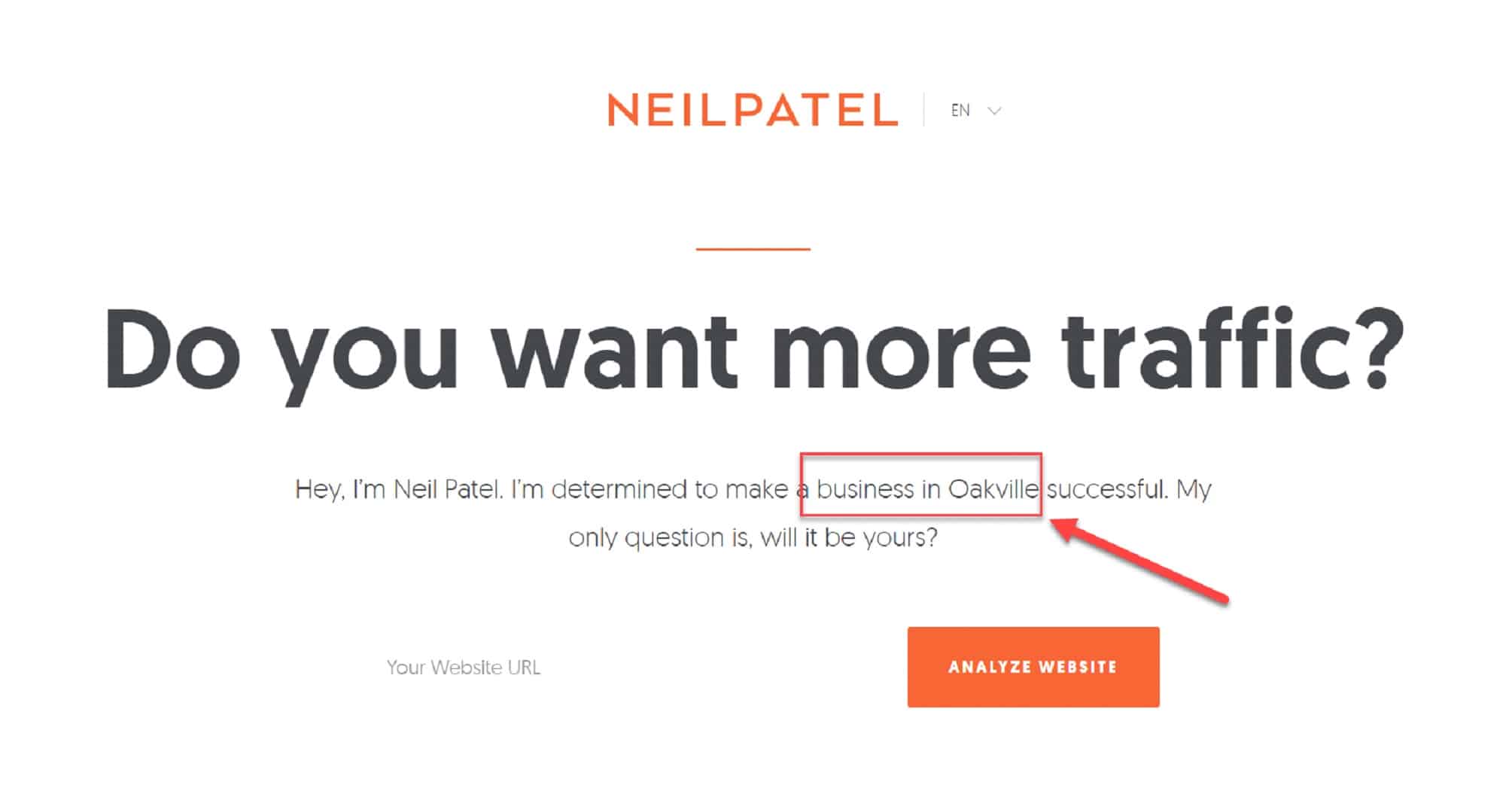
When customers open the website and see this, they’ll think – Oh, he wants to work with a business in MY city. This evokes a sense of inclusion, which can inspire people to get to the next step in your B2B digital marketing funnel.
While this is just a marketing tactic and most of us know that Neil Patel has never even heard of half of the cities that he mentions on his landing page, it’s still smart and effective.
One thing to note, though, which can be used as a cautionary tale in this example – make sure that your IP tracing service is precise; otherwise, this personalized CTA misses the point.
Another great example is Codeacademy’s website. It’s simple, yet effective.
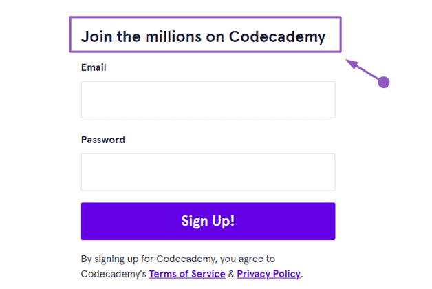
The landing page shows you can millions of people use Codeacademy, which increases their authority. And, you’re immediately prompted to enter your email address and join the community. You can even go the extra mile and include a live visitor count, TrustPilot rating, testimonials, etc.
e) Curiosity
Curiosity is another powerful tool that can yield great conversions.
The whole point of the phrase ‘’Curiosity killed the cat,’’ is to show how people love to experiment, ask too many questions, and investigate – even to their own detriment.
Our brain requires a steady flow of information so it would be able to process in our daily life.
Since curiosity and anticipation are widely used in marketing and sales, we’ve decided to dedicate a whole section to it. Let’s get to it.
3. Create curiosity and anticipation in your CTA
Get users to click with curiosity and build a sense of anticipation in their minds. For example, if you are offering an amazing discount on your products, make sure that you say: “Limited time offer” or “Today only!”
This technique is very effective, as it creates a sense of urgency in the minds of your audience.
Curiosity inspires people to research more, while anticipation forces them to fear that they might miss out on an amazing deal if they don’t take immediate action.
Here’s one example of a curiosity-based CTA. This is a service that connects users with appropriate psychics.

They used two very effective phrases that are suitable to this particular niche. And, they combine both anticipation and curiosity:
- Curiosity – ‘’What out what lies ahead’’ is a great way to inspire people to learn more about the service in a mysterious way. This particular example won’t work well in every niche, but it’s perfect for this industry.
- Anticipation – ‘’You deserve answers’’ is a great way to build anticipation. Upon reading this text, all that pops up in my mind is ‘’What kind of answers,’’ ‘’Is there something that I’m not aware of,’’ ‘’Should I ask them to tell my future?’’
Even if you didn’t believe in psychics and astrology, you might be compelled to click on it – it’s only $1.99 and who knows, I might learn something new about myself.
Curiosity and anticipation are great for marketing since they evoke a positive emotional response. Science shows that we, as people, are wired to expect positive experiences. So why not use this knowledge in your landing page CTA strategy?
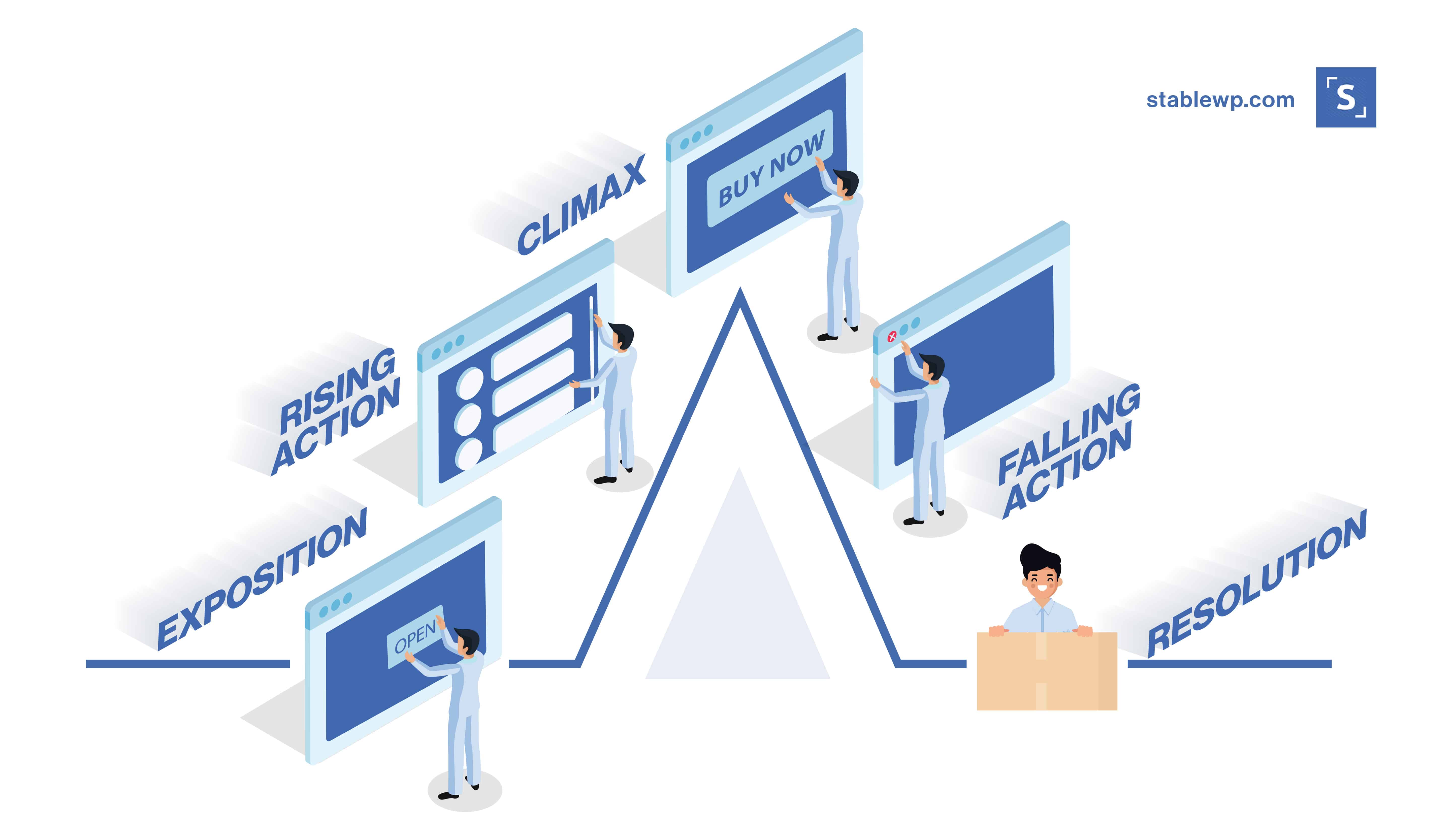
Let’s use Freytag’s storytelling pyramid to paint a better picture.
For the sake of our analogy, think of landing page CTAs as the climax of the story, while the landing page itself is the introduction and the complication. When we scroll through a website, we’re anticipating something useful or helpful, and an excellent curiosity-driven CTA can meet our expectations.
When clicking on your website, people are curious to see what you offer. You should nurture that curiosity for a little while by using clever lines that you simply can’t ignore.
In the example below, it is obvious that the website is offering a personality test.
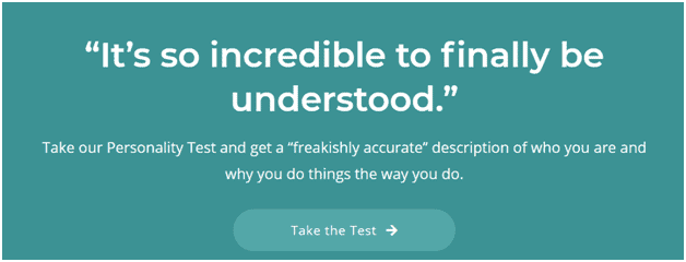
The devil’s in the details, though.
The sentence fragment that says ‘’get a freakishly accurate description of who you are and why you do the things the way you do’’ inspires an insane amount of curiosity which is followed by the anticipation of the test results you’ll receive.
And here I go again – I did take this personality test just for giggles.
You’ll probably think that I’m the easiest shopper to get – I swear that I’m not. But I love a good CTA.
4. Utilize the power of scarcity, exclusivity and urgency
Scarcity and urgency in CTAs are essential persuasion tactics that can help your landing page conversions tremendously if implemented correctly.
With scarcity, you capitalize on the idea that what you have is limited and there is a sure chance that you might run out of stock soon or before someone else does. It urges you to take immediate action which you might miss out on if you don’t react quickly.
Exclusivity has the same exact effect.
I want to feel special. You want to feel special. We thrive on feeling special and cared for.
Here’s an awesome example that does just that – offers an exclusive deal that is only available to the marketer’s email subscriber base.
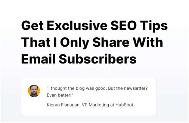
It uses ‘’exclusive’’ as the main power word, and it even goes as far as to emphasize exclusivity by noting that it’s only meant for its subscribers.
Again, notice the details?
He doesn’t condition you to sign up – well, not directly. But that’s the catch.
Invisible conditioning is a great tool for promoting exclusivity and scarcity.
The copy is not saying that he won’t send emails UNLESS you subscribe. It simply states that this exclusive deal is for subscribers. And the hidden message is obvious – you HAVE TO join if you want to reap the benefits.
Here’s another example that promotes both urgency and scarcity.
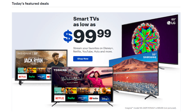
While it’s subtle, the landing page emphasizes the fact that this deal is valid only TODAY. It displays amazing offers – who doesn’t want to get a badass smart TV for only $99!?
And, to top it all off, they have a handy ‘’shop now’’ button that takes you straight to the next stage in the sales funnel
As you can see, this type of CTA doesn’t even have to be very innovative or unique. A plain old ‘’you’ll miss this if you don’t act now’’ does the trick.
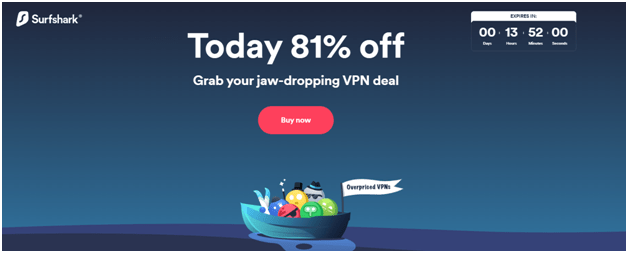
This is yet another great example of creating a sense of urgency and scarcity:
Here are some other ways to use exclusivity, urgency, and scarcity in your landing page CTAs:
- Only 3 discount codes left
- Only today
- Exclusive to our followers
- Only 24 hours left to get this deal
- Limited offer
- Get my free e-book now
- Only 2 items left in stock
- 3 shoppers are looking at the same item
5. Highlight the benefits user gets for clicking on CTA
Make sure that your CTA copy features benefits to your audience in the form of a unique offer or bonus. These benefits can be both specific and generic, though specific ones are usually more effective.
The goal is to share information about the product or service in a way that’s beneficial for the customers. You can use phrases like:
- Call us today for free consultations
- Buy one watch and get another for free
- Use our service to score up to 40% discount
Here is how a flight compensation platform managed to market its services to show a clear value proposition CTA for the customer.
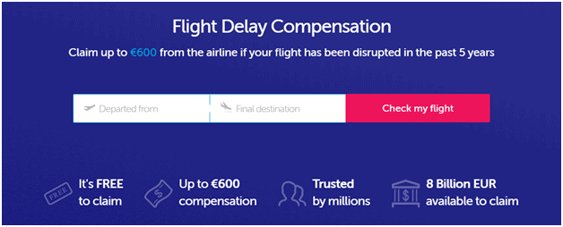
The benefits are so obvious that it hurts my eyes – you can receive up to 600 euros for delayed flights and the service is free to use. When you combine that with social proof (‘’trusted by millions’’) and power words (‘’Free,’’ ‘’8 billion eur available to claim’’), you get an irresistible offer.
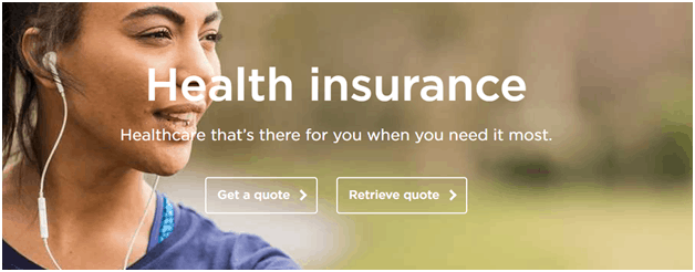
Here’s another clear, short and sweet, value-based CTA.
Even though mental health is a difficult and broad topic to discuss, especially in terms of benefits, the website manages to highlight the gist of their service cleverly.
6. Match your CTA and landing page intent
CTAs must match the user intent to maximize the landing page conversion rate.
One of the worst SEO and digital marketing mistakes you can make is to ignore the intent behind a landing page. You have to think like a customer.
Ask yourself, ‘’If I typed in this search query, what would I be looking for?’’
Here are some actionable data that will show you how impactful is a CTA that matches the user’s intent.
A Scandinavian fitness company has decided to perform a couple of A/B tests to see if changing their CTA would increase conversions. Their initial CTA said ‘’Get your membership’’ While it’s okay to use instructional CTAs, it was not enough to drive a desirable number of conversions.
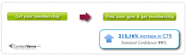
What they forgot to consider during the first attempt is the customer’s intent.
If a customer is looking for a gym, they probably won’t click on the first ‘’get membership’’ button. They have to consider the physical location of the gym, the tools, and the membership options. So, the company decided to change their original CTA to ‘’Find your gym & get membership.’’
Adding three simple words has managed to match the intent completely and has brought in a massive increase in the click-through rate – it went up by 213%.
Here’s a great example of a CTA that hits the user intent perfectly.
This is a platform that offers SEO tools. I reached it by typing in ‘’free SEO tools.’’
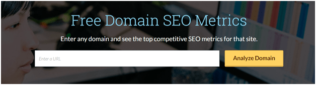
And guess what? I opened a website that offers exactly that with the first click. It displays a search box where you can immediately enter your website to analyze it, it emphasizes the fact that it’s free, and it offers a brief description of what the tool does.
It has matched my intent 100%, which is why I would use this service if I was in the market for SEO optimization tools.
7. Strategically place your CTAs
CTAs are an essential part of a landing page. You have to be smart with CTA placements on your landing page. It’s important to make it as visible as possible without making it aggressive and intrusive.
Users need to be able to quickly and easily find your CTAs from any part of your landing page.
While other types of CTAs allow you more freedom in terms of placement, placing it properly on your landing page is like science. It’s where people land from respective search results or paid ads, and it’s where customers should find what they’re looking for.
We recommend doing one of the following:
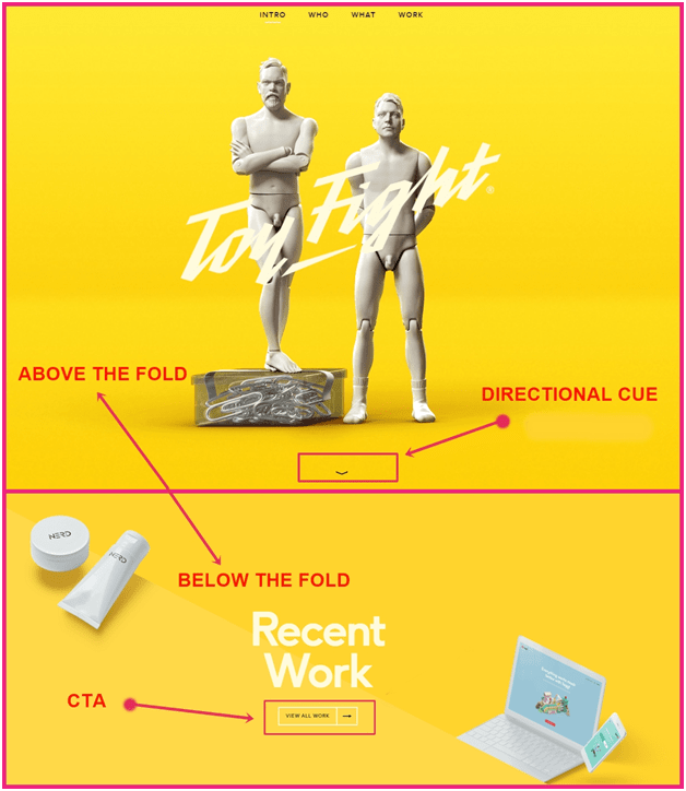
a) Place your CTA above the fold
Placing your CTA above the fold means that it’s going to be the first thing your visitors see when they enter the website. Make sure to use an inspiring headline, add a couple of product/service clarifiers, and a visible CTA which inspires immediate action.
b) Place CTAs below the fold with directional cues
While it might seem counterintuitive, placing the CTA below the fold has also proven to be effective for generating quality leads. Some companies have witnessed a serious surge in conversions after repositioning their CTA button below the fold.
However, if you decide to place your CTA below the fold, make sure to include a good value proposition above the fold to entice the visitor into scrolling down the page.
And don’t forget to add directional cues to guide your customer to the action button. Here’s one great example:
8. Make your CTA button stand out
Your landing page CTA must be easily noticeable. It must stand out and be the center of attention. To help maximize your landing page conversion potential, they need to dominate your landing page.
CTAs need to have a high position in the visual hierarchy of your landing page.
Ensure that your button CTA is visible, large, and appealing. Here are some general tips:
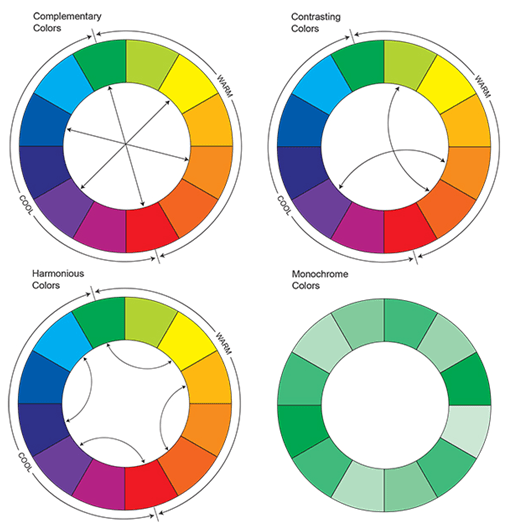
a) Use contrasting colours
Contrasting colours will ensure that your CTA button stands out from other landing page elements. You can use the colour wheel to figure out which colours are on the opposite ends.
Here is a great example of using contrasting colours for their landing page CTA:

If you take a look at the colour wheel image above, you’ll notice that blue and yellow are on opposite ends – which is why they’re so contrasting. The button is very catchy, and it stands out from the rest of the page.
Hell, I can even see it with my peripheral vision. And that’s exactly what you should look for.
On the other hand, let’s see one bad example.
The CTA buttons on this website don’t stand out at all. They are boring, they used uninspiring language, the buttons are clear (a big mistake), and everything just blends in, resulting in a messy landing page.
If I had bad vision, I would have to use a telescope to find where to click – thanks, but no thanks.
b) Make the button look clickable
The button should look like a button (thank you, captain obvious). What we mean by that is that it should cool clickable – the whole purpose of any button is to have someone click on it. And, if your CTA button looks like a regular image or icon, no one will notice it.
People didn’t come to your website to play detective or use their psychic powers to locate interactive elements. You should make it obvious that they’re interactive and clickable.
Here’s how to make your button seem clickable:
- Use shadows
- Use gradient colours
- Adding symbols that indicate a consequent action – arrows or an angle bracket (‘’>’’)
- Use 3D effects – when a user drags their cursor over the button, it should slightly change colour or look indented, so the customer immediately knows that clicking on that element box will result in a certain action.
Here is an excellent example of a button that looks clickable:
c) Use white space
White space is the blank area found between other elements on your landing page. You can use it as a tool to make your button design more effective and appealing.
If you add too many components without any breaks, the user will be overwhelmed by the amount of data they need to analyze. And your button will get lost in the sea of other elements.
And we know that you don’t want to lose any potential customers.
What’s another great way to keep customers? Offering a solution to a nasty problem.
9. Aggravate the problem, then offer the solution
Infuse your landing page CTAs with solutions to a problem. This tip also uses emotional psychology to enforce the desired behaviour in users.
Most people use search engines to find solutions for their problems. However, to know what kind of a solution you need, first, you need to realize the problem.
And that’s where you step in.
Here’s a little secret – there’s a whole customer base that hasn’t even entered the problem-solving phase. You see, there are five main components of each problem-solving process:
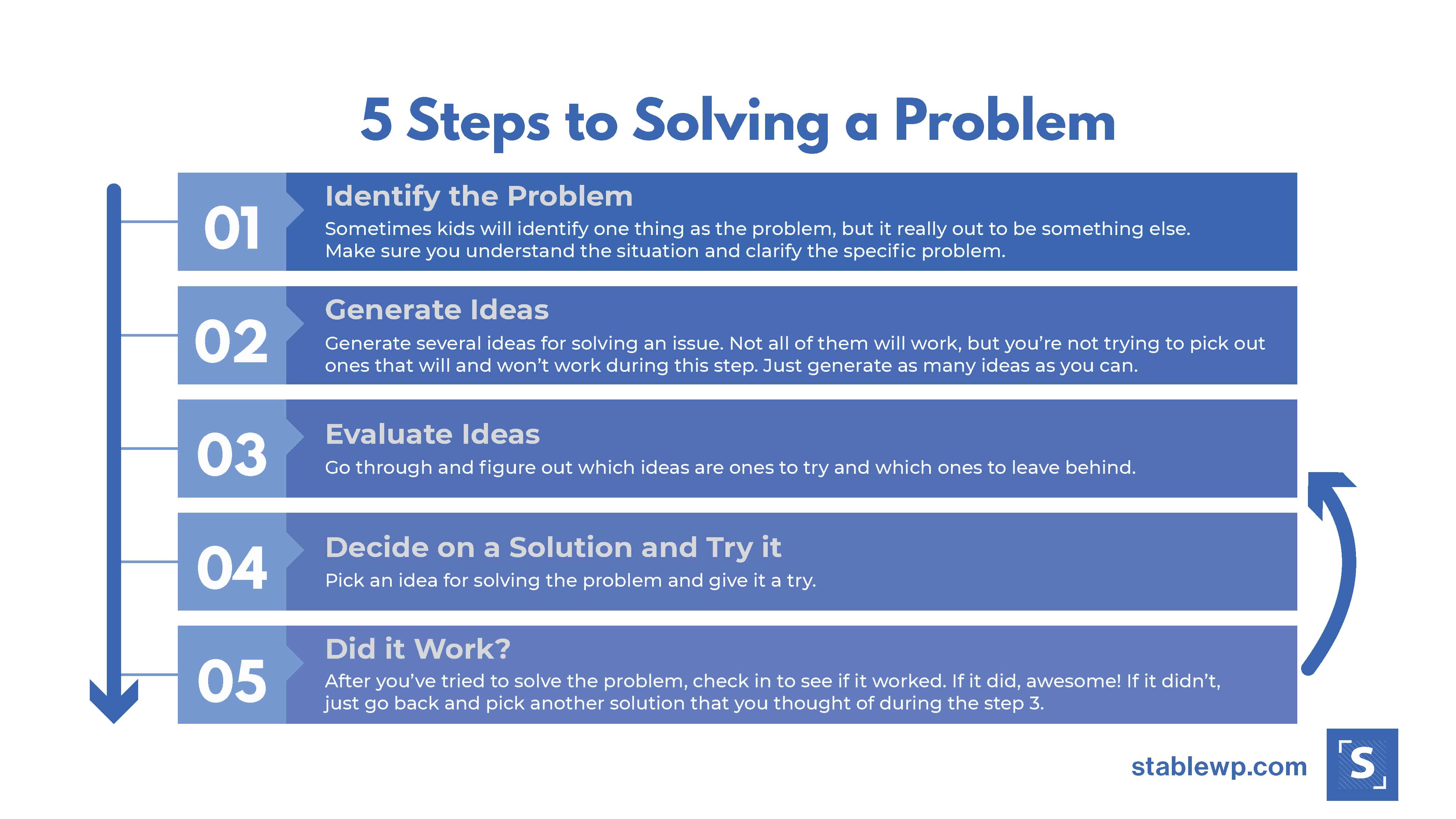
To start the problem-solving process, you need to identify and define the problem. This is your opportunity to present the problem on your website, making it sound even worse than it is.
Use adjectives, hyperbole, and clever language to make the problem seem unsolvable. The customer will start feeling hopeless.
But then…
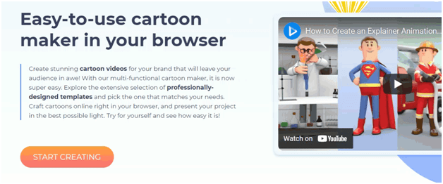
All of a sudden, only one click away is the perfect solution to their problem. How can they not take this opportunity? This is a great way to cash in on indecisive customers that are not tech-savvy. Here’s one great example:

This website is meant for people who are not professional designers, rather marketers looking to quickly create landing pages for ad campaigns.
And what’s their biggest concern or doubt?
‘’I can’t ever make my page look as good as other high-profile services’’
The landing page above feeds into their insecurities and offers an easy and quick solution. All your website design needs are only one click away.
It offers templates right on its landing page because that indicated that the designs are already pre-made, ensuring that the customers need no prior experience or technical design knowledge.
If you’re not sure that this will work for your brand because you offer a unique service that not many people are familiar with, you can always test new elements before finalizing your decision, which brings me to my next point.
10. Test your CTA and optimize it for best results
Landing page CTAs can always be improved. And since they play such a pivotal role in your conversion optimization, it’s important that you test them. Try different variations and combinations of words and phrases. Test the design, placement and colours.
This will help you decide what works best for your audience.
For example, if you want to cater to the audience that is at the beginning of the funnel stage, you can test soft sells like ‘’Learn more,’’ and ‘’View more.’’
If they’re at the end stages of the funnel, you can test harder sell tactics like ‘’Buy now’’ or ‘’Sign up for a free trial.’’
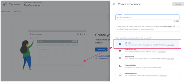
Google Optimize is one of the best free tools you can use to split-test your call to action. You can use different CTAs for different audiences and select users from different traffic sources.
Just navigate to Google Optimize website, sign up for an account, and start A/B testing your landing page CTAs.
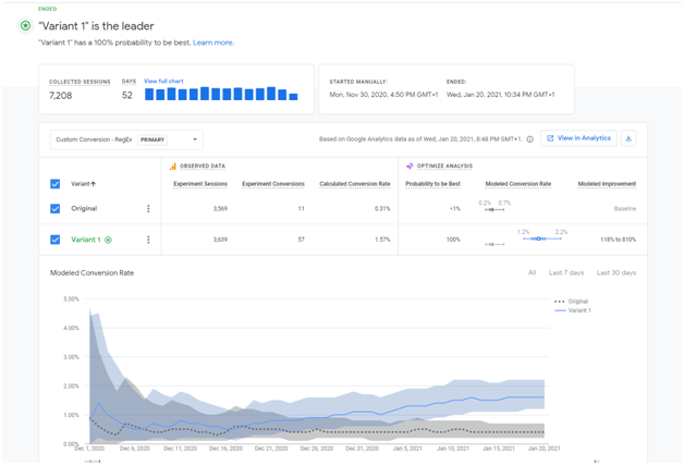
Once your landing page test accumulates enough data, you can analyze the results to declare the winning CTA variant.
Check out our blog post where we show unique landing page testing ideas that will boost your conversions.
To make the right decision, you need to be able to correctly measure the effectiveness of your landing page CTAs.
How to measure the effectiveness of your CTA
Measurements and analysis are a crucial part of every conversion optimization strategy. How can you know whether something worked if you never checked?
The analysis helps you discover what works and what doesn’t. It shows you which elements you should improve.
But it also indicates what works well – when you see that something works, use it more frequently on your website.
There’s a bunch of available tools that will help you with analyzing this data – Google Analytics is just one free example in the sea of others. When you find a suitable tool, here’s what you should do.
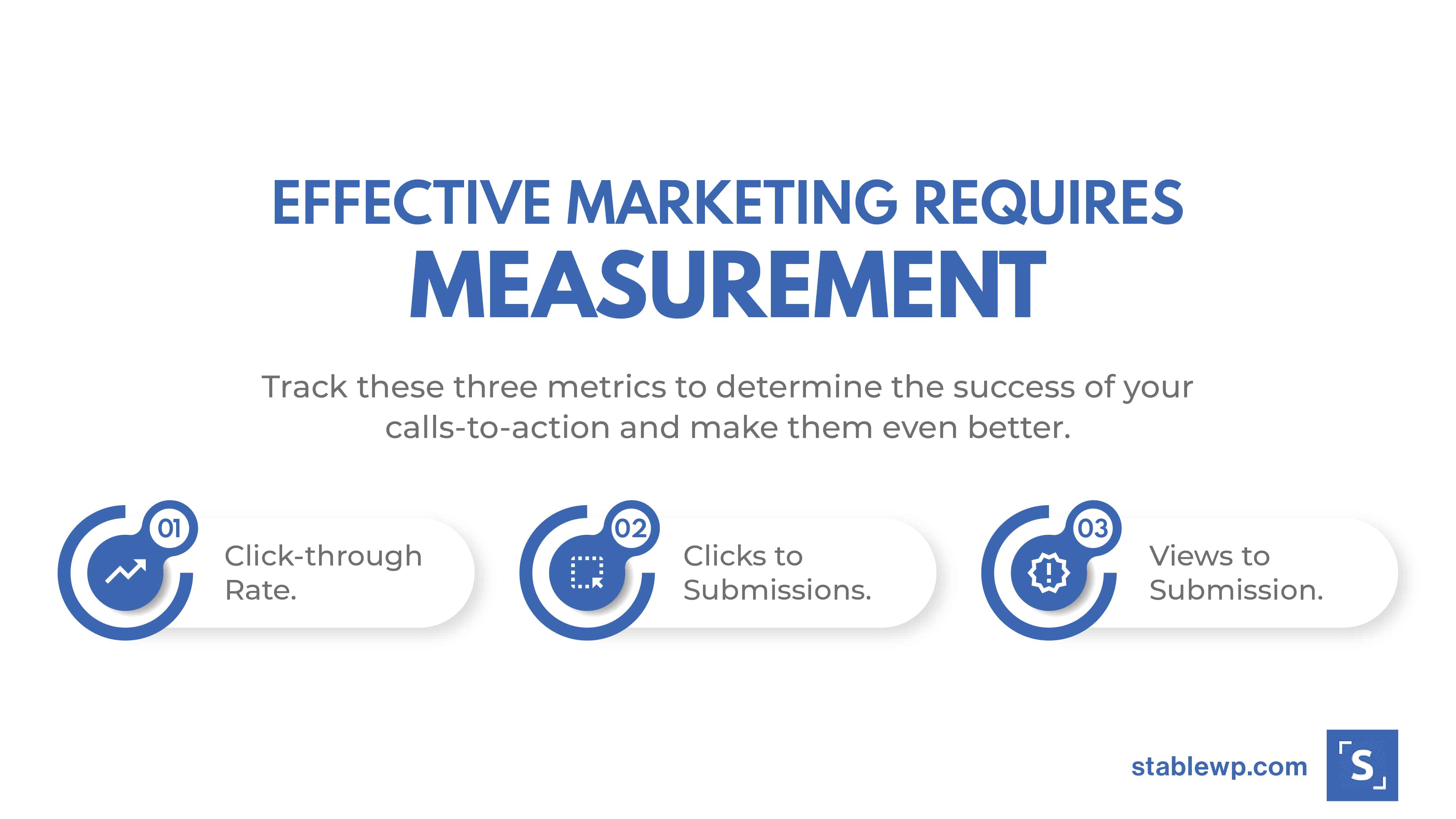
There are three main metrics you should use to measure the effectiveness of your CTA:
- Click-through rate – measures how many people click on your CTA after noticing it on your website. This is probably the easiest indicator to compare and improve upon. Create a variation of your CTA and see how you can improve (placement, text, design)
- View to submission – measures how many people that see your CTA, convert into actual leads. Analyze competition with a high view-to-submission percentage to know how you can improve your content and increase your conversion rates.
- Conversion rate – indicates the percentage of users who have reached your landing page, submitted a form and became a part of your lead nurturing process. If you notice that the percentage is very low, you are probably missing the search intent.
You might want to benchmark your results against others in your industry and use some ideas from competitors to improve your website and as inspiration to create something even better than them.
Ready to create the best landing page CTAs
CTAs are the backbone of every effective landing page. They inspire people to sign up for your lead capture forms, purchase your product, or to perform any other desired action that boosts your conversion rates.
Without them, your sales would drop like flies. Don’t believe us?
We dare you to remove them from your website and see how that ends up ????
All jokes aside, it’s what drives your customers to enter the sales funnel. It gives them exactly what they’re looking for, which is precisely why it’s so effective. While it’s challenging to get it right from the get-go, it’s certainly not impossible.
If you feel like you’ve explored all resources and tried everything in your power to optimize your CTAs, but you’re still not noticing an increase in conversions, maybe it’s time to reach out to professionals.
It took us years to figure out the perfect recipe, but now that we did, we want to share our expertise and take your brand to the next level. Reach out and learn how we can help increase your conversion rate.
[do_widget id=custom_html-25][/fusion_text][/fusion_builder_column][/fusion_builder_row][/fusion_builder_container]